Biggest Stock Market Falls Since 2008 Coming Up Shortly?
Okay, just wanted to get this out there given the potential profit opportunity if this scenario plays out.
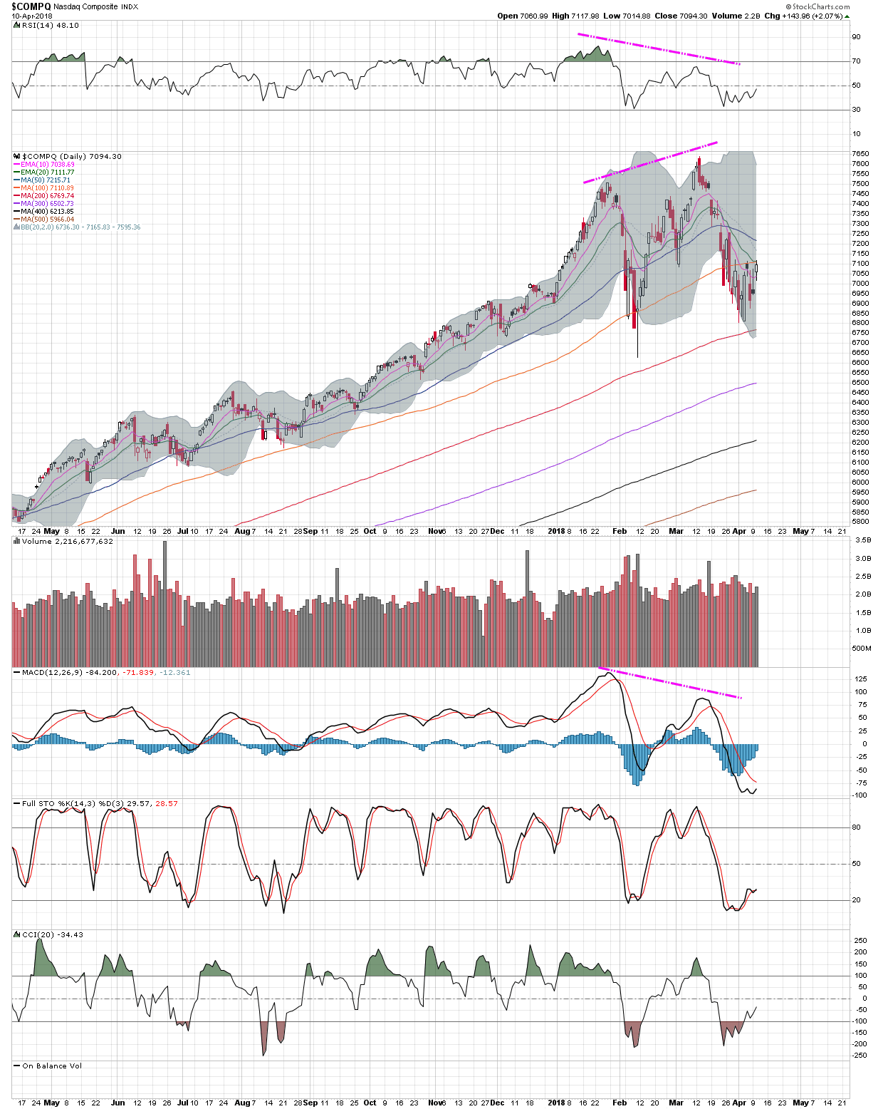
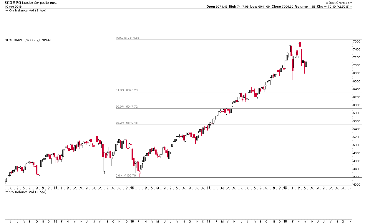
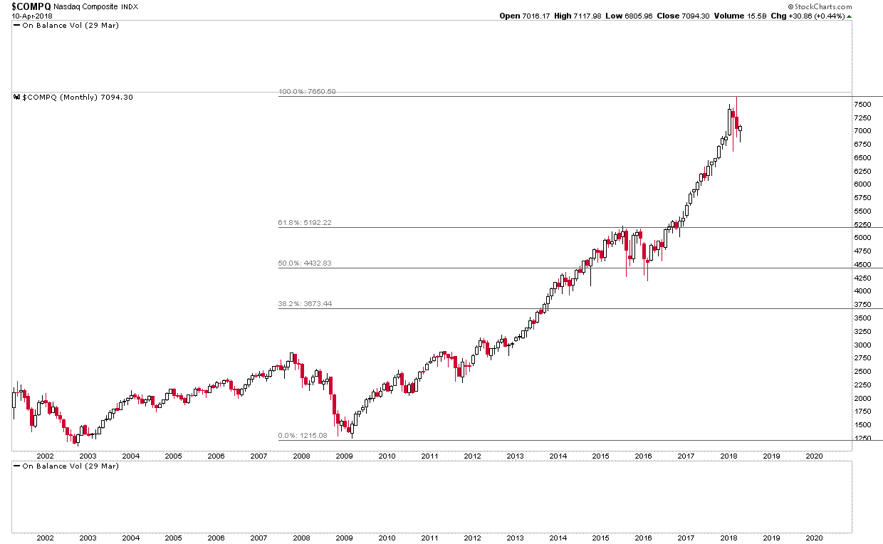
What’s bugged me for a while is that $COMPQ (and $NDX) look as though they are building out a H&S but $SPX and other broad indices do not.
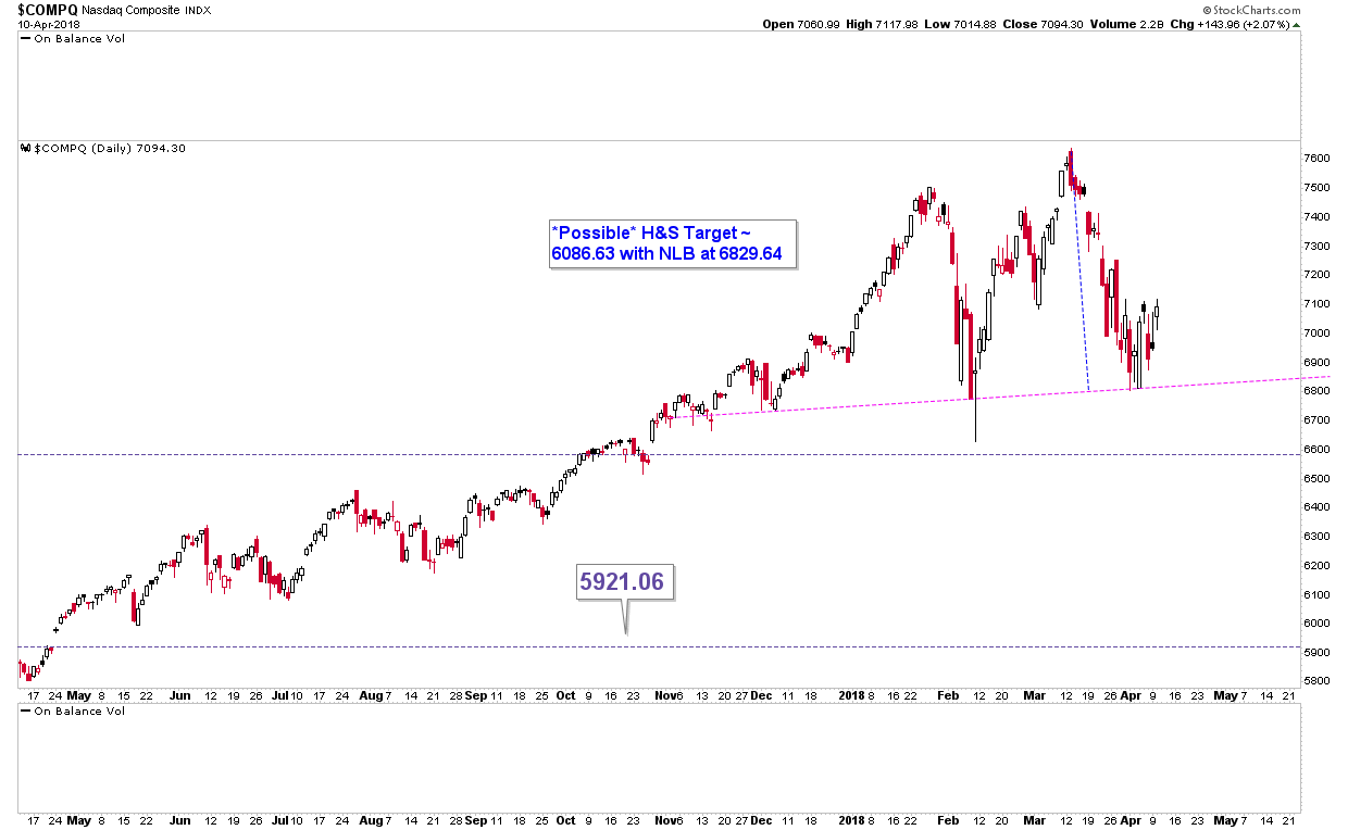
Here’s $COMPQ with the potential for a H&S to form:
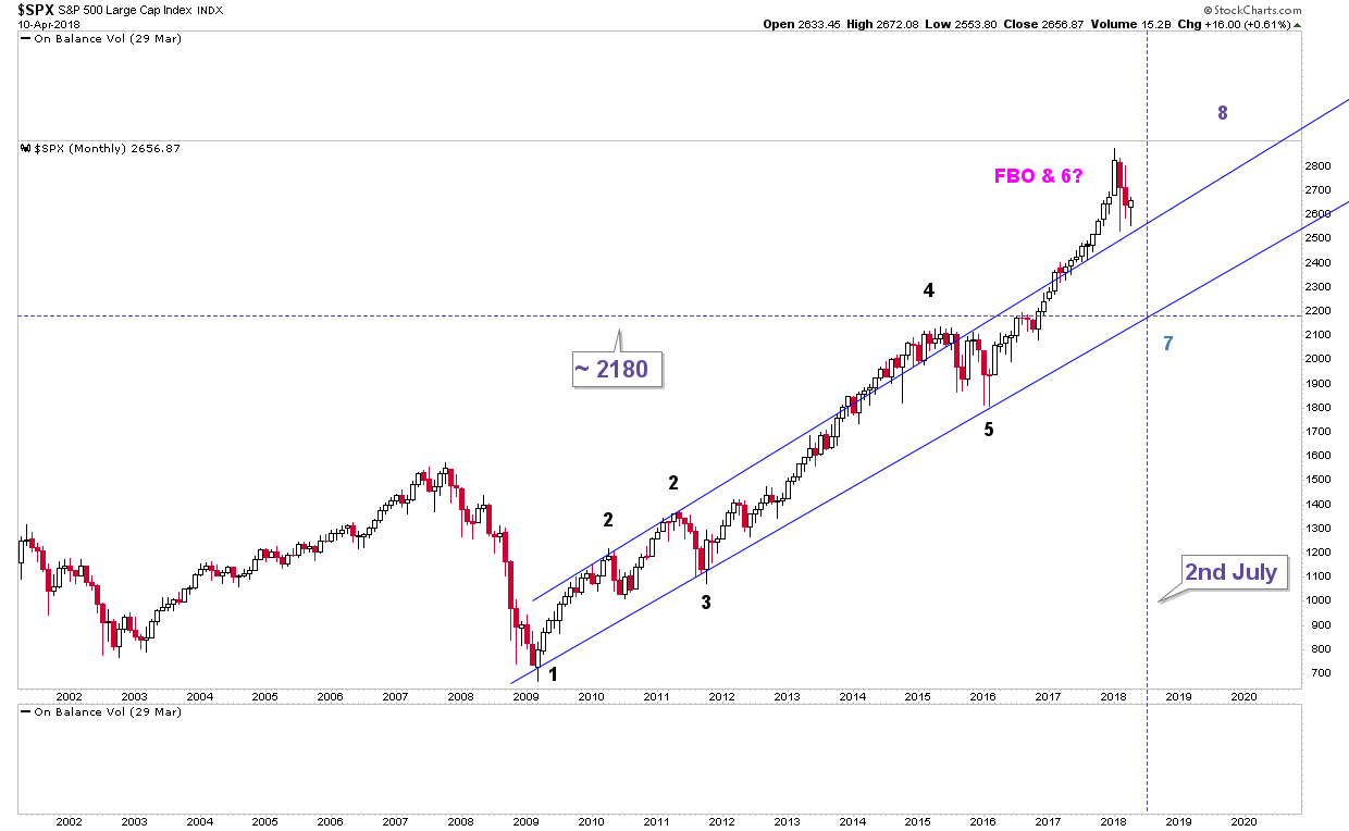
Here’s $SPX, where clearly a possible H&S is not building out:
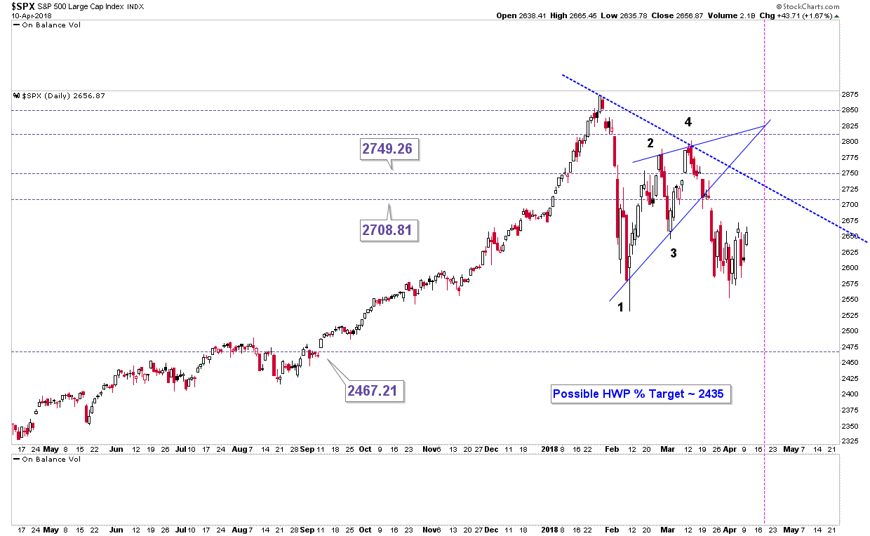
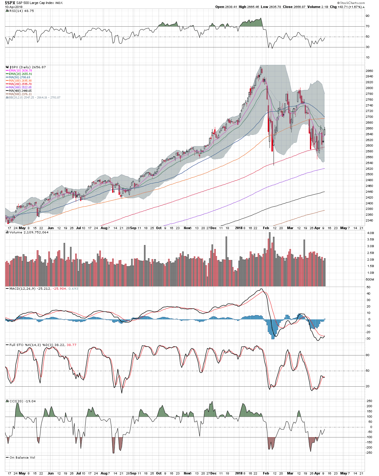
I’ve thought for a while that the bearish rising wedge on $SPX’s daily is a halfway pattern to the downside. However, the downside move hasn’t materialized. Price has clearly broken out of the rising wedge but hasn’t come close to hitting the target. As those of us following $SPX know, the daily SMA 200 has been holding as support.
One potential scenario I did have with respect to $SPX is that the bearish rising wedge noted above *is* actually a halfway pattern to the downside. However, instead of price breaking out of the wedge and having another impulse move down to target, it has instead broken out of the wedge, fallen a bit and is now working out a backtest of the bottom rail of the wedge to leave everyone scratching their heads wondering, “what the hell is going on?”.
This is where it helps if you put the two charts for $COMPQ & $SPX side by side:
For the sake of argument, lets say that $COMPQ has begun to build out the RHS of a potential H&S pattern. Let’s also say that $SPX is going to roughly track this move, so it too is also going to rally. Let’s go with the IH&S Sir Rambus has noted for $SPX:
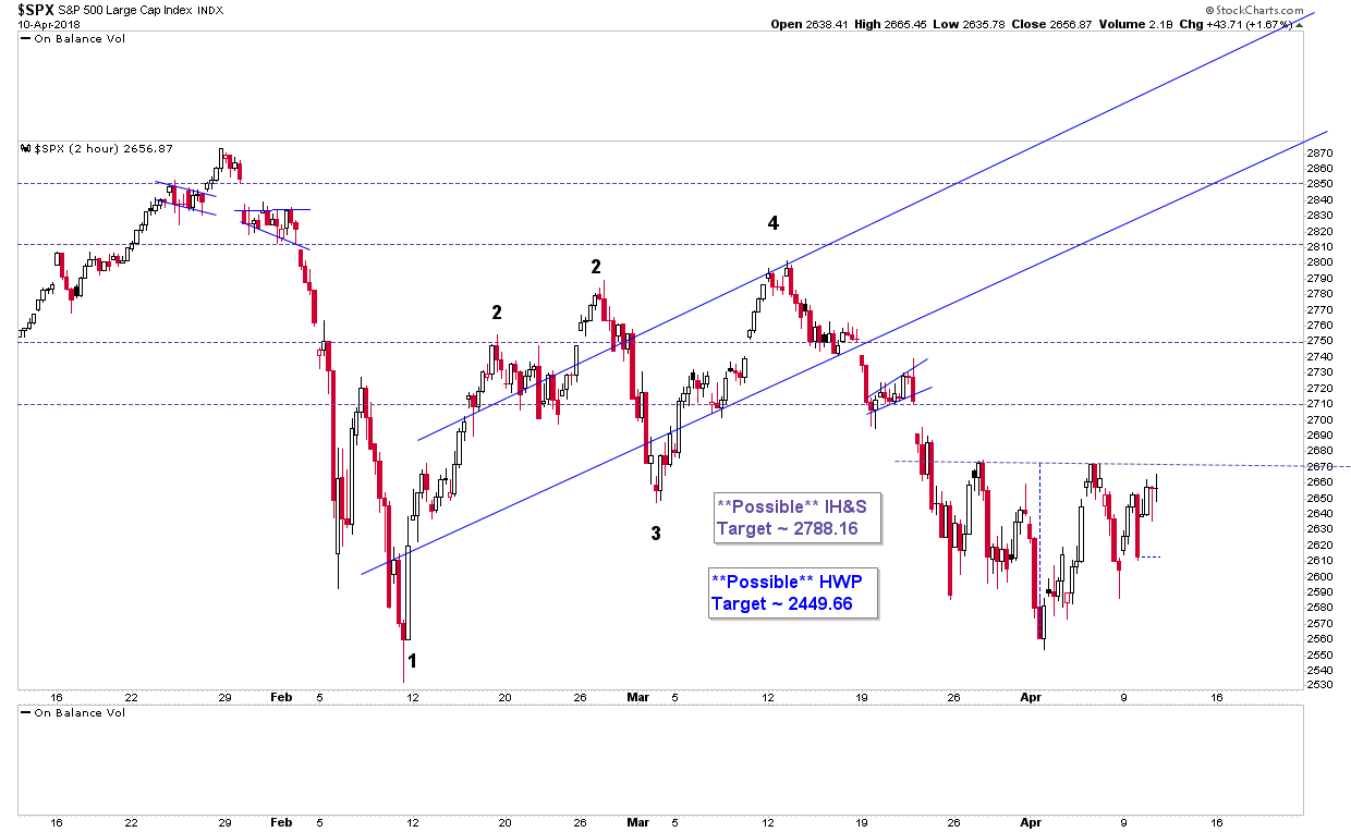
We’ve got $SPX potentially going to rally up to 2790 and $COMPQ also going to rally up to form the RHS of a possible H&S. (I don’t have a price target for $COMPQ presently.) If $COMPQ *does* rally here to form the RHS of a potential H&S, and the potential H&S plays out, that would mean $COMPQ suffering 2 falls of ~ 10%. This is where my cognitive dissonance comes into play.
We have $COMPQ potentially falling ~10% twice but we only have $SPX falling potentially ~12% (as I recall). That doesn’t make any sense. If $COMPQ is going to fall ~20% then it is highly unlikely that $SPX “only” falls ~12%. However, the only potential pattern I have for $SPX is the bearish rising wedge, which is a halfway pattern to the downside. Other than that, I don’t have anything. What I’m saying here is that in my mind there’s an inconsistency between the patterns for $COMPQ & $SPX, which simply doesn’t make any sense. It’s here that I turn my attention to $MUT.
$MUT is a high yield index no one pays any attention to. However, I think it’s important because it correlates quite strongly with $SPX. So, if I want to solve the riddle of the inconsistency between the possible price targets for $COMPQ & $SPX, $MUT may be a place to look.
Here’s the daily charts for $SPX & $MUT side by side:
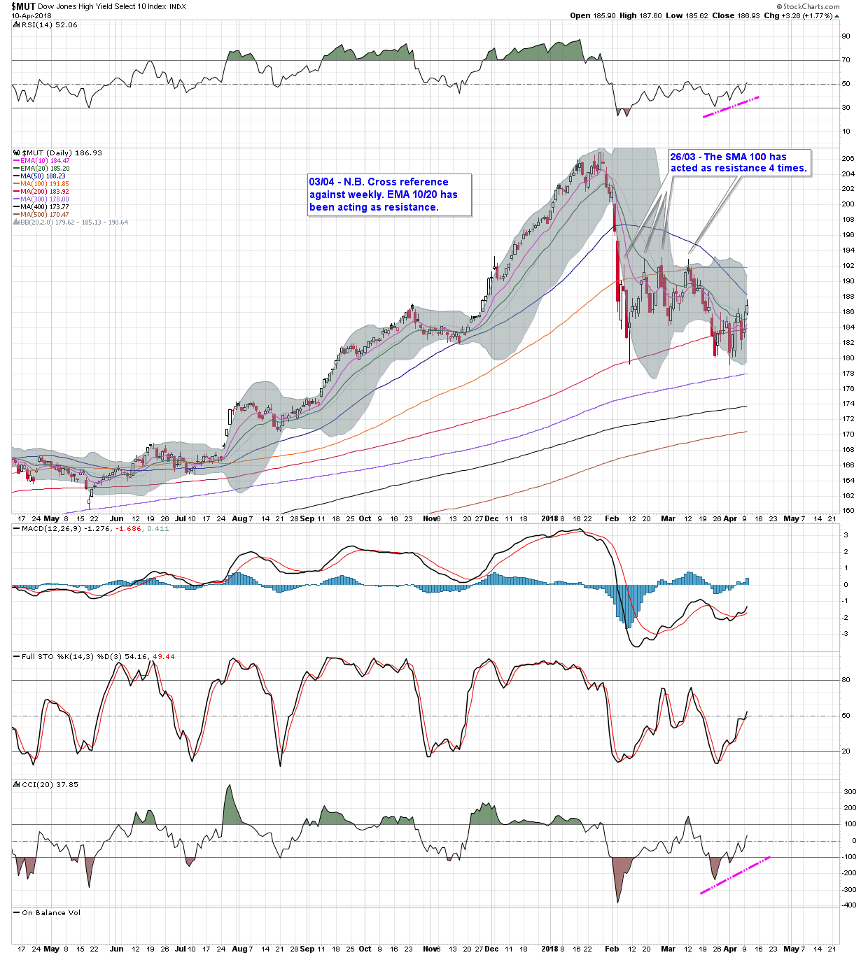
There is a similarity between the two even though one measures equities and the other junk bonds.
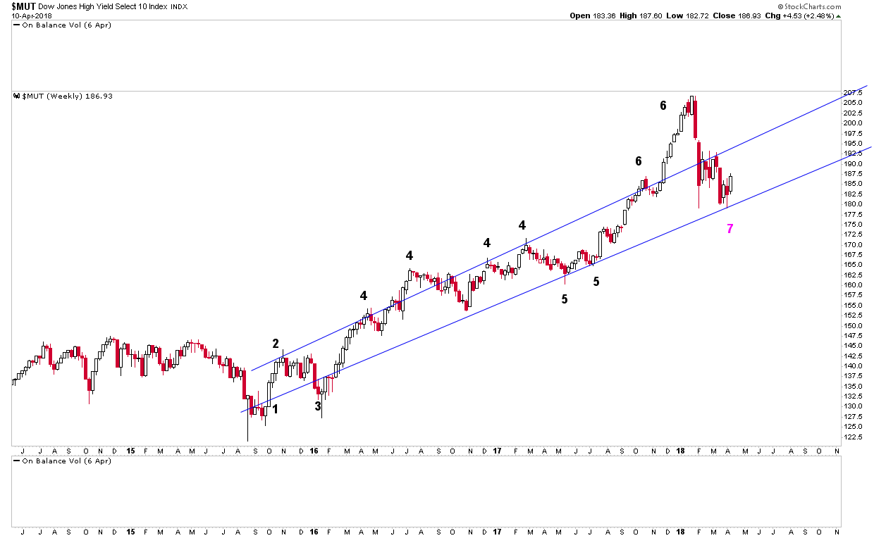
If you look at $MUT charts in detail, you can see they have very similar patterns to those of $SPX. $MUT also has a potential IH&S on the 2 hour and it too has a potential triangle, which may turn out to be a halfway pattern to the downside, just as $SPX does. You can see both potential patterns on the chart below:
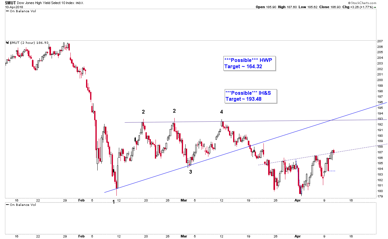
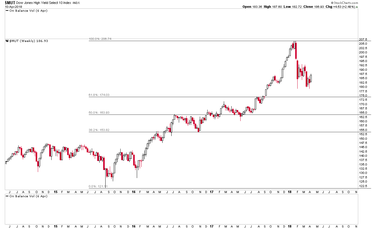
For the sake of argument, let’s say $MUT does rally here, along with $COMPQ, $SPX. etc. However, let’s also say, as is the case with $SPX, $MUT is just working out a backtest of the bottom rail of its bearish rising wedge before beginning the 2nd impulse move down. If this scenario were to play out, it would mean $MUT falling to ~ 164. Guess where the 50% retracement level is for $MUT’s rally out of its 2015 low? ~ 164:
So, to recap, were $MUT to fall to ~ 164, it would mean $SPX falling to ~ 2450 and $COMPQ falling to approximately test the neckline of its H&S pattern. (I think.) If $COMPQ *does* then break the neckline of the possible H&S pattern, it implies that both $SPX and $MUT are going to fall lower than ~ 164 and ~ 2450 respectively. So what levels could they fall to?
Firstly, let’s check the weekly and monthly chart for $MUT:
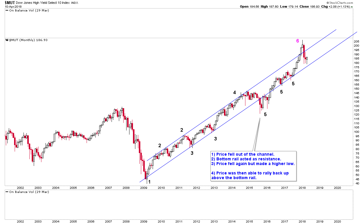
If $MUT were to fall to ~ 164, price would have clearly fallen out of both of the channels above. If price were to fall further from there, what level could it fall to?
Let’s take a look at the longer term monthly chart for $MUT:
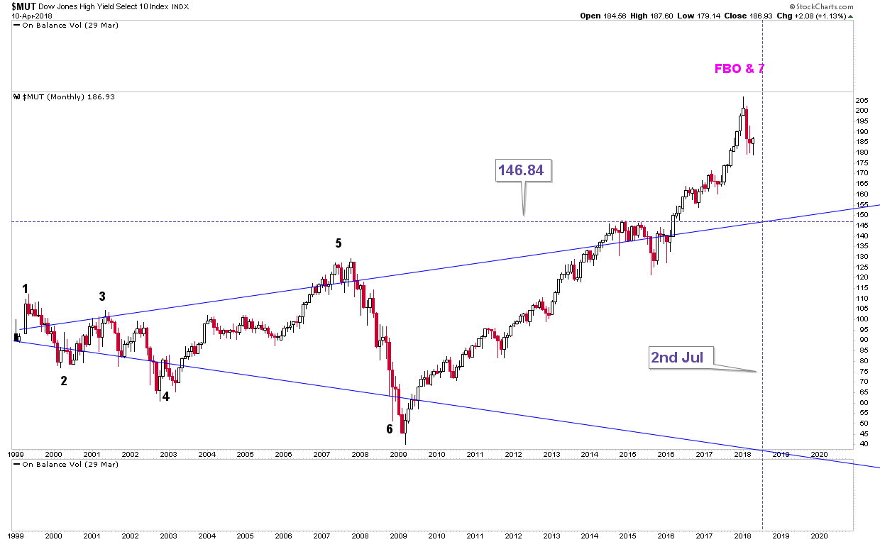
To me, this chart jumps out. Under this scenario, $MUT falls to ~ 164 (unclear of what it does then), then it falls again to bottom at around 146.
Let’s say $MUT did bottom at ~ 146, the top rail of the massive, multi-year triangle above. If it did, *all* it would be doing is a backtest of the top rail. Financial MSM may well be screaming “it’s the end of the world” but it wouldn’t be. It would just be a backtest of the top rail of the very long term wedge and, also, close to the 1st Fib S level for $MUT’s entire rally out of the post 2009 rally:
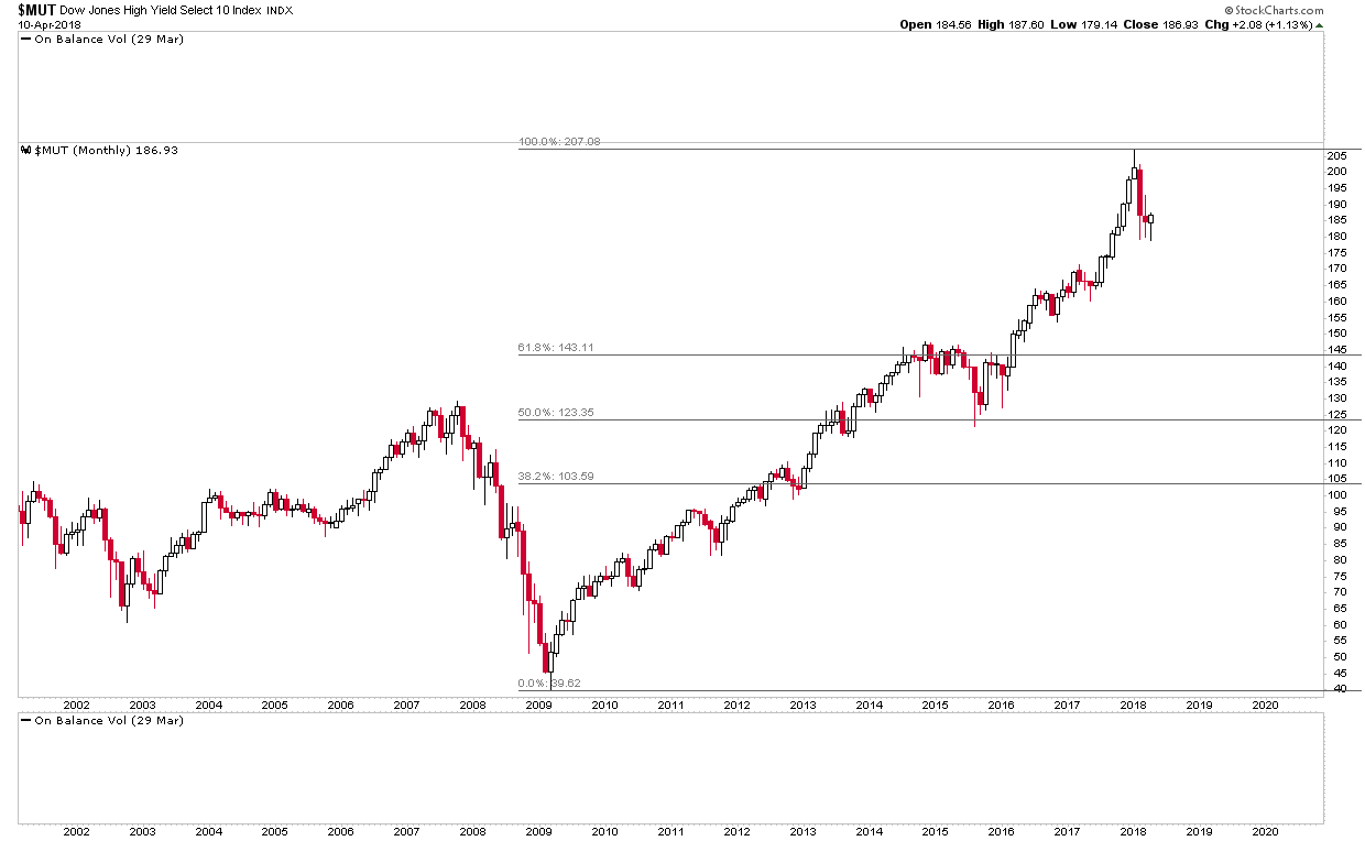
In fact, now that I think about it, I would think $MUT is likely to fall below 146 and test that Fib S level.
If $MUT were to fall to ~ 143, what level is $SPX likely to fall to? We know it may fall to ~ 2450, but if it were to have a second down leg, what would the price target be?
Here’s $SPX’s monthly chart:
Can you see where I’m going with this? If $MUT does fall really hard, we’re looking at $SPX falling to at least 2180. What we have then are two possible targets for $SPX. The first, $SPX falling to ~ 2450, the second, $SPX falling further to ~ 2180. Let’s look at the Fib charts for $SPX for the rally from the 2015 low and entire post-2009 rally:
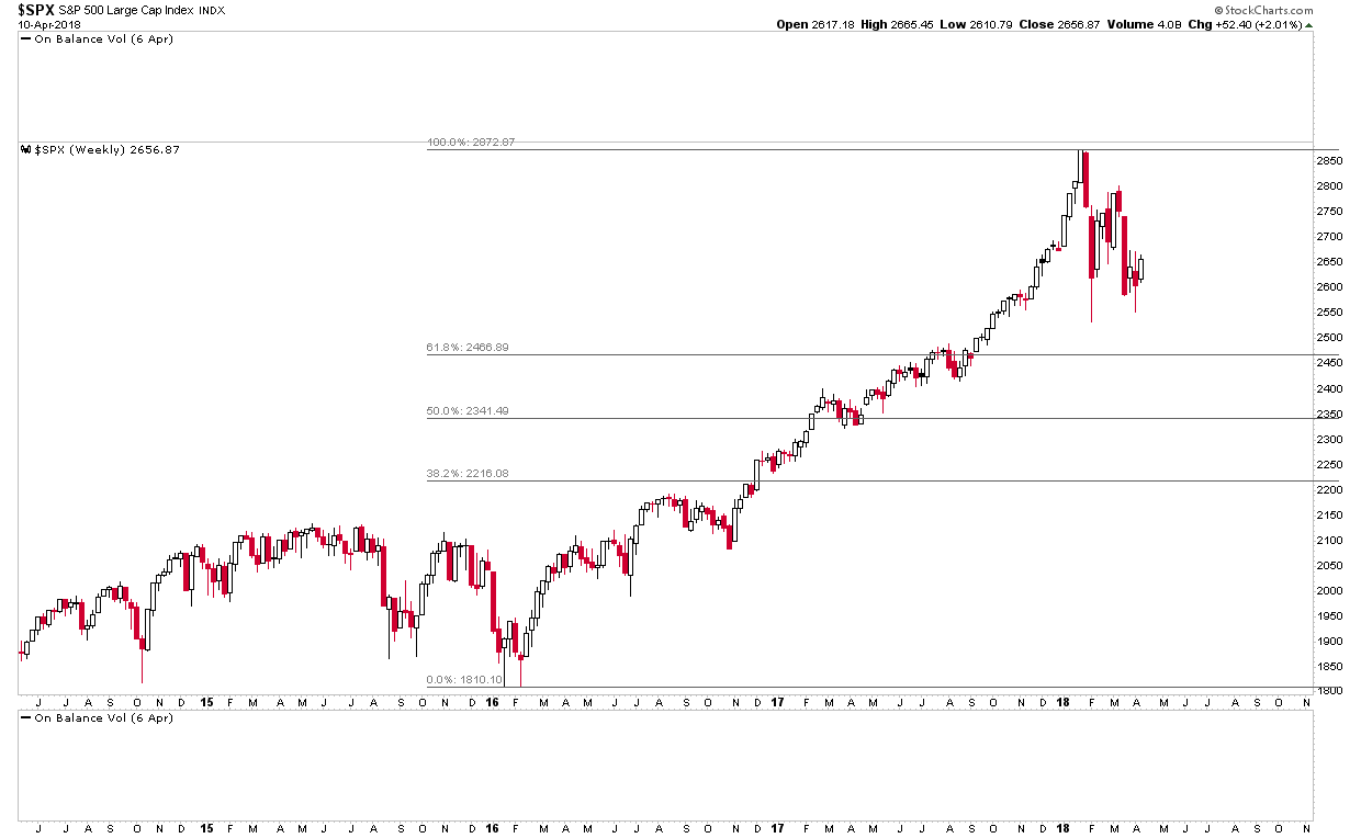
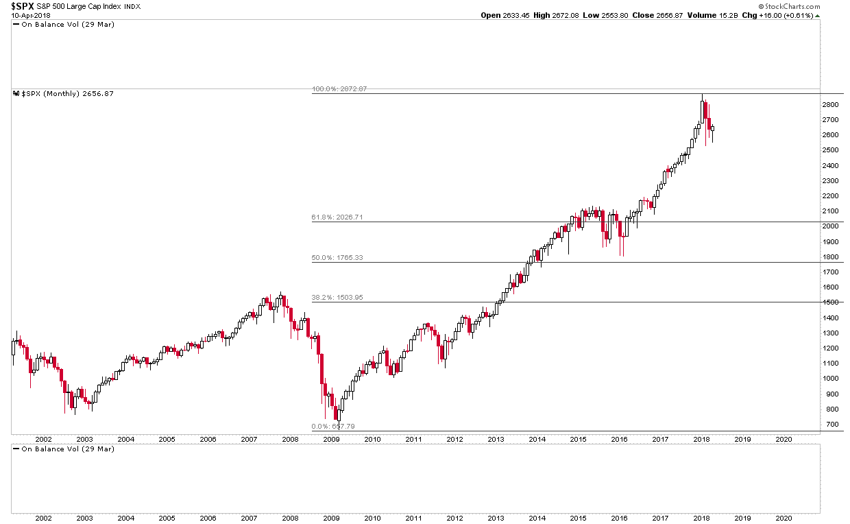
The first Fib S level on the 1st chart is 2466.89. The first Fib S level on the 2nd chart is 2026.71. The targets I have for $SPX are ~2450 and ~2180 respectively. Could not $SPX spike below the bottom rail of its long term (post-2009) channel and hit 2026.71? It looks doable to me. Here are the charts side by side so it’s easier to see:


Such a fall would mean price spiking below the bottom rail on the 1st chart above but it’s certainly possible.
So, to wrap it all up, I suspect we may be heading towards the biggest correction in equity markets since 2008. If this is the case, I think there is going to be *a hell* of a lot of noise in the financial media (and the mainstream media for that matter). However, it won’t be “the end of the world”, far from it. It will just be a correction. A significant one but a correction nevertheless.
Coming full circle, where does this leave $COMPQ? If $MUT is going to fall to the 140’s, $SPX to the low 2000’s, what level is $COMPQ going to fall to? Good question and I’m not entirely sure of the answer. Here’s the normal daily chart with potential H&S again:


The possible H&S target for $COMPQ is ~6090. As you can see on the 2nd chart above, there’s an outstanding gap to possibly fill. I’d guess it would be filled in the event of the potential H&S pattern playing out so, at a minimum, $COMPQ is going to fall to 5921.06.
However, that doesn’t really seem low enough given the lowest targets for $MUT & $SPX. If they are going to be hit, $COMPQ looks like it is going to fall further. In truth, I simply don’t know where $COMPQ is going to end up. I’ll leave that up to you guys. Here’s $COMPQ’s Fib charts for its two rallies though, the first from the 2015 low and the second from the 2009 low. It looks to me if $MUT is going to fall to the 140’s and $SPX to the low 2000’s, $COMPQ is going to fall to the low 5000’s:
I realize this is an *extremely* long post so thank you for taking the time to read it. I’ve been looking at charts for a weeks now and thinking to myself “something is up here”, meaning something big could be brewing, possible very big. I just wanted to give you this (very long and complicated), “heads up”, so if things do start playing out this way, it’s something we can be on top of and hopefully make good profits from. Plus, if/when the bullets start flying, you want guys around you who are shooting back.
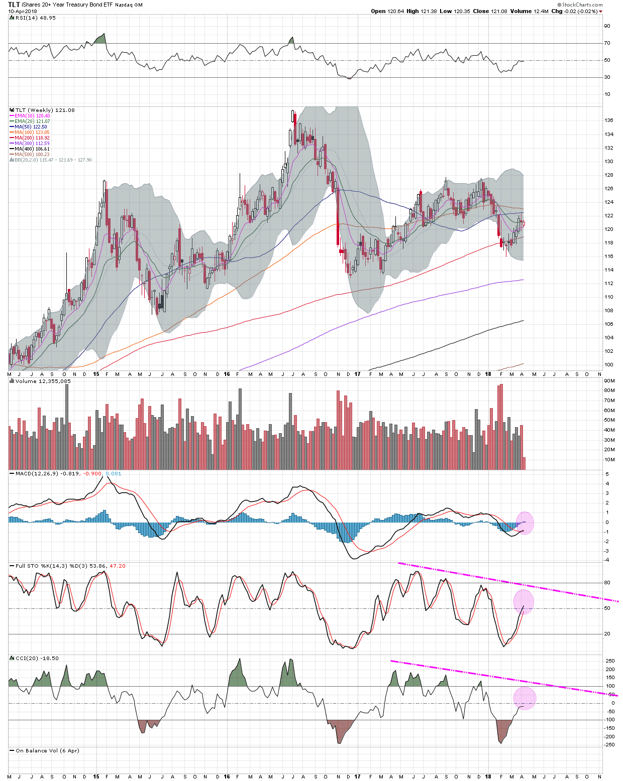
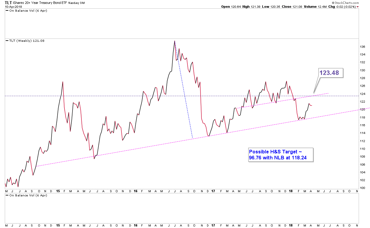
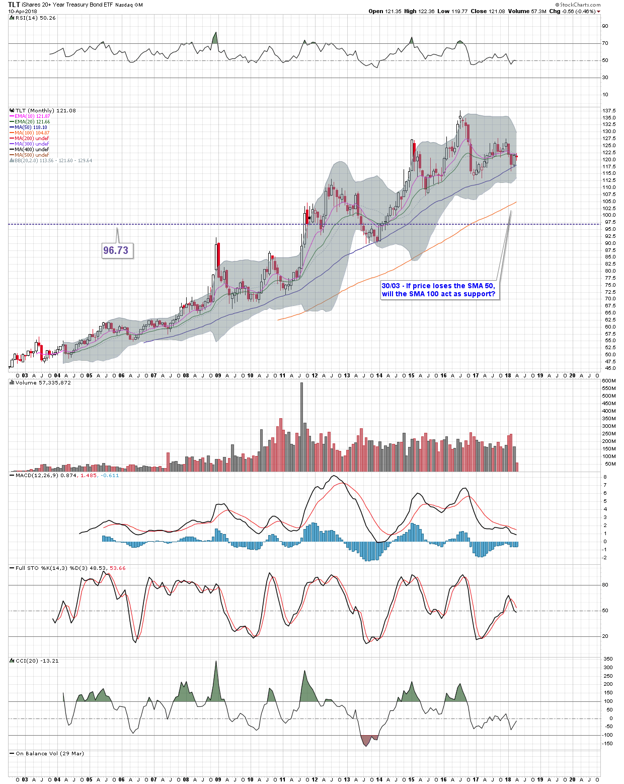
Finally, here’s some charts for TLT & TIP, which say to me “something big is coming.” Both are ripe to “pop”. Here’s TLT, getting ready to plummet:
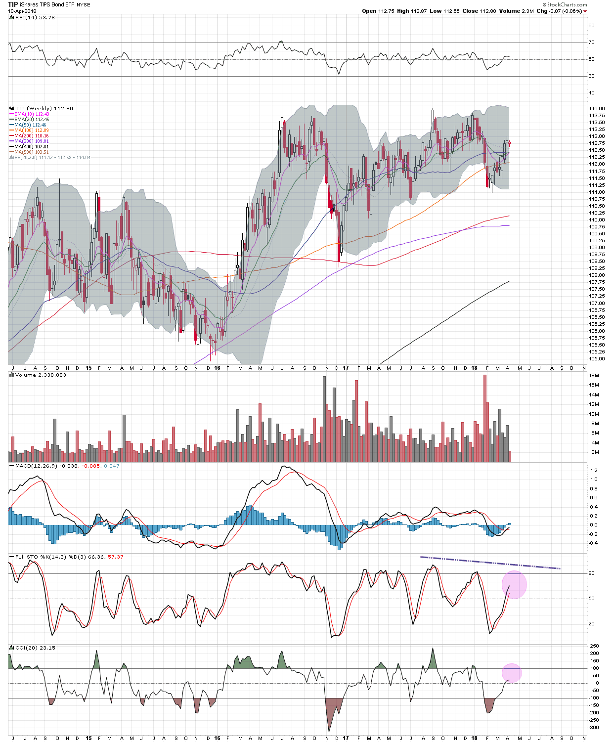
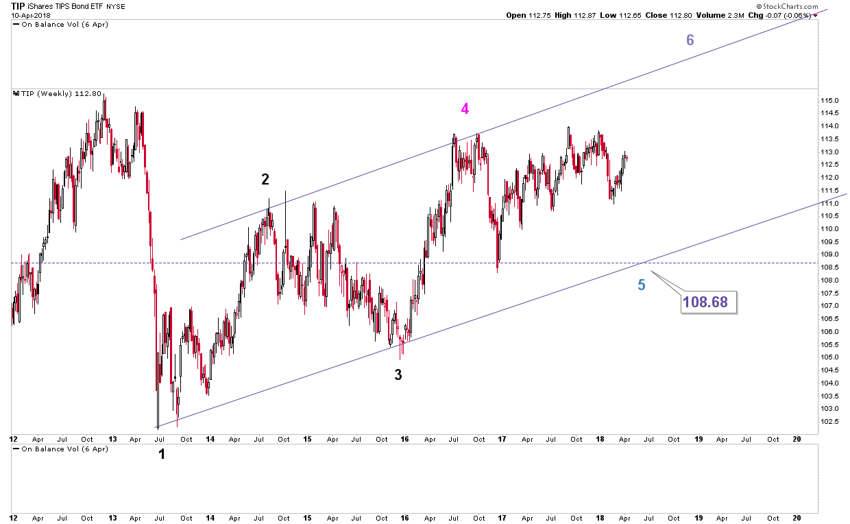
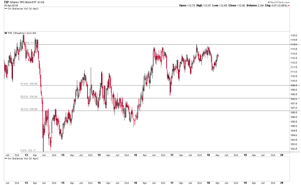
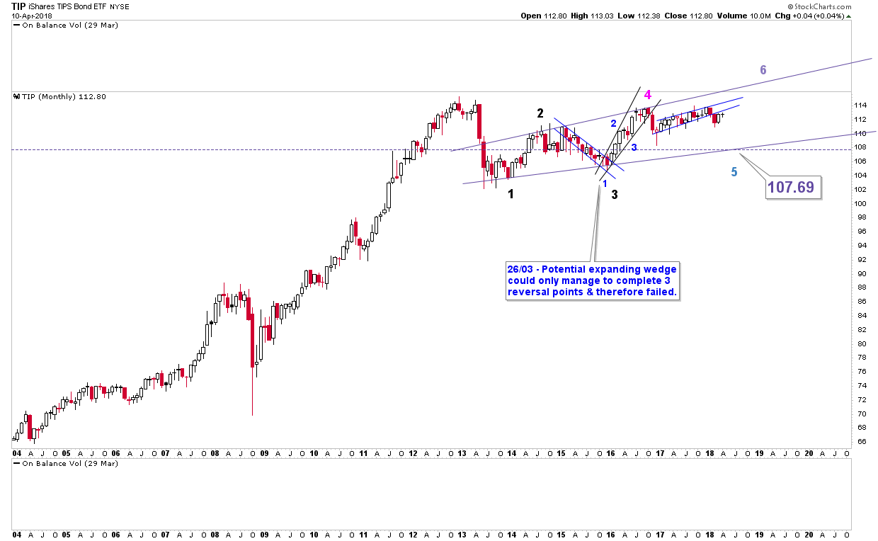
Here’s TIP getting ready to plummet:
I think we’re looking to the middle of next week for SM’s to top out then things start falling apart again. It could well be fast and furious.
Sorry, no time to answer any questions on this, I’m up to my neck at the moment.
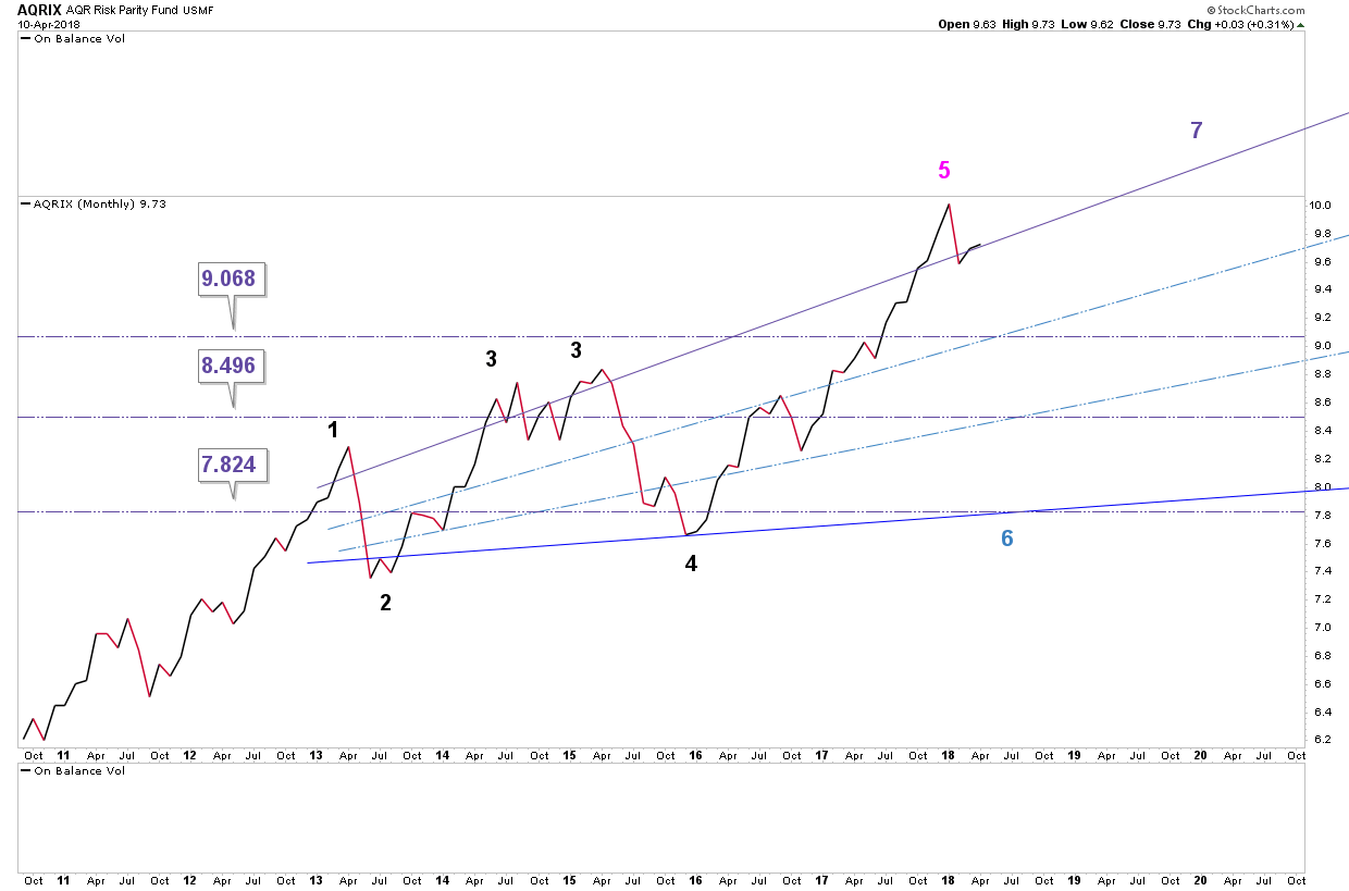
[Bonus Chart – This is AQRIX, which tracks the performance of Risk Parity Funds and is sadly EOD only. If this goes where it’s pointing to, all hell is going to break lose amongst risk parity funds because stocks and bonds and going to sell off simultaneously, which they are not correctly positioned for]:
GLTA
Kudos to you first for almost taking up a single page with one post on this site.
Wonder what happens if it had been longer than can be displayed?
“So, to wrap it all up, I suspect we may be heading towards the biggest correction in equity markets since 2008. If this is the case, I think there is going to be *a hell* of a lot of noise in the financial media (and the mainstream media for that matter). However, it won’t be “the end of the world”, far from it. It will just be a correction. A significant one but a correction nevertheless.”
EW keeps its simple. We hold here, and we have a wave 4 triangle perhaps, ahead of the last rally in this bull. If we don’t, the top is in and down we go. But as you say, it COULD be just a correction. Cycle wave 1 off 2009 would be done, Cycle 2 down to retest 1576 is next in the bull. Then hyperinflation as CBs panic. Or … the banking system fails before CBs can react, and day bye bye even to 666. And for all you gold hugging seditionists (hi Ras!), think about what will get sold when everything else goes no bid. May we all live in interesting times!
Wow, what a lot of work you have put into this presentation. I have to go to bed, but will read it tomorrow. Quickly glancing through it I see similar things in my charting, but not really believing it can come true. How know!? Not a EW guy, but will try to follow. Thanks for another great post!
There’s no EW dummy! (to me). See I’m tired.
Jenkinslane, you must be right !!
I noted the following anomaly: despite the strong rally in the QQQ yesterday, all my out of the money call options in the inverse ETF (JAN18 QID 15C) are all largely in the green !!
Somebody must have bought them all up at the close paying whatever price to suck them up !!
Something big could be imminent (should happen on Tuesday.
*JAN19 QID 18C
Thanks JL
Can’t say I’ve had time to read it all yet. Then re read to understand it all.
Cheers very interesting.
PD there are plenty of things that are going to go up in value if your scenario plays out lol. Use your imagination Pedro.
Thanks for your work JL. Could simply be a correction, or is the top in ? I’m still not sure, but thanks for your thoughts.