$GOLD fractal?
This is a busy chart, maybe too busy. The annotations sort of grew on the chart as the price of gold unfolded, but notice how the pattern today in early 2018 is similar to the topping pattern that formed in the summer of 2016. What if…nah, couldn’t be. Could it?
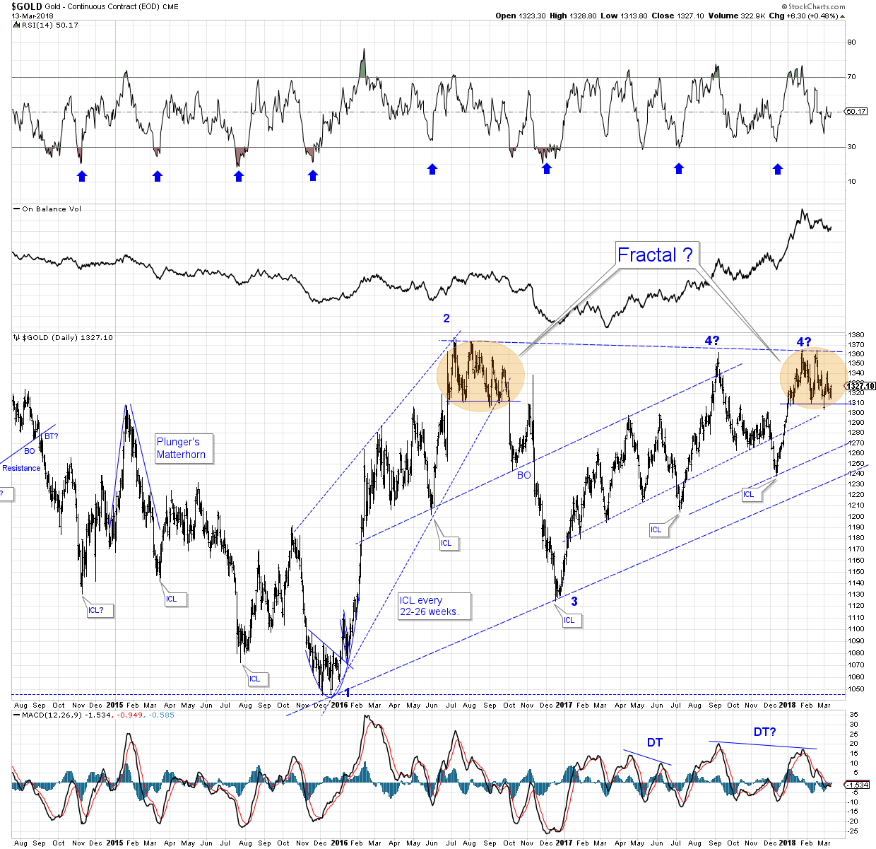
(BTW, the intermediate cycle lows marked on the chart are only guesstimates)
Hmmmmm….
P.s. thanks for the fractal and of course I’ve thought it was just a bear wedge like you have numbered…
Gold has become a religion which must be defended like one’s messiah….
I like to think the pattern will resolve to the bullish side after a possible FBO at point 5. Of course, one must be open to whatever the market throws our way, and not doggedly pursue either the bullish or the bearish case. Telling the market what it can or cannot do could be hazardous to one’s portfolio, n’est ce pas? In any case, it looks (to me) like the next big move in gold could be down to an intermediate cycle low. Guess we’ll see. Good trading, Chuck.
Trade oil, the black gold. Trade the oil services, even better…
I see your point (in general), silver fox. What definition of a Fractal are you using? Bill Willaims, Ph.D.?
https://goldtadise.com/wp-content/uploads/2018/03/Bill-Williams-Fractals.jpg
Fractals commonly exhibit similar patterns on increasingly smaller scales. So similar pattern, similar result, but on a smaller scale.
Hope that’s helpful, BooBooMan.