90 years later – about 3 generations – Fourth Turning, anyone?
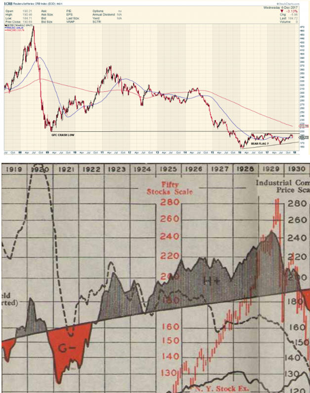
Fully’s CRB weekly chart at the top, mid 2007 to the present; a slice from my Babson’s chart of economic conditions published in 1937, covering 1919 to 1930. Dashed line is Industrial Commodities, scale on right, red HL is the stock market. Anyone see the obvious similarity between commodities back then to today? Notice that the market continued to rise as commodities started going into freefall.
Editor’s note

Very interesting. Thanks.
Wow…not many are paying attention to you stuff Avocado Pit….I appreciate your historic perspectives
that is an uncanny similarity…well spotted and yikes !