Which Way Are We About To Break ? Clues From The Gold:Silver Ratio
The following chart is indexed to Zero in 2003. From that point, when the GSR goes down, silver is outperforming. This is typical in a PM bull, and is reflected in the rising gold price. When the GSR goes up, gold is outperforming. This happens in a PM bear because silver is a more thinly traded market and is prone to wild price swings. It over performs on the way up, and under performs on the way down. So where are we now ?
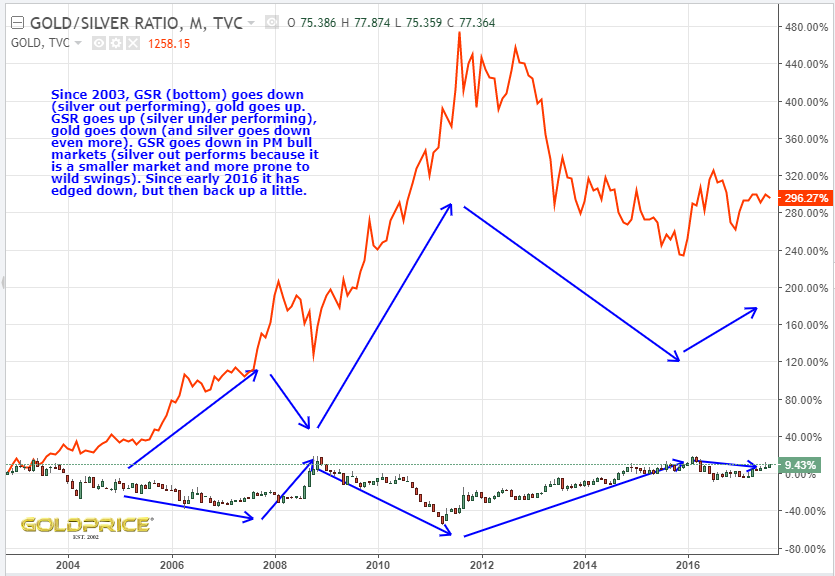
The GSR has been going up since 2011 (PM bear), and despite the 2016 rally, we are just now returning to a GSR ratio typical of a PM market bottom. This adds weight to my belief that the next BIG move will be up, not down.
Lets look at the GSR in more detail and add some trading indicators, to see if they can give clues. What we’re looking for is something that tells us we’re nearer to a bottom than a top in the PM market. Are the GSR indicators primed for a rise in the gold and silver market, or a drop ? Here’s the chart…
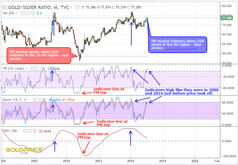
It’s very clear to me, that although we may see short term moves in either direction, the odds are stacked in favour of the next BIG move being an UPSIDE breakout. This is not 100% of course – indicators can remain high (or low) for extended periods. However, at these levels, the odds of an upside breakout are much higher than a downside one.
Great work NS thanks. The moment of truth is not far away now. A few more weeks and we will have our direction!
saweet. Gotta wait till the boyz back from summer break to get movement.
Yes, nice work, Northstar. Thanks indeed!
Thanks.
Great analysis Northstar
Thanks guys. Keeping a very close eye on things now. The next few weeks could be explosive.