Golds Next Big Move
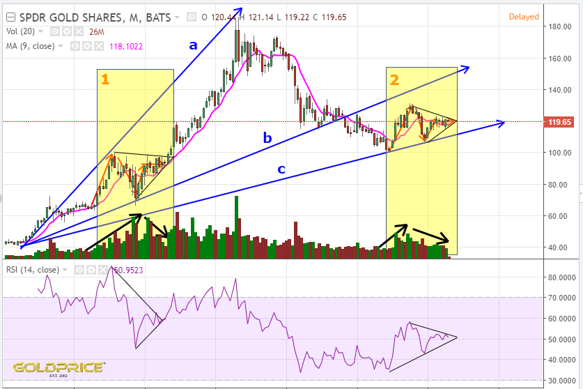
I’m using GLD as a proxy for gold price here, and comparing early 2009 to our current position. The similarities are striking. I’ll go through the chart features one by one.
1) Price entered yellow box 1 with an up-down-up-sideways pattern and then exactly the same in box 2.
2) The MA9 approached the apex of the triangle in box 1 acting as support. It’s doing exactly the same now (currently in the 118 area)
3) Importantly, volume rose into the triangle in box 1, then declined as the apex approached. Exactly the same is happening now.
4) The RSI formed a bullish triangle and broke out as the apex approached. It’s doing exactly the same now. Also, note that it’s starting from a lower point, so the RSI upside potential is more than it was in 2009.
None of this guarantees a break to the upside, but it adds a lot of evidence to the bullish case. In isolation, these factors might not mean too much, but when you put them all together…
Excellent analogy.