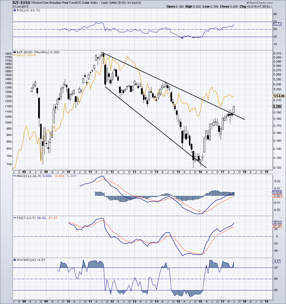
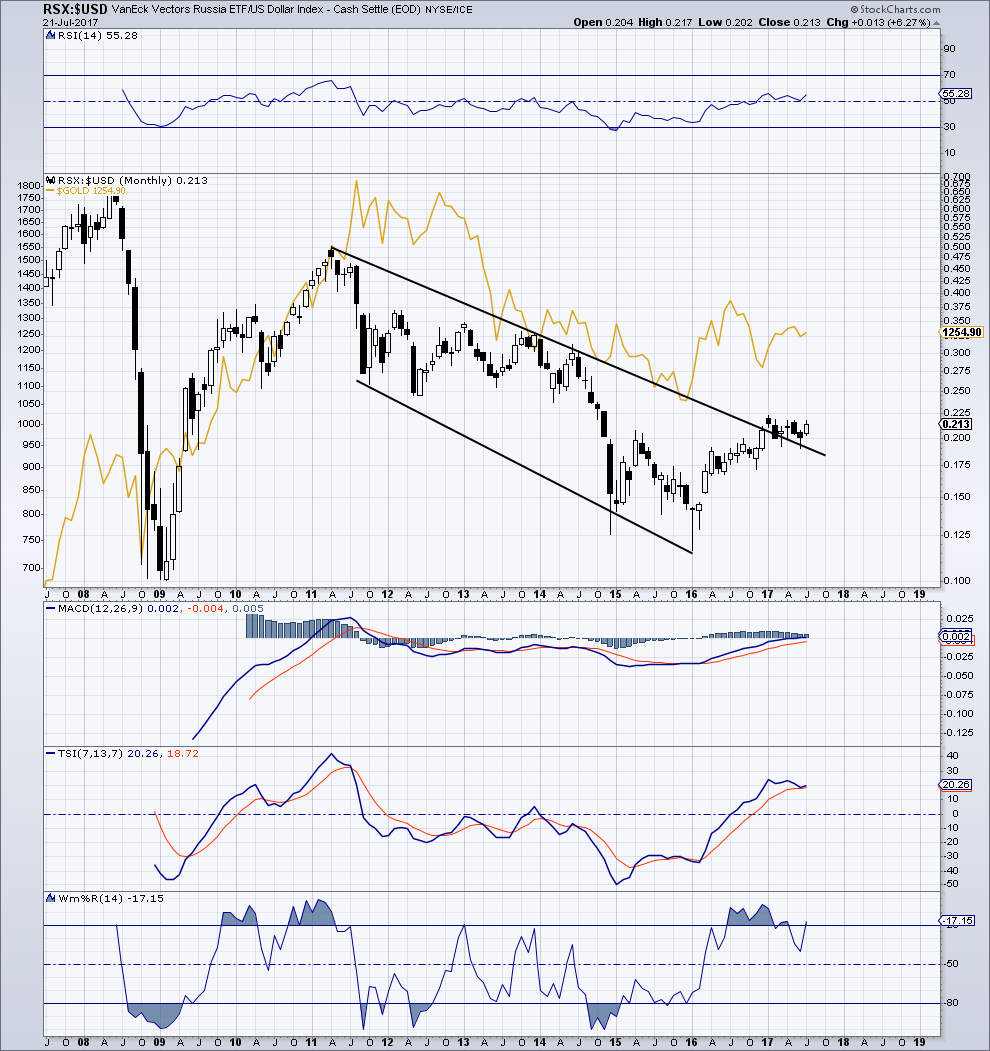
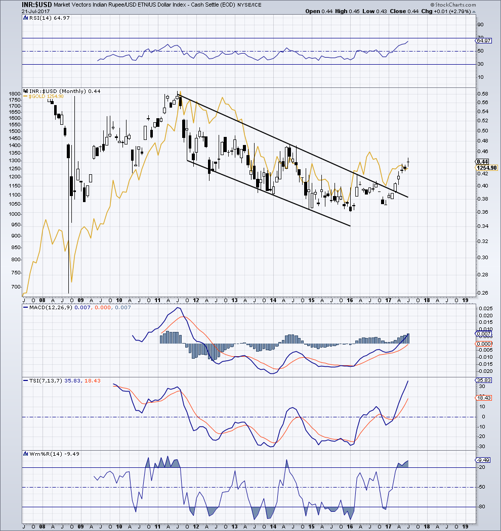
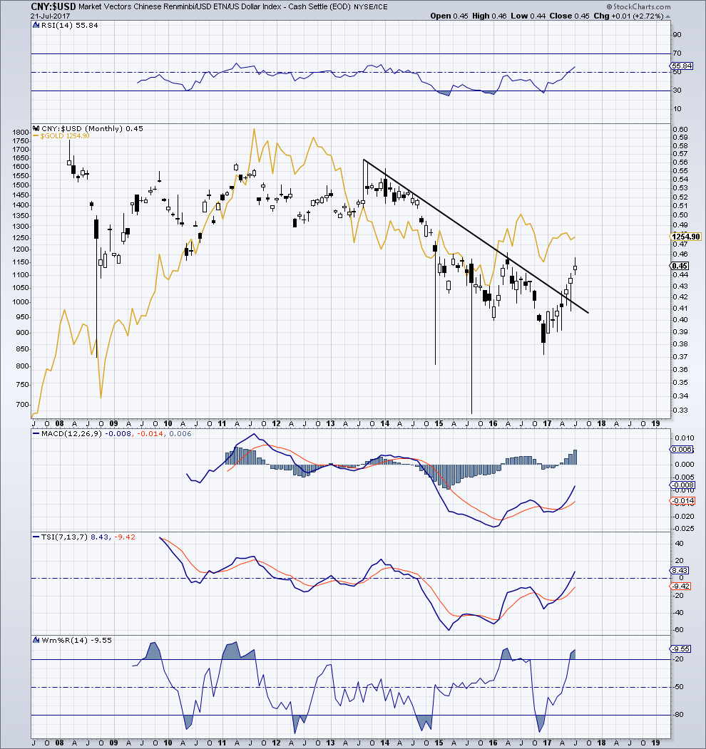
BRICS:$USD / Gold Overlay
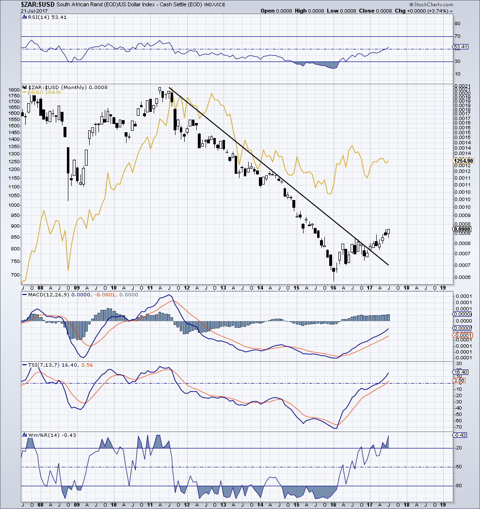
This post was inspired by the exposure that Spocks Global matrix has to the BRICs nations as well as both Spocks and Graddhy’s big picture currency charts Ive been following for some time. In fact, the first chart below, BZF:$USD is a replica of a chart within Graddhy’s Currencies 1.0 post on 7-19-17. Hope you dont mind I used your chart G.
Despite the most likely inaccuracy of my line positioning, one can not deny the obvious BO’s. I also find it interesting that the correlation with gold (IMHO) appears to have tightened since the 2008 financial crisis. Monetary recalibration in the making?
Focusing out the windshield with less regard to the daily spit and spudder noise coming out the tail pipe. That stuffs exhausting 🙂
My 5 year old little girl’s calling me out on my promise to take her lake swimming today. As Spock once said, family first!
Disclaimer: Rookie charting, borrowed charts and student observations. Viewer discretion advised.
Good stuff Optional.
Thanks Graddhy.