Gold – Where The Hell Are We Going ?
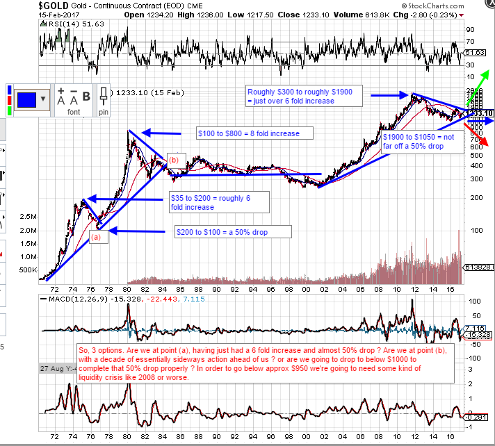
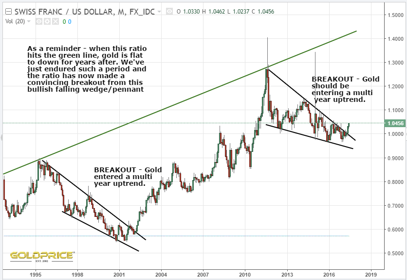
I posted this chart back in Feb, but it’s still valid. As Fully says, we could be at point(b), with a $200 drop ahead, followed by a 60% rise and then sideways for years (the blue arrow). I prefer the green arrow option, but only time will tell. The other chart is one I previously posted of the CHF/USD ratio. This is one reason I’m expecting the $1180 region to hold, followed by an upside breakout. As ever, I could be wrong.
Thanks NS. People are getting really fed up now and I can see many posts on other sites where many have pulled the plug and sold all their PM holdings to invest elsewhere.
The $BPGDM is now 17.86 so we may be nearing a bottom for now, although I still think the end of July maybe the time for a change and we could go lower yet. Either that or they are all going down the pan!
The first graph tells it all.
The TIME structure of the bull from 2001 to 2011 is basically the same of the 70’s bull market,but the last bull market has been weaker.
1968-1980 from 35 to 850 more than 24 fold increase
2001-2011 from 250 to 1900 about 8 fold increse
Either the last bull was a whimp one or we need another leg to reach about 6000 .
And if so this new bull will last 20 years or more whereas the 70’s bull did last about 12 years.
And don’t forget that we don’t have a gold stock bull market stronger than the the physical since the 90’s .