The Year is 2024, The $SPX Has Just Closed At A New All Time High of 5054…..
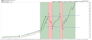
What if the rectangle (first spotted by Rambus for me), is just one giant halfway pattern to the upside?
Let’s say $SPX rises to ~ 2600 from here. Whilst a fall back to 1550 looks terrible on the quarterly linear chart, it would be ~ 40%, which is less than the previous two falls. The questions then are: how long does the fall take and what route does it take? Does it take 3 years, 1 and a half years, 1 year or less? My gut tells me it would take less time than the last and the fall would be similar: starting slowly, building up a head of steam, then something majorly snaps leading to the waterfall declines, panic, emergency meetings, etc.
Looking at the chart in more detail, the green arrows show the gradual increase in the rate of change of the $SPX over time. I count the current pattern as beginning in late ’94 although I guess that’s open to debate. The $SPX rose from ~ 460 to ~1500 from late ’94 until the start of 2000, ~ 5 years. That’s a rise of 326%. If we then assume that the $SPX bottoms this time around in 2018, 2019 at 1550, we’re only talking 2023-2024 before the $SPX finally tops out at just over 5000.
What I like about this scenario is I can almost see the TV spokesmodels thrilled at the break of 5000. What comes after that, who knows, but my guess would be “nothing good.”
What the above (extremely speculative) scenario means is the Fed fires up the QE afterburners when the $SPX is hitting ~ 1550 again. That would then go hand in hand with the $USD embarking on a multi-year fall, commodities and PM’s embarking on a multi-year rally…, etc.
