Not an appealing picture
I reference three random charts in the PM sector using my one chart eyeball method. The reason I make my weekly 30 EMA a bold black line is to make it stand out as it represents the dominant trend. I regard the 30 EMA as analogous to how bond traders revere the yield curve. It tells a multiple of stories to the trained eye.
These 30 EMAs are just plain ugly… what does it portend?
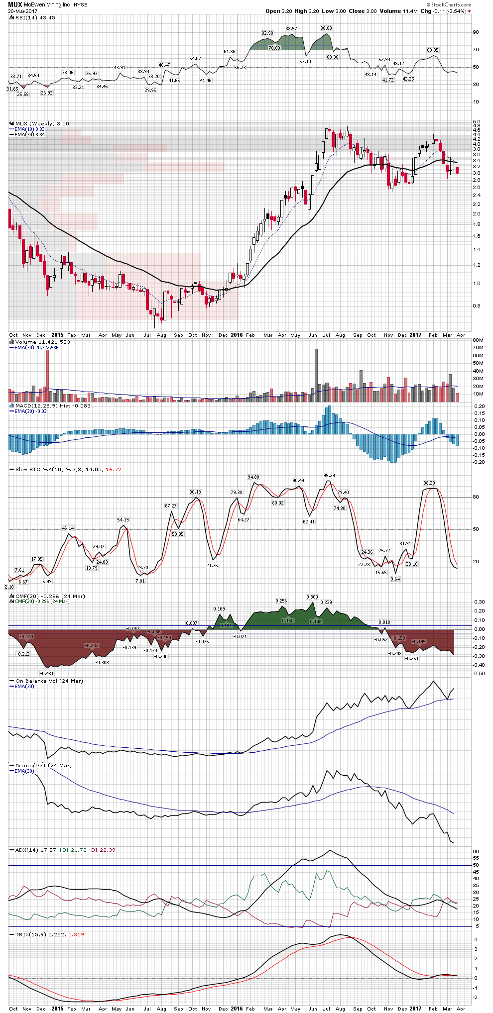
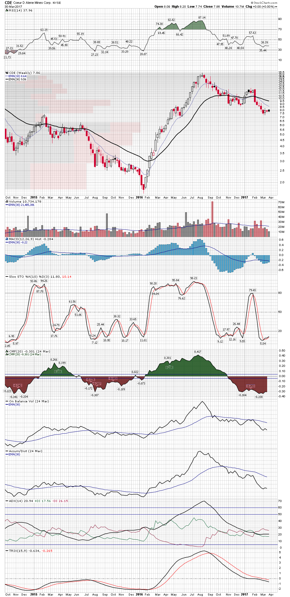
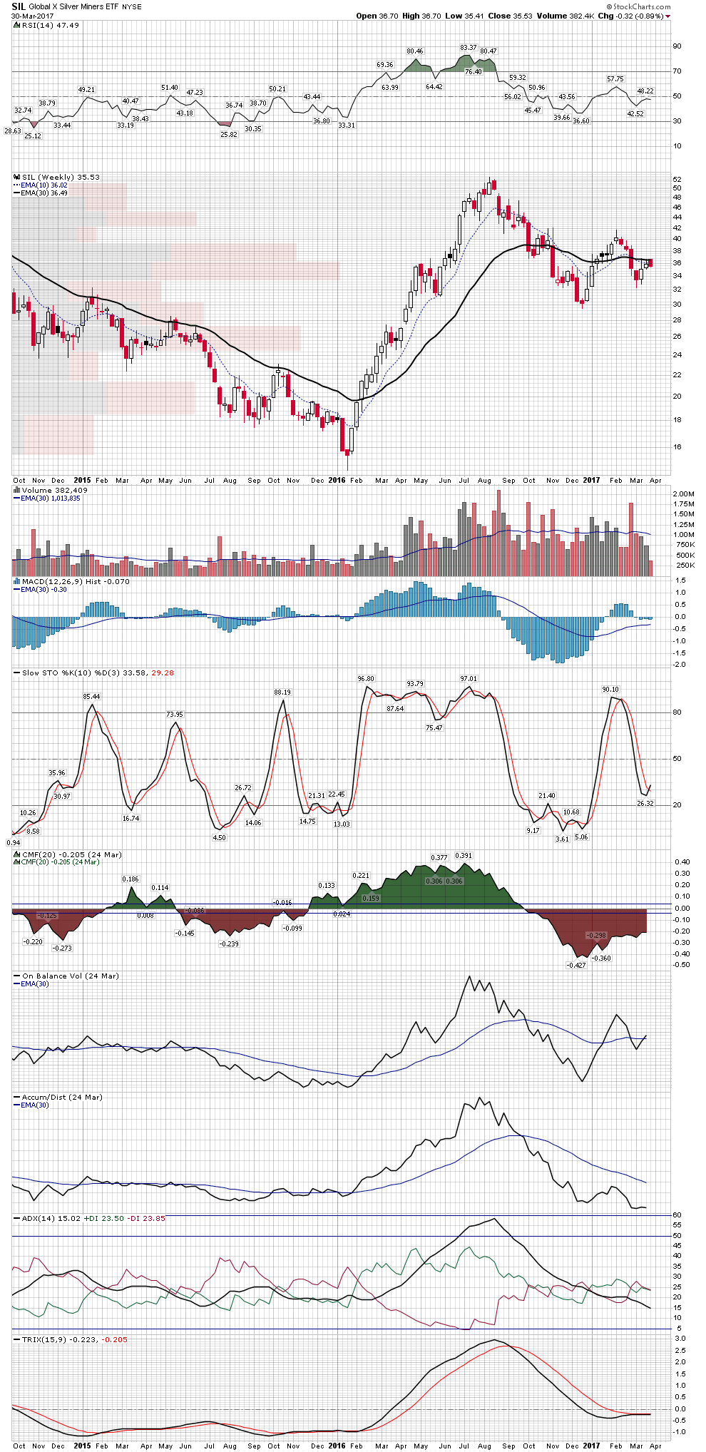
I’m starting to get LT buy signals now for the metal shorts on my system. Not exactly everyday events.
I’ve seen EW suggesting perhaps one last (brief) stick save, but April could get ugly.
Perhaps May as well.
I am sorry I don’t understand what you are saying. Can you rephrase it.
I think he is saying that he is getting long-term buy signals from his charts.
I agree that April and, perhaps, May might get ugly. I’d be happy if it ends up being a consolidation period. But, for next few weeks, dollar seems like it’s going to trump and stomp on PM’s.
That Impulse move of THE Lows was epic. 200% in 7 months for most PM Indices…a lot more for some individuals
History shows a consolidation period of a year or so is not unusual after such a start
https://stockcharts.com/h-sc/ui?s=%24HUI&p=W&yr=17&mn=0&dy=0&id=p34943465890&a=513978712
Fully, the difference between this corrective period and those others is during this one the miners didn’t even come close to retesting their highs. Basically its the weakest “consolidation” if you want to call it that. However, we do have to keep in mind that in Jan 2016, miners were the cheapest they were in at least 90 years. Bottom line, there really is no primary trend right now but the secular trend (after Jan 2016 low) is definitely up.