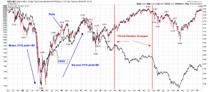
Credit Spread vs PM Sector or CDNX
Sir Fully: Nice chart of long term rate vs gold.
Evaluating PM sector one has to compare with credit spread.
CDNX is an index related to risk on/off in PM sector.
The chart shows exceptional relation with credit spread HYG/IEF. When credit spread narrows risk is on and vice a versa. But during some period in past the credit spread and CDNX diverged and now seems the relation is back to synch???
This spread showing business activities are going to improve. SO as CDNX will rise with risk in sympathy of risk on. HOPEFULLY.

Excellent analysis Bikoo
I am trying to absorb this
HYG / IEF ….you say if this narrows ( chart price drops) its risk on…is that right ?
My sense is if HYG ( High Yield Junk Bonds) rise faster than IEF (10 year treasury Bond)
The Credit Spread widens and this is Risk On , thus Speculative money goes to CDNX type Companies ( Micro Cap Miners et al)
I see your chart is in Price spread but your notes are in Yield Spread
This is confusing to feeble minded old dentists .
gotta synch up the lingo
🙂
When the PRICE is rising the High yield bonds are in vogue over the 10 years …that’s Speculation Friendly and so the CDNX should rise too …Right ?
The reason it is confusing is that HYG and IEF are bonds prices. Yield is inverse to bond prices. When HYG drops the yield on bond is rising faster than IEF yield thus credit contraction like in 2008 to 2009. That means when ratio drops credit is widening thus credit contraction. When the HYG/IEF ratio is rising means credit narrows/credit expansion and yield of HYG is dropping faster than IEF yield. Yield of both is narrowing.
One can chart it with yield curve TYX/IRX (long rate to 3 month T bill).
I learn from Steve Saville from his blog:
“The other fundamental drivers of the gold price are the US yield curve (as indicated by the 10yr-2yr yield spread), credit spreads (as indicated by the IEF/HYG ratio), the relative strength of the banking sector (as indicated by the BKX/SPX ratio), the US dollar’s exchange rate and the overall trend for commodity prices.”
http://tsi-blog.com/2016/11/gold-and-the-real-interest-rate/
It doesn’t have to be that complicated IMHO
Just see that when the Cart is rising Risk on,,,,when falling , Risk off
Agree!
just watch the dynamic yield curve on Stockchart. Click Animated and watch how yield curve moves and effect on SPX on the right. At the top in 2007 yield curve was flat or inverted. It has been steepen ever since. Now it has begin to narrow. AND credit is getting normalized.
Means risk on. Party on the street as well in CDNX.
http://stockcharts.com/freecharts/yieldcurve.php
Bikoo..we have a terminology problem here…your terminology seems incorrect.
When the yield Curve is rising it is Widening ( Long term 10 year yields are increasing faster than short term yields ( 2 year) …a widening Yield curve favors Risk ON.
If the yield curve is flat or negative the 10 year and 2 year yields are the same OR the 10 years is less than the 2 year…which means investors are scared of risk. 10 year bond PRICES are Stronger than 2 Year…as money flows into longer term bonds (risk off)
One of us is out to lunch on this terminology. So far I am convinced its You…but I can be wrong .
I think I’m with Fully on this, introducing Yield with bond prices in the terminology does complicate it. I also would intuitively think that (yield) spreads would narrow during risk off (into ’09) and expand in risk on (coming out of ’09). Regardless of semantics I think we agree on that. The Oct. ’12 to Oct ’14 anomaly was caused by QE+++, voidance of true price discovery, encouraging markets the Fed had it’s back which seemd to work for those with direct access to easy money (riskless BTFD) – a false flag of success. Since ’15 the relationship has normalized with the flaws of the keynesian solution being exposed (the joke of 2% gdp) and now we are going to realize with inflation forcing the Fed’s hand to raise rates, that the anomalous period has just added fuel to the inflationary firestorm to come.