The Pattern
OK – I have found another of these patterns in the making. Below are the charts. The top chart is the infamous Nasdaq 100 chart starting in the year 2000 which shows the classic setup. The one below it is the $XAU chart starting in April 2016 and ending today.
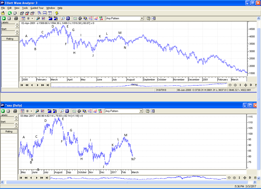
Will this pattern finish the setup? I don’t know, but I will watch it and keep the board updated. For those that weren’t around during the tech bubble pop, here it is. It went from 4800 down to 800.
From where we are now, if this pattern continues, we should see an increase back up to point ‘M’. This would take us up to something around GDX 25-26. If at that point we follow the same trajectory as the tech bubble crash, it would take us another 2 1/2 years or so to finally bottom with GDX getting all the way down to 5. Stay tuned.
Interesting. Thanks.
That will take a bunch of popcorn eating to get down to 5…..
Yeah – target sounds crazy to me too. Maybe the fractal will break to the upside sometime before 5 is reached. We’ll see.
Dang that is quite analogous! I’ll be on it for gdx 25.
Thanks
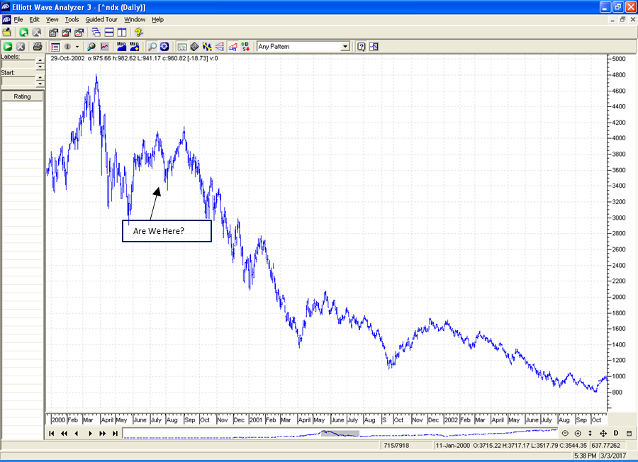
Remember ..Context…NAZ was at the end of a parabolic UP move in 2000
GDX was down 80% from its top in 2016.
Different beasts IMO