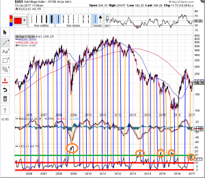
HUI Indicators
Some of these indicators are bit of a dark art, although I understand moving averages/RSI/MACD type stuff. Anyway, one I haven’t looked at much before is the Ulcer Index. Sounds like something your Doctor might be more familiar with…
I noticed that when it peaks, the HUI reaches a low point (follow the orange lines upwards), and when it drops (to within the two red lines I’ve put on) the HUI reaches a peak (follow the blue lines up). So where are we now ? Well it looks like we just passed a significant peak – in fact the level of the green line (20+) has only been reached 4 times previously in the last 11 years. So, on the face of it we ought to see the HUI rising as this indicator falls into its next trough between the red lines.
If nothing else, it’s a pretty picture, lol.
