Wowser
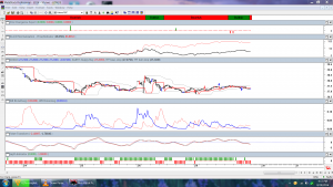
I am a big fan of Williams A/D study. Here is a chart of the 10 minute GDX. I have never seen such a positive divergence on any other chart I have looked at. Bressert turned negative in the last 20 minutes of the day (see the ribbon on top). But I am impressed with the divergent action in the Williams study.

Jim
No Clue as to any of there indicators
Please enlighten
Fully:
The panel of indicators are as follows:
Top panel (ribbon) is a Walter Bressart plug in study. Bressart (along with Hurst) are 2 top cycle analysts extant. This study is rather simple. Red means the issue being studied is in the sell mode. Green is buy mode.
Second panel is the normalized Williams A/D indicator. Larry Williams created this indicator as sort of an accumulation/distribution indicator for commodities where volume wasn’t available. This indicator is currently showing massive positive divergence on the 10 min chart.
The next panel is the price chart. Pprice is surrounded with a bull/bear envelope along with an indicator called the sajeth indicator. The sajeth indicator acts as sort of a SAR indicator, but I find it to be more sensitive, Also in this panel are Bressart sell and buy arrows used in the package.
The next panel is Bressart’s red line blue line model similar to Aroon.
The next panel is a fisher transform. Think stochastics modified.
The final panel shows whether the sajeth indicator is bullish or bearish.
Again, what really stood out to me is the Williams A/D panel. I can’t remember seeing it this bullish ever on any issue. Maybe it will turn out to be a bad or contrary signal….I don”t know.
Thanks Jim….these are all new to me
No end of the learning when it comes to TA
OOps Fully … I missed a panel. Panel 2 is my “divergence” expert. It goes off when there is divergence showing up on the MACD. The Williams panel is panel #3. Sorry.