Relative Rotation Graph
Here is a snapshot of another type of chart offered to stockcharts.com members.
It’s called a Relative Rotation Graph.
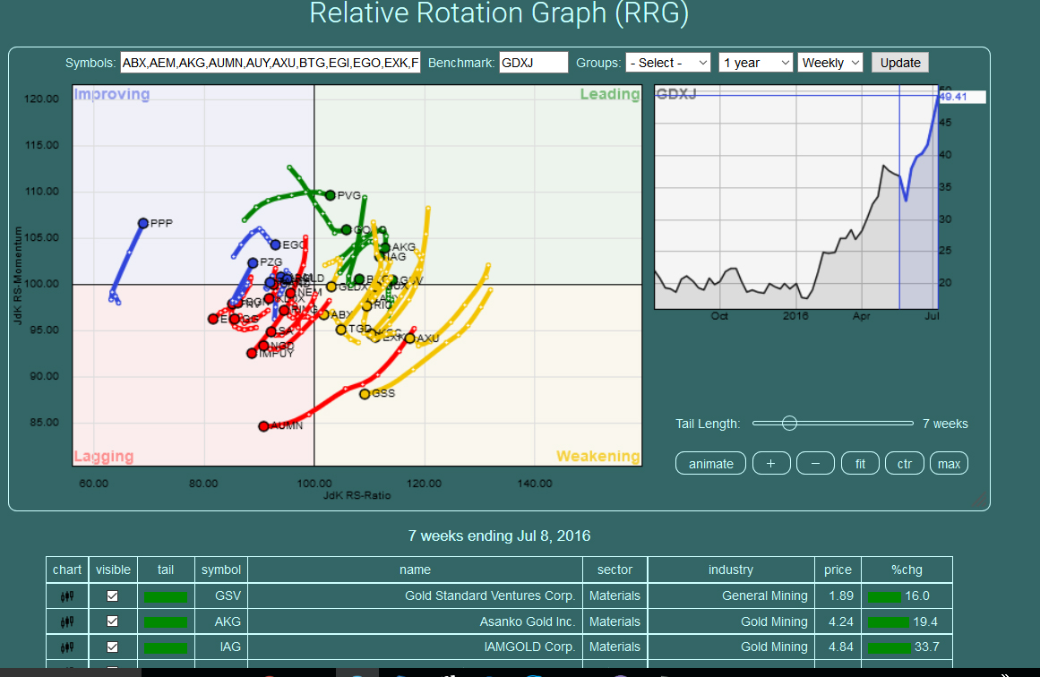
This is a graph of US traded Gold stocks. At first glance it looks like a jumbled bowl of spaghetti! We are all aware of rotation in Gold stocks. Some that outperformed lose momentum while others that were lagging begin to out perform.
That is what this type of chart is designed for. To show those stocks gaining momentum and those losing momentum. It is broken down into four quadrants Improving, leading, weakening and lagging.
The stocks are also listed under the chart color coded to the quadrants along with their performance percentage gains.
The stocks have to be measured against a benchmark I choose the GDXJ.
The chart is based on relative strength although it is not RSI in the conventional chart based form. I am not clear how it’s calculated.
I don’t know much about this type of chart but it’s interesting. If anyone has insight on using this chart I would love to hear about it.
My basic takeaway here is I want avoid weakening and lagging stocks (the bottom 2 quadrants) and only buy Improving, leading stocks (the top 2 quadrants)
You can make your own chart of course for any stock or index.
Here is the live link to this one if you want to bookmark it,
that’s brilliant! What a clever idea for a chart….you can probably contact the folks at Stockcharts and ask them questions…the link isn’t live
there is a lot of information on these Relative Rotation Graphs at stockcharts.com for subscribers….thanks for telling us about this!!!
The link works for me. Try copying and pasting it in your browser.
you link is live now….and I subscribe to Stockcharts so I can go there too….thanks again
that’s brilliant! What a clever idea for a chart….you can probably contact the folks at Stockcharts and ask them questions…the link isn’t live