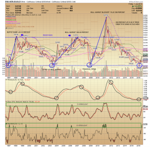
Long term major bottoms in the Silver Gold ratio
Here is a long term chart of the Silver Gold ratio since 1997.
I wanted to show some key points regarding the lows in this ratio.
There have been only 4 major lows which I have circled on the chart. The latest low is now.
Here is how Silver performed after the low
1997 From this low Silver rose 44% due to the Buffet Buy
2002 Start of the Silver Bull market Silver rose 348%
2008 the Financial crisis Silver rose 399%
2016 ?
Also notice how the low in the ratio was tested and held on all four occasions.
Opportunities like this in Silver do not come around that often four times in 19 years!
I think we are only at the beginning of another major Silver Bull market.
Recently Silver has blasted higher notice the Williams Oscillator is in the overbought area. The ratio may be overstretched short term.
On the daily chart Silver is looking overbought as well.
My current game plan is to wait for a pullback and then take a big position via SLV options.

nice historical perspective…i will be buying silver…
Excellent chart. Really puts things in perspective.
Thanks for the Roadmap…