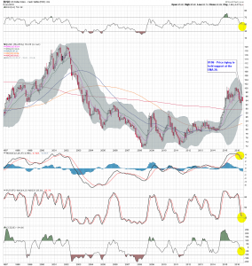
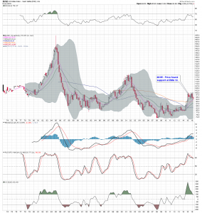
$USD Charts & $TNX “Breaking Bad”
What I probably should have said in my previous post is the $TNX charts are saying to me that something is coming down the pipe, sooner rather than later, and it isn’t good. The first chart I posted looks to me to be a possible half way pattern to the downside and the other $TNX charts I posted confirm, IMO, the direction is down.
Secondly, the PoG and $TNX inversely correlate from time to time. If the $TNX breaks, and breaks hard, to the downside and if the inverse correlation between PoG and $TNX holds, gold is going up to +$1400 in short order.
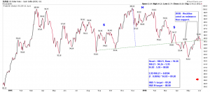
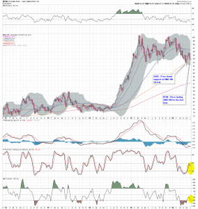
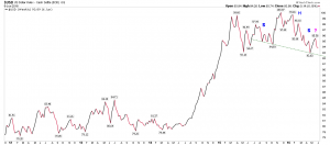
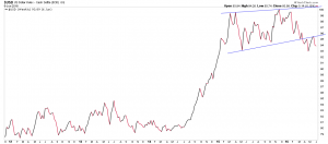
$USD charts look bearish to me, regardless of FOMC members’ endless jawboning, which adds to the bullish case for gold and the miners:
