Charts from a Fan of Rambus
Hi Fully
I have been a fan of Rambus’ charts ever since I saw them on Kitcomm when xiphos posted them in 2009. His charts is what really started my appreciation for technical analysis. I remember seeing them for the first time and going ahhhh… lol… like that post he made back in 2012 or 2013 about the s&p500 when it was just breaking out of a rising wedge. I’ve been a subscriber to Rambus before. However, due to my style of investing for the very long-term, I’ve unsubscribed.
Today, I was glancing at the daily gold chart and noticed something that I’ve seen else where. Last weekend, when I reviewed my chart of other gold stocks, I also noticed something that surprised me. I wish to share this with you and hopefully you will forward this to Rambus. I’m not expecting any reply from him since I’m not a subscriber anymore but meant for this to be like a gift to the master from a student that he didn’t even know he had. 🙂
I hope he will like the charts that follow. They start out vague but build on a theme that is expressed in the last 2 gold stock charts.
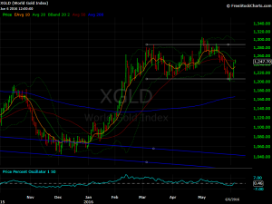
gold daily chart shows a rectangle consolidation
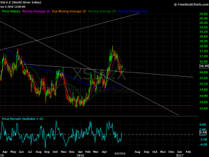
silver daily chart shows a cup and handle bottom that measures to 18.8x (something I learned from Rambus) which means silver is going to make a higher high!
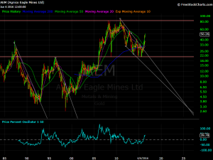
AEM monthly chart shows the 50-month sma is a clear divider of bear and bull markets. I’ve been bullish on AEM since it closed above the 50-month moving average. The rectangle consolidation since 2008 shows that the top rail is acting as a magnet. If the rest of the gold stocks follow AEM up, they have much more upside to go before a prolonged consolidation! This and the chart below is perhaps the most surprising conclusion the charts are suggesting – gold stocks have more immediate upside and isn’t yet ready for a multi-month consolidation!
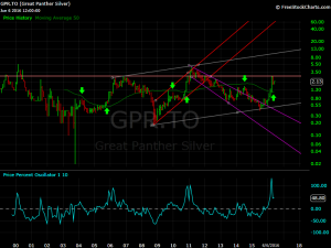
Great Panther monthly chart that I’ve had since 2010 shows a relationship it’s had with the 50-month sma where the first rally stalls out there and once we get a monthly closing above the 50-month moving average, it’s off to the races. The bottom indicator is something I found while looking for an indicator that would tell me how much price is above a certain moving average but in percentage terms. so PPO 1,10 is how much the current price is above the 10-month ema. I’ve noticed in the past 2 GPR bull markets, the PPO 1,10 made a double top close to the 100% level.
Also notice, during the dip after the 1st top in PPO, there was only 1 month that was red and the 2nd top in PPO was achieved within 2 months of the red month. This means GPR is going to make a higher high within 2 months if history is to repeat


Thanks for the charts. Been a follower of GPL myself.