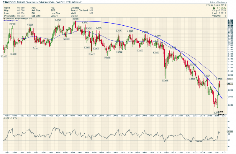
The Most Incredible Ratio Chart on the Planet
The XAU is the Oldest of the PM Stock Indices we use so going back 25 years we need to look at the XAU:Gold Ratio
Absolutely Beyond Brutal
When I first Got interested in PM Stocks it was circa 1995…I bought some juniors and they went 10 bags in a few months…I rode them UP and I rode them back down
I never got into the XAU type stocks But this chart shows they also went up vs Gold.
Gold went NO where all thru the Junior mania of 1994- 1996 (Flat at $400)
Point is when this Junior mania ended after The Bre-X Head Geologist jumped out of a helicopter into the Jungle
That was THE top in XAU stocks vs Gold…down they went down down down into the Gold Bottom of 2001 and incredibly
down down down all through the Gold Bull Decade where Gold rose from $250 to nearly $2000…then down down down
even more as the Gold 5 year mid cycle bear unfolded..20 years of relentlessly LOSING ground vs the Commodity they mined.
I got into Gold Stocks because I always heard from the gold promoters they were leveraged 3 to 5X to the Price of Gold.
No one told me it was Negative leverage…sheesh..what a cruel market this has been.
I venture to say Gold Stocks have been the all time absolute worst investment in the history of investments…
And Yet this is where we in this community focus our attentions.
20 Years…and now…a glimmer of hope…all nightmares must end. Its only 5 months so far but hope springs that
this unprecedented carnage will now reverse in a BIG way. Good Luck Goldtenters one and all .
LOG Parabola for Spock


Fully: try a log scale and fit a parabolic curve from the highs to the lows
added it for those who live on Vulcan
thanks. that is what I was looking for.
the 25 year downtrend is now convincingly broken.
most think in straight lines, cause and effect … but its a curved universe.
I really like that log parabola. It does tell the real story.
Good post. Ratio is where one can make sense of market. There is another ratio for PM sector: Silver to gold long term.
However XAU to Gold is not the oldest ratio. It is BGMI/Gold since 1920. This ratio has been in decline ever since 1964.
I had requested Sir plunger to update the ratio. I do not have data.
A 50 year Nightmare !!
The BGMI is a useless index however..The original stocks in it are all gone now ( defunct) and NOBODY has any clue whats in in now….They still track this thing but nowhere on the internet is there a list of its components
Disregard it !
Hey Fully, could you do this for other commodity industries… for example oil? May be interesting to see if this phenomenon is confined to only gold.
Cash…Its ONLY in Gold
The $XOI:$WTIC Chart is normal