Simon: The Major Uptrends all broke except Silver
Simon, this is my reply to your comment.
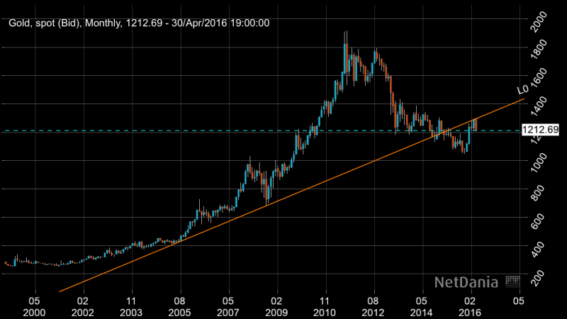
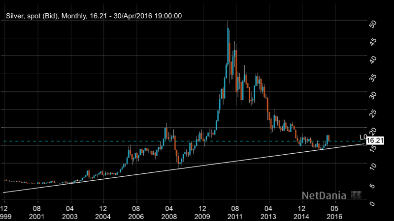
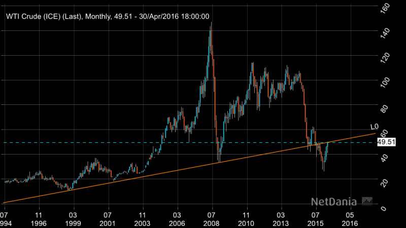
I take tremendous pride in not “line fitting” for an agenda. I try to be absolutely as accurate as I can with my lines. For example on the Netdania charts above ANYONE can double check the accuracy of these. I connected lows to the left and let where it contacts out in the future be for anyone to see. This is EXTREMELY accurate software.
Gold and Oil both broke their respective long term trends. They have backtested with oil on the trendline NOW.
Silver found support and bounced off of it. I believe if my theory is correct it will break through in the ensuing months.
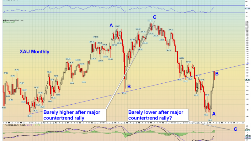
The XAU also just happens to have the similar trendline broken and backtested from below recently.
These charts are what they are. I didn’t however lay lines down to fit an agenda which I took offense to.


The first three charts (commodity charts?) are Linear. They show absolute price changes in nominal depreciating dollars.
The XAU chart is log scale. It shows percent price changes in nominal depreciating dollars.
There is a difference.
Usually a long term chart is drawn in log scale. If one chooses to use a linear long term chart it would be a courtesy to clearly label it as such. If each of these charts are drawn to support the same outcome on the same time frame, they should be drawn on the same scale.
Great point. Netdania does not allow one to use log scale. People that have Netdania know it would only be possible to chart in linear. I guess I should have explained this though since not everyone has Netdania.
PC, after viewing the additional charts you and others posted, though I don’t have netdania anymore, I see where you are coming from. Sorry to offend; please accept my apologies.
Ahhh cool. No prob. Thanks. Sorry I was so defensive! 🙂