GLD Thoughts
I like the consolidation above the key pivot on the weekly chart. I suspect anyone who has cashed out or gone short in anticipation of an “Annihilation” as triggered by COT data will be disappointed with 2016 as gold prices head towards 2012 levels within a year. I feel that looking at weekly and monthly charts grounds our perspectives much better than short term charts. Oil is another great example where I saw folks who were citing multiple layers of resistance with crude in $40s when looking at daily or intraday charts. However, if you turn to weekly and monthly charts you see prices driving up from an inflection point. Again, I have a multi-year investing timeframe and am not looking for cashflow from my trades so everyone’s needs and perspectives are different.
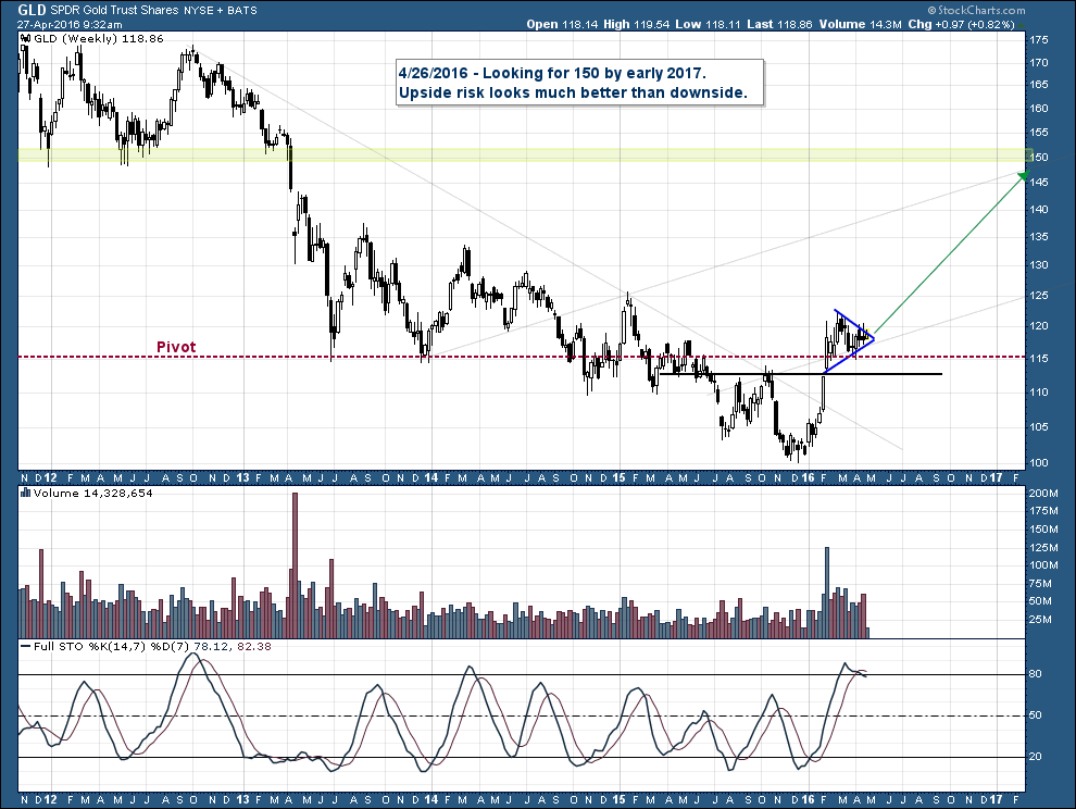
Yes, I work off primarily the weekly charts. Takes out the noise of the daily action. Also, just think of all that short squeeze fuel that sits above today’s prices from all the skeptical ones who don’t think this is the real bull. I suspect the return to “known values” may very well take that one year you are speaking of and may be up to the levels you mention. I see this as one of those unique few times in a lifetime moves where if one understands what’s going on here he can be right and sit tight and sleep well being 100% invested despite the huge level of skepticism out there. It’s there because people don’t understand these principles of bull and bear market phases. Once we move into Phase II things will not be so simple as phase II is the most deceptive phase. Where we are now is actually not deceptive at all.
I completely agree with your perspective Plunger. I’m sitting tight and sleeping well and feel the skepticism helps validate my take on where we are in a multi-year move.