5 year Counter Cyclical Move Now Over
Spock was one of the first to call it , well other than Bo Pony . But Bo called it for the last 3 years.
Anyhow…Plunger Posted this at The Chartology Forum :
Kudos to Plunger who called HUI 100 , 2 years before : (Nice to see you Bullish Sir Plunger)
……………………………………………….
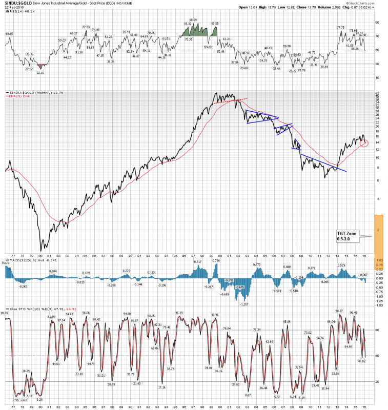
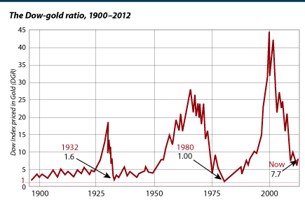
We see here how the DOW/Gold ratio over the past 5 years has been in a counter cyclical bull market against the secular trend. Ultimately we should see a final objective of between 0.5 and 3.0 in the ratio. Keep in mind the last two secular bottoms in the ratio were in 1932/3 @ 1.6 and 1980 @ 1.24. Next time is anyones guess, however my range is as depicted 0.5-3.0. That’s a big range but allows lots of gains in the PM sector.
So what we have witnessed over the past 5 years has simply been a mid course correction in the big swing in the Dow Gold ratio. A similar mid course correction occurred in the last cycle from 1974-1976 when the ratio corrected from 5 to 10. Our current cycle corrected from 6 to 16.7 showing that the amplitude is larger this time.
Last time once this correction was over is when gold really got moving. At the end of the correction in 1976 gold went from 104 to 875 when the ratio bottomed going from 10 down to 1.24. So we can only imagine what the gold price could do if the ratio travels from 16.7 to lets say 1.0. It would propel the PM stocks to stunning levels.
DOW Gold Ratio 100 years


Here is the ratio updated:
http://www.sharelynx.com/chartstemp/DowGoldRatio.php
My target for Dow:Gold is 0.7:1. Who knows if it can reach there? That was from Nick Laird’s chart too. It’s the mega megaphone of all time.
The real fun starts if the megaphone breaks down giving a log chart target of 88:1 in favour of gold. That could only be in a hyperinflation.
Let’s say that when and IF it approaches to 3 it could be one of the best indicators on when to start to sell.
Hello, thanks for opening the door to this site for me.
Regarding the Dow/Gold chart, I prefer this log version as I think it is visually more compelling but of course the same story.
http://www.macrotrends.net/1378/dow-to-gold-ratio-100-year-historical-chart
I find this chart important because it is relatively clean with clear and sustained moves over long periods of time between competing asset classes – elevator down (stocks dn gold up), escalator up (stocks up gold dn). The stalls or temp reversals in trend are largely due to non-(free)market interventions.
I started following this ratio in 2013 and noticed the downward trend (gold up more than stocks) was reversed (temporarily IMO) with the sustained onset of QE which has completely mispriced US market RISK. I expect the downward trend will resume once CB’s are out of ammo (like about now with the progressive onset of NIRP and PM’s FINALLY reacting to true RISK) however this time I believe with a vengence – it will have a much steeper slope than ’01-’07 and it’ll move so fast ppl won’t know what hit them and they’ll think the move is over but it won’t be. I’d expect this ratio to at least hit and possibly exceed the 1.4 low given the increased magnitude of risk (per James Rickards’ complexity theory).
Anyhow that’s my first post. Thanks again :).