Gold’s daily parabola may be breaking out depending on your state of pessimism.
The parabolic downtrend in daily gold since mid-2013 may be breaking out depending on your state of pessimism/optimism.
Drawing the parabolic channel accurately is a bit of a nightmare because it is a tantalisingly close fit but not quite exact.
The bottom blue line speaks for itself – the channel low. The two upper blue lines are drawn taking more account of some points on the chart than others. The lower one (optimistic one) is through the daily closes starting with the day of the high at $1434 in August 2013. I am taking that one through the recent high near $1191 at the end of 2015 and it is a good fit. This line has been breached at the close – in fact it was at yesterday’s close and this has been exceeded today to the upside.
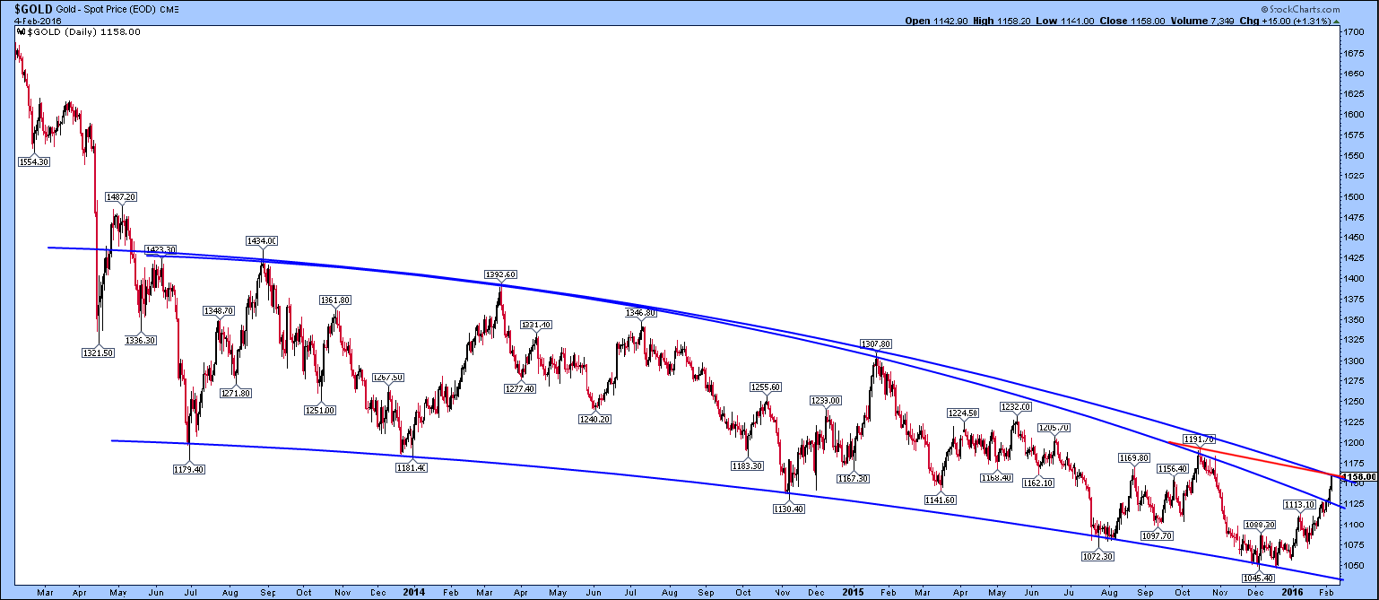
The top blue line is the most pessimistic version of the parabolic trend that I can imagine, going through the 1434, 1347 and 1308 intraday highs and allowing the recent late 2015 $1191 high to miss. The gold price is just about hitting that line. However, I think that line is not a good fit since it hugs the daily close at the Aug 2013 high and chops off the actual $1434 intraday high. I actually drew it to bisect the June and Aug 2013 highs. I just wanted to see if I could draw a parabola that had not been breached yet. It’s looking not too convincing.
A better way is to look at the recent slope. The red line shows clearly the slope between today’s high and the $1191 high. The downtrend has visibly slowed considerably if this is compared with the blue parabolas, so maybe there is a real change of market behaviour here. This is the first time in 2.5 years that this has happened.