Gold in Euros – I can’t quite make up my mind … bullish or bearish?
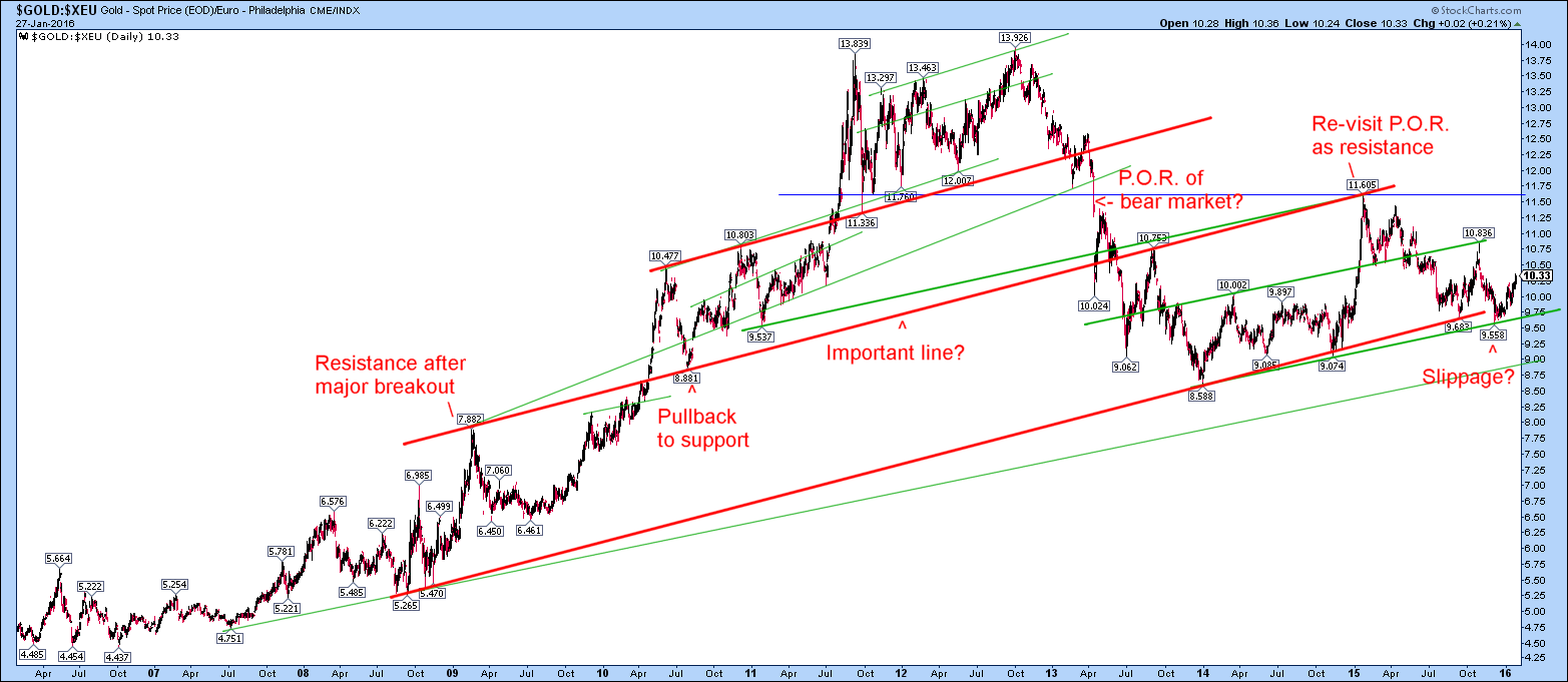
I can’t quite make up my mind whether this is a plentifully bullish chart of gold in Euros ($GOLD:$XEU on stockcharts.com) or if it is starting to slip a little under some kind of giant head and shoulders pattern… I drew this one a few days ago:
and today, without paying attention to the previous one, re-discovered it and drew a slightly longer term one:
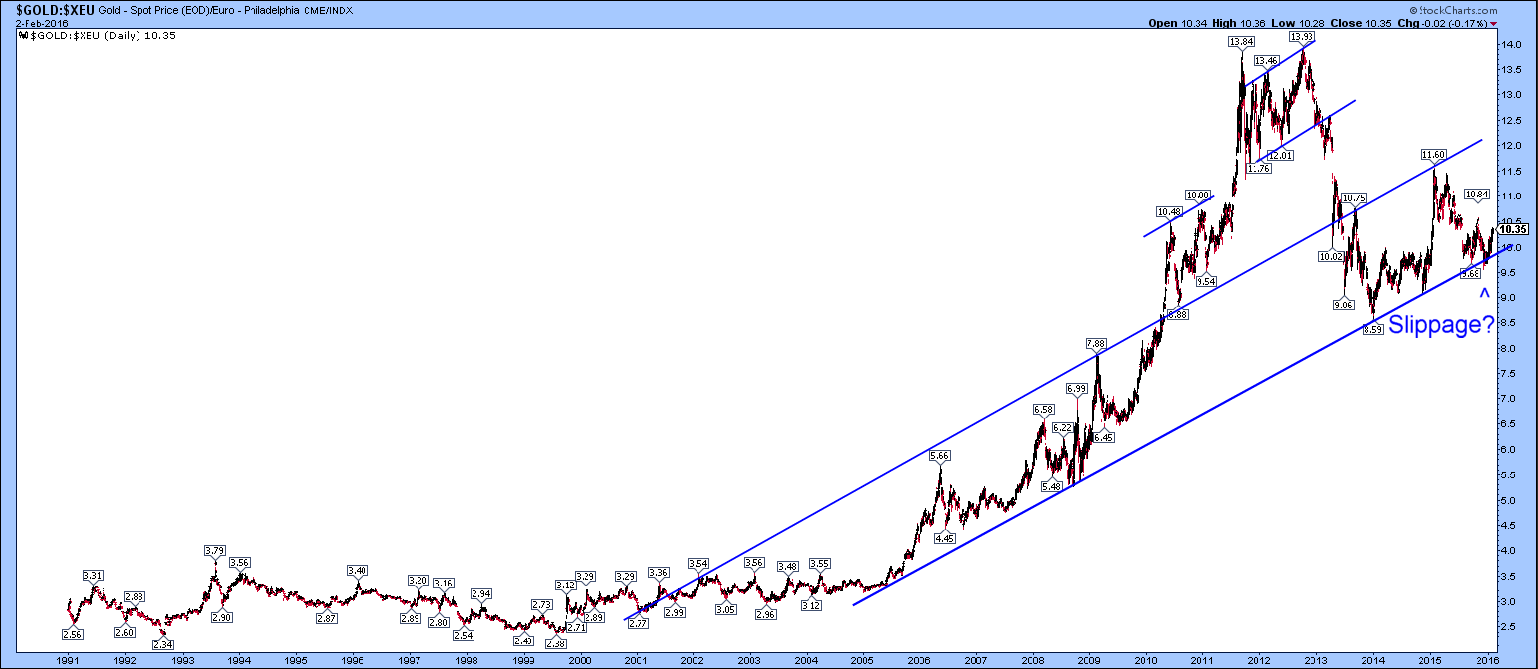
Not exactly the same slopes, actually the lower one is more schematic because the bottom blue like is slightly less steep than the one above but both show a little slippage under that bottom line which might be worrying. Perhaps?
It’s all about the bottom line, after all, as the manager at GE said as he announced our redundancies in 1993.
That IS ambiguous …keep an eye on it though
Things seem to be ambiguous in everything gold at the moment!