Stock Bear Calibration #1
Just doodling this weekend with some SPX charts looking at patterns from 2008-09 for clues. The top to bottom move from 2000 to 2002 took approx 34 months while the 2008-09 drop took approx 17 (around a Fib 50% reduction in time).
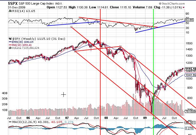
So lets look at the pattern from 2008-09 for clues as the downtrend pattern thus far is more similar to this crash. Lets start with RSI trend lines and how they work in conjunction with Plunger’s 30ema (i.e. Trendline breaks in the RSI can provide an early clue to start watching the 30ema for confirmation).
The Red down fork is NOT “Technically” correct as the handle is not attached but it does seem to channel price rather nicely into the Bear Market Low. Note also how price breaks the Forks down trend right where we get the 30ema cross over as well.
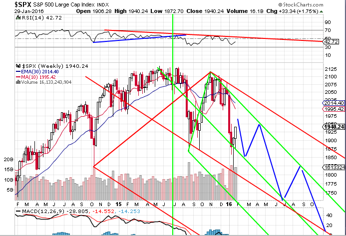
My 2nd chart has two possible downtrend channels. The Big Red Fork is not technically correct but I like the way price is tracking to the middle fork. The smaller green fork is technically more correct with a handle near the May 2015 High.
Also perhaps interesting, is that it would be 17 months from the May 2015 High into Oct 2016.
Lastly, the declines could be much steeper and adhere to the Red Fork channel rather than the Green.

