A visual analysis of the 44-year USDX dollar index chart.
I have just been messing around with the US dollar index (USDX) chart of the past 44 years, trying to make some kind of sense of its current move and where it might go in the future.
I noticed two things:
The first dollar bull market in the early 1980s is obviously a lot steeper than the second one in the late 1990s but the bull in the 1990s is a bit broader. The areas under the peaks are quite similar though.
Firstly, I considered the areas under the chart using the red lines as bases, which are drawn across from the bear market bottoms.
However, I also considered what one might intuitively view as the areas of the actual bull markets. These are difficult to determine but I tried drawing black lines from the first major higher high after the bear market lows as a starting point.
It’s plain to see that the early 1980s and late 1990s bull markets are similar in area. The area under the curve in physics often represents something like the total energy involved or the total distance travelled or something like that. So the 1980s bull was more impulsive but the total energy involved was the same as the late 1990s bull in the US dollar, it might be fair to say.
To me, this indicates that the second USDX bull market was actually of about equal ‘strength’ to the first, even though it reached a lower high.
So, what can we conclude from the recent bull market action? So far, our third bull market (area 3) is quite a lot smaller, i.e. Area 1 = Area 2 >> Area 3 if measured above the black lines. If you measure above the red lines it is still smaller than the others. To me this hints that the dollar bull market is not over yet. It may have a lot further to go either in price or in time (or both) before it starts down again and completes the peak.
The second observation I made was the red lines. The down-slope of the red line under the second cycle (1990s-2000s) is less steep than that under the first cycle (1970s-1980s). The third red line which is drawn between the 2008 and 2011 lows (so far) is up-sloping. This perhaps hints at a long term turning of the US dollar to the upside after 40 years of bearish market action.
I am also considering the upper blue line and the impulsive move through it in 2014 to the upside. I am wondering if this blue line might possibly become a median line, in which case action-reaction line analysis might suggest much higher highs for the USDX in the future.
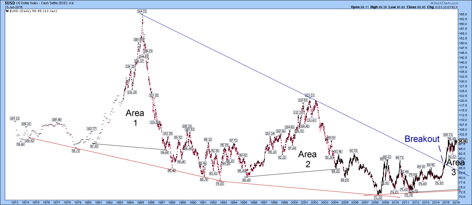
It is possible that the red and black lines under Area 3 could be erroneous because they are merely drawn using the bear market low in 2008 and the first higher low in 2011. Perhaps these are similar to the lows in 1992 and 1995 and it is possible still possible that the USDX could actually go to lower lows in the future. So, the lines under area 3 are merely conjecture but that is the best I have.
I am still a little intrigued though by the seeming gradual rolling to the upside of the lows in the USDX over the past 25 years or so and if this has any major implications for the inflation/deflation arguments.
i can not enlarge the chart. Can you repost the chart????
I have been having a bit of trouble with this for some reason. I found that that for some reason it was not linking the chart to the media file, so I ended up finding by chance that I had to edit the post, left click the chart in and hit the pencil logo to edit and link it to media file manually.
It should be “enlargeable” now!