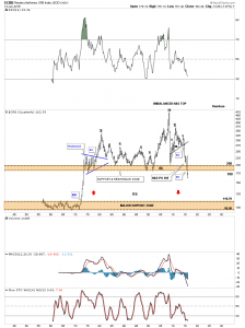
THE SCARIEST CHART ON THE PLANET
From Rambus Wednesday Report Hot off the Press
Yikes…Warning do not Look if you have a Heart Condition
“The implications of this 60 year quarterly chart for the CRB index is staggering if it completes this impulse move down which so far has been working out beautifully. Again on this massive time scale you can see an unbalanced H&S top that measures out to just below the major support zone at the bottom of the chart”
Rambus

The CRB’s weighting has completely changed since 2005 or 2006, so anything before 2005 is not viable charting sense. Also, the weightings in these commodity indices are completely out of whack. The CCI which is no longer on stockcharts, is the only commodity index that reflects reality and it is trading around the 08 lows. The CRB is at 40 year lows when most commodities (ex energy) are at or above 08 lows. These commodity indices make no sense. The CCI was the CRB until 2005. Look at monthly charts of Ags, Copper, Oil, Gold, etc and all have some room to fall (10-15%) before testing major support. Gold the least though.
the debt load of all governments,corporations individuals will continue to weigh on growth especially inflation related growth vehicles