Inflation Adjusted Gold Price – A Matter of Perspective
One needs to incorporate the effects of inflation in order to fully understand the historic gold prices.
The information is hard to find, but there are a couple of artifacts to show…
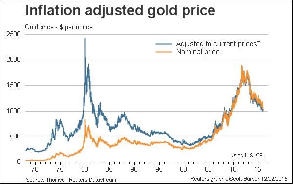
The first being a mainstream chart showing the gold price adding in the effects of inflation by adding in the Consumer Price Index(CPI).
Keep in mind that this uses a modern government controlled factor that calculates CPI. Also keep in mind that how CPI is calculated by the government has changed(re-baselined) over the years. So this is not a an exact science, and can be in fact manipulated for a multitude of reasons.
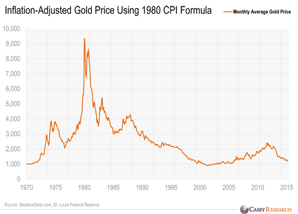
The second chart uses the CPI as calculated using a constant set of market products prior to the government re-baseline. It is from Casey Research heavily biased to the gold side.
Implication on this view is that we are close to an all time low in the gold price. This view has some merit. My guess is that there is a happy medium here between these two charts.
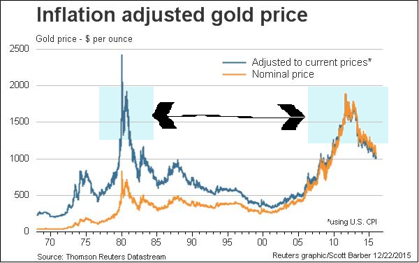
Let’s take a closer look at the Reuters Chart(Probably biased low)
The casual observer will focus on the two peaks or light blue regions on this chart.
This perspective does not paint a rosy picture for goldbugs.
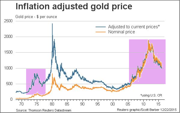
They say that history rhymes and harmonics build…enough to take down bridges in Washington state.
What if? (Look hard, there is remarkable similarity – focus on the light pink)
They say that hope is a powerful word? and if you are a goldbug now that may be all that you are left with. Could it happen as in the last chart…nah, no way.
Travelling for a few days…thought a quick and different type perspective might be useful. And no, I am not giving up hope 🙂


Great and balanced Post Stubborn
So what this means is the Gold is NOT a good inflation hedge . Who Knew ?
Sheesh…If you drank the coolaide you believed it was !
MARTIN ARMSTRONG QUOTE “Its clear there is whole industry out there, which has stolen $billions from poor folks who believed the inflation hedge lie.”
One thing about the gold promoters: some (many) of them are salesmen, just like any other salesmen. If you buy what they are selling, they did not steal it from you. There is no one forcing anyone to buy gold or gold stocks. People are responsible for their own decisions and for performing their own due diligence. If my gold related investments go to zero, you won’t hear me blaming anyone but myself for that unfortunate outcome.
Salesmen yes but they don’t disclose
Snake Oil Salesmen
Here Here! Well Said!
but if MA thinks gold is going to $5000 an ounce who cares if it’s because of inflation, deflation, government corruption,the will of the Gods…at least people might have bought some gold for their rainy day fund
Stubborn I think it would be good to see your last chart showing gold at a nominal price of $5000 an ounce (roughly Martin Armstrong’s estimate of gold’s ‘future’ priice) . Not sure of the date of that price target…maybe you could have two charts : one showing a nominal price per ounce of $5000 in 2017 or 2018 ( the purported end of the PM bull market by Adam Hamilton’s paradigm) and another chart showing a $5000/oz price in 2025 or 10 years from now and I bet a lot of investors would have been very interested in getting and staying in the game with that prize out there and they would have been glad they listened to few snakeoil salesmen and bought a 100 or maybe even 200 ounces of American Gold Eagles for their piggy bank
and Stubborn if ypu do do a chart showing gold at $5000/oz (nominal price) please let me see it–I know I will feel excited and grateful I got in the game and bought some gold