How many ways are there to draw a bearish PM chart?
How many ways are there to draw a bearish PM chart? It’s a bit like how many goldbugs does it take to change a light bulb.
These are 3 peaks and a house patterns revisited in gold and silver from August 2011.
The target on silver was $12.44 and on gold it was $1155. As you can see, silver had already made its top near $50 at point Z and was on its way down into the $30-40 range when I annotated the chart. Now it is $14:
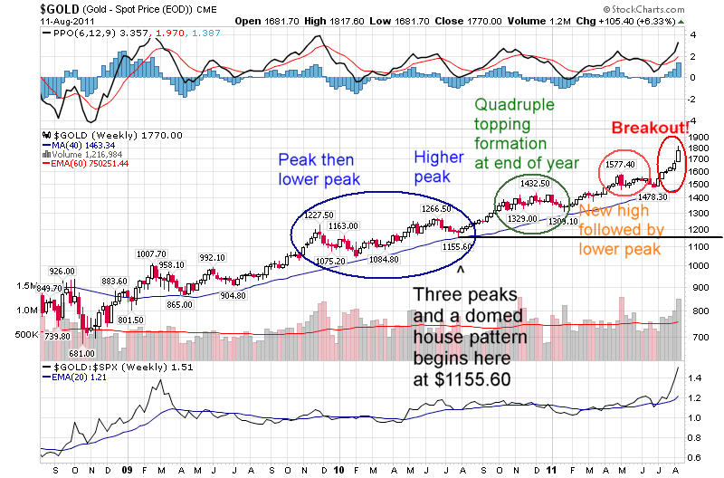
Gold has of course already exceeded its $1155 target to the downside as of the end of 2014 and is now at $1060 as of late 2015. Again, this chart was made in August 2011.The breakout happened much later in gold and was much shorter in duration. It was only another month or less to the gold top price of $1920 when this chart was drawn:
To me, this implies $12.44 on silver is pretty likely. How much these targets could be exceeded is a complete mystery to me. I can remember thinking in last 2010 that gold should be topping and was worried that it wasn’t confirming silver’s explosive rise (from $18 to $31). In the end I took it as a non-confirmation. As soon as gold did confirm silver’s rise to $50 by going to a new high of $1577, the silver bull market was over. Then later in the year, gold made its move to $1920 and silver didn’t confirm it by making a new high – it fell way short. That turned out to be a great big sign that it was all over.
Some might say the bear trap points at $1307 in gold and $14.65 in silver are the actual targets of the patterns and in that case they have both already been exceeded. However, when I drew the charts I made the final target so that it would obliterate the entire pattern’s price action from the start.
Here is an old like to a blog post with a similar chart:
http://1000gold.blogspot.co.uk/2013/04/three-peaks-and-domed-house-pattern-for.html
Dave in the UK
Superb Work
You are not chopped liver
Nice