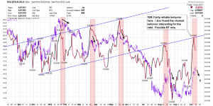
Silver:Gold Ratio Chart – Bikoo Idea
Thanks Bikoo for the ratio chart you shared as a comment to my silver post. You know, I also subscribed to the premise that silver led but curiously I had never bothered to chart the ratio. I have no clue why. I decided to test the premise and plot GDX behind price. Sure enough the correlation is solid. I shaded in red the periods immediately after the ratio started falling. I also noticed some interesting channel behavior that forms some structure to the ratio. I created my own version of the chart below. Yes, if the ratio behavior holds true, the GDX should begin falling soon.

thanks for the chart mark, makes perfect sense as silver usually spikes up at the end of rallies in the pm sector
Good observation. Note the chart is about the SGR (silver to gold ratio).
when silver spikes up, it is outperforming gold, hence SGR spikes up
Mark great chart.
How do you organize your Stockchart favorites? I have many favs but it is hard to monitor and find trades.
mark, if you think about you short .. you were correct; you were thinking a one or two day pull back.. and thats what you got… im not really seeing any type of topping pattern at this point though gdx is approaching a resistance area which “might” cause another shallow pull back; but in my opinion the real resistance lies higher up.
Next critical turn date for GOLD is 16 Oct HIGH
Miners should turn earlier.
Yes, it was what looked like an obvious reversal candle that got me to stick with the short trade. It obviously didn’t play out that way.