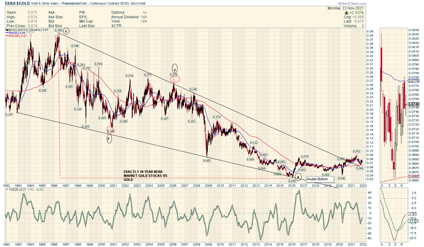
$XAU : $GOLD RATIO CHART
Thanks JenkinsLane
Over at the Chartology Forum where some bright Gold Minds hang out he posted a version of a Chart I had forgotten about..
Thanks for reminding me of this chart JL.
I produced it years ago now
I have it drawn slightly differently from your line chart
Point 2 is circled where there is a near miss which is counterbalanced
by the spike overshoot at point 3
Drawn this way we have a breakout and now waiting for Take Off
What is really most stunning is this Ratio was dropping all the way through the great 2000 to 2011
Massive Bull Run . The Place to be was Phys not PM Stocks…who knew ?
Note the Top in this Ratio was when Gold was about $400 in 1996…the year Bre-x died
In that regard you can say PM Stocks have NEVER recovered from the Bre-X Mania and Bust Era
I was there …Every tiny Rock was a 10 bagger and many many were over 100 baggers in a year or 2
Of course that all disintegrated when The Head Geologist for Bre-x Jumped out of a Plane over Borneo
Taking my huge windfall profits with him
Great post, Sir Fully!
Thanks,
GL
I was working in Indonesia in 1997 when the scandal broke. The scandal was reflected badly on the Indonesian Indonesian Government and so someone had to pay for it.
They reckon the Geo was pushed out of the Helicopter over Borneo, although his wife reckons it was not him who fell out.
https://www.smh.com.au/world/hoax-revealed-how-two-men-made-millions-then-vanished-20050528-gdlesa.html
Thanks Dickus thats a great article. A reminder of how the greatest Scandal in Mining History ended.
cheers
Anyone long in the tooth with gold/silver have their own special stories to tell, of fortunes made and lost. Personally, I am a twice round-tripper.
Was seriously hoping that I would get a third ticket punched for another trip – unheard of in a single lifetime. However, given the latest gyrations (crushing decline) it appears my inclination to abandon the precious forever back in July seems the better path. If only I had taken it. Instead of another trip up, this grind has wiped me out.
Gold and silver. The most disappointing investments on earth. And I did not mean to use the word “investment” but there does not seem to be another suitable alternative. Boondoggle, perhaps?