GDX Volume
Not much of a “volume” guy; so I decided to look at a 10 year chart of GDX…
On the “minute” charts I do see at times volume spikes right before a big move…
However, on this weekly–
Note the green: volume is flat while the price ascends…
Would one not expect more volume out of this “green” move?
Note the red: volume increasing while the price descends…
What is this really telling us? I have read volume peaks can determine an end of a trend…
Not very accurate on this chart–note the peak, not useful…
Incorrectly some think that stocks that are “up on high volume” means that there were more buyers than sellers, or stocks that are “down on high volume” means that there are more sellers than buyers. Nope, regardless if it is a high or a low volume day there is still a buyer for every seller.
So, how can I find this “volume information” useful other than on the “minute” charts?
I am just an “amateur”!
Feedback welcome–I need to be enlightened!
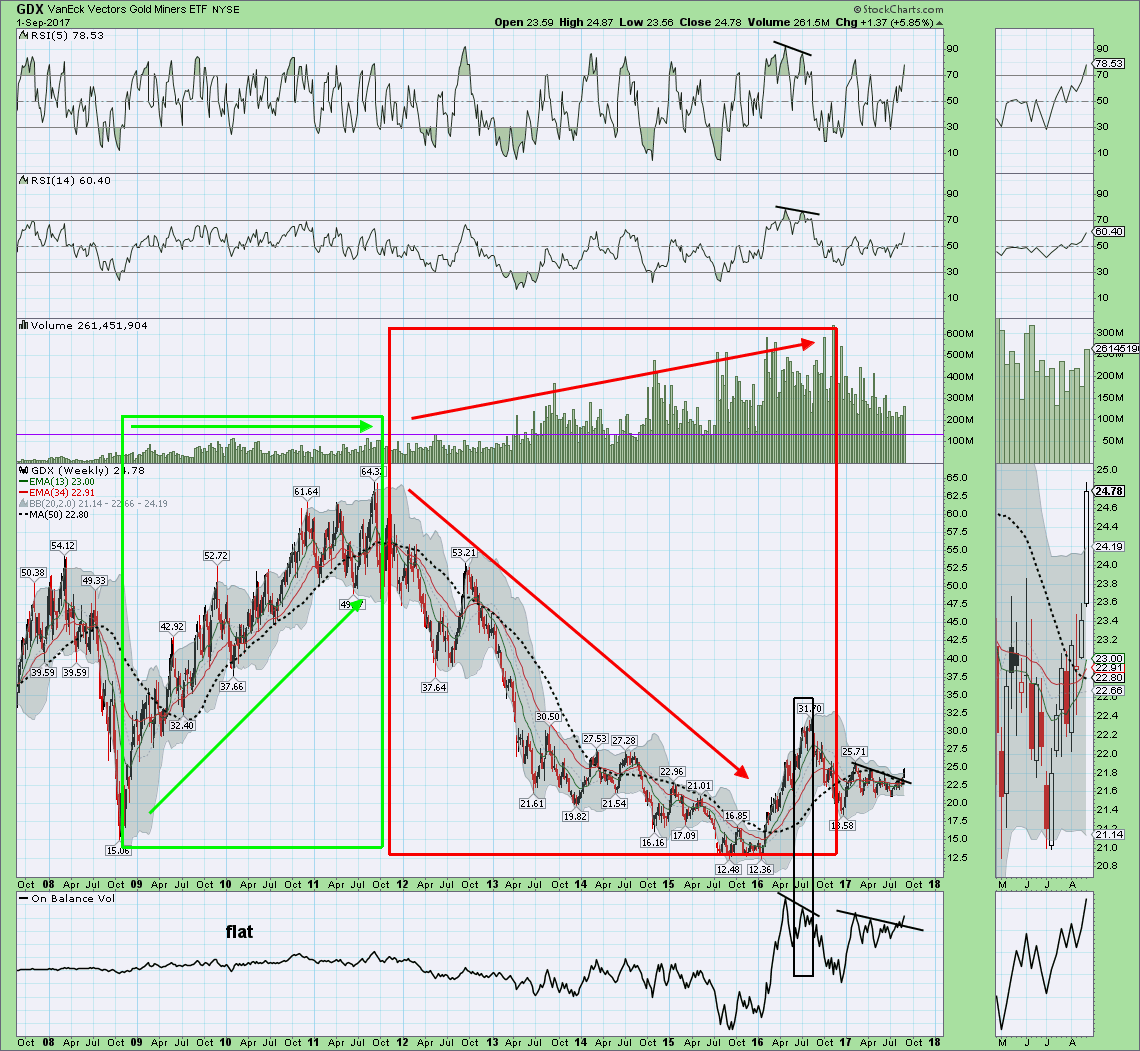
OK, added the OBV…a negative divergence same as the RSI…
This is not telling me anything the RSI does not convey…
However, I do use use the OBV on minute charts paying particular interest to trend line breaches; then again, I use trend line breaches on the MACD, RSI, stoch, etc…
So, I guess this is why I am not a “volume guy”…
OBV is supposed to sort this out
add that to the chart Eagle