$TNX Chartapalooza
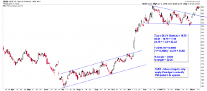
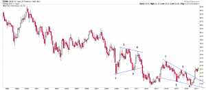
Possible halfway pattern to the upside:
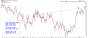
Possible IH&S:
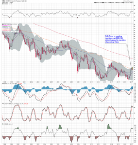
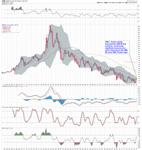
Price on weekly chart breaching the SMA 100 for the 1st time since 2007:
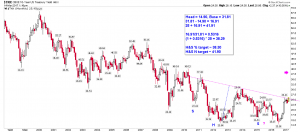
A larger possible longer term IH&S, neckline roughly equal to SMA 100 on weekly above:
LH & RH shoulders of the possible IH&S above are nice wedges IMO:
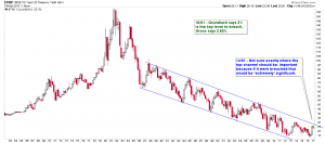
If price were to clearly breach the SMA 50 on the quarterly I think it would be hugely significant
given that it hasn’t happened since 1985:
Channel with Grundlach & Gross’ “stock market danger” levels:
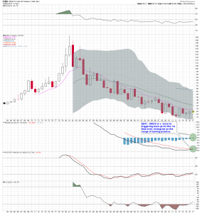
Yearly chart just for MACD & MACD histogram:
higher rates = higher risk. Mighty usa being brought to front stage with money issues finally. Will see how the debt ceiling fight goes and outcome won’t matter as shaky times. Kinda looks like Nessie poking her up and taking a look 🙂
low rates … sustained merely by CBs hitting the ctrl-P key incessantly constitutes even higher risk
since free money goes increasingly to projects with no net social value (ie, mal-investment)
forcibly low rates are simply about lining pockets and averting economic and political reality, and not about investing in the future
and that’s why the tears in the social fabric are starting to appear …
low rates are about as high risk as it comes for those claiming to be in the driver seat of world affairs
at some point, those counting on simply rolling over their (outsized) debt servicing requirements … will find that they can’t.
Agree with everything you’ve said.
Thanks JenkinsLane,
Very significant observations indeed.