Where are we going!
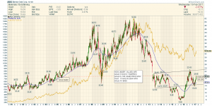
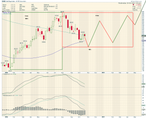
It is at times like this that I take comfort from the following 3 graphs. When started investing in miners not only did I buy the wrong ones, but I did not take any profits thinking that once the Bull started it would be a ride up. I now know that along the way there are some very big pullbacks as these graphs illustrate, so apart from always keeping a core of good juniors, and also some explorers, I now take profits when they exceed 40-50% and sometimes lower. This latest pullback has once again reminded me of this and I am better placed this time than last summer when I just sat and watched my funds fall.
Somehow I have to learn how ride these waves better and as can be seen below, even with the larger miners like ABX they can be very big! Amazing how it went from around 46 to 15 in a very short period. I still love to invest in them as where else do you get this kind of ride. I expect I may get tired of it one day and buy some dividend stocks, but not just yet!
These are all from Sir Fully’s previous posts and the last one is the one I am looking forward to it being on the money but perhaps a month or too later on this year 🙂


Thanks for this reminder Odd Job. It is very important to look back on that Bull market from 2000 to 2008
and see how the consolidation periods looked and felt and how long they lasted !!
I actually forgot about these charts.
You had them blown up full size and running off the page…I adjusted .
Well done to bring these back. They were inspired by a Rambus Post back then
It is so easy to lose track of where we are . well done
Cheers. Sorry about the charts still learning 🙂