Rose-tinted glasses: gold in non-USD currencies $Gold:UDN and $Gold:$XEU (Euro)
This is quite an interesting chart. This is gold divided by UDN, the bearish US dollar index fund. Therefore it represents the weighted average gold price in the components against which the USD is compared. It’s probably almost the same as the Kitco Gold Index.
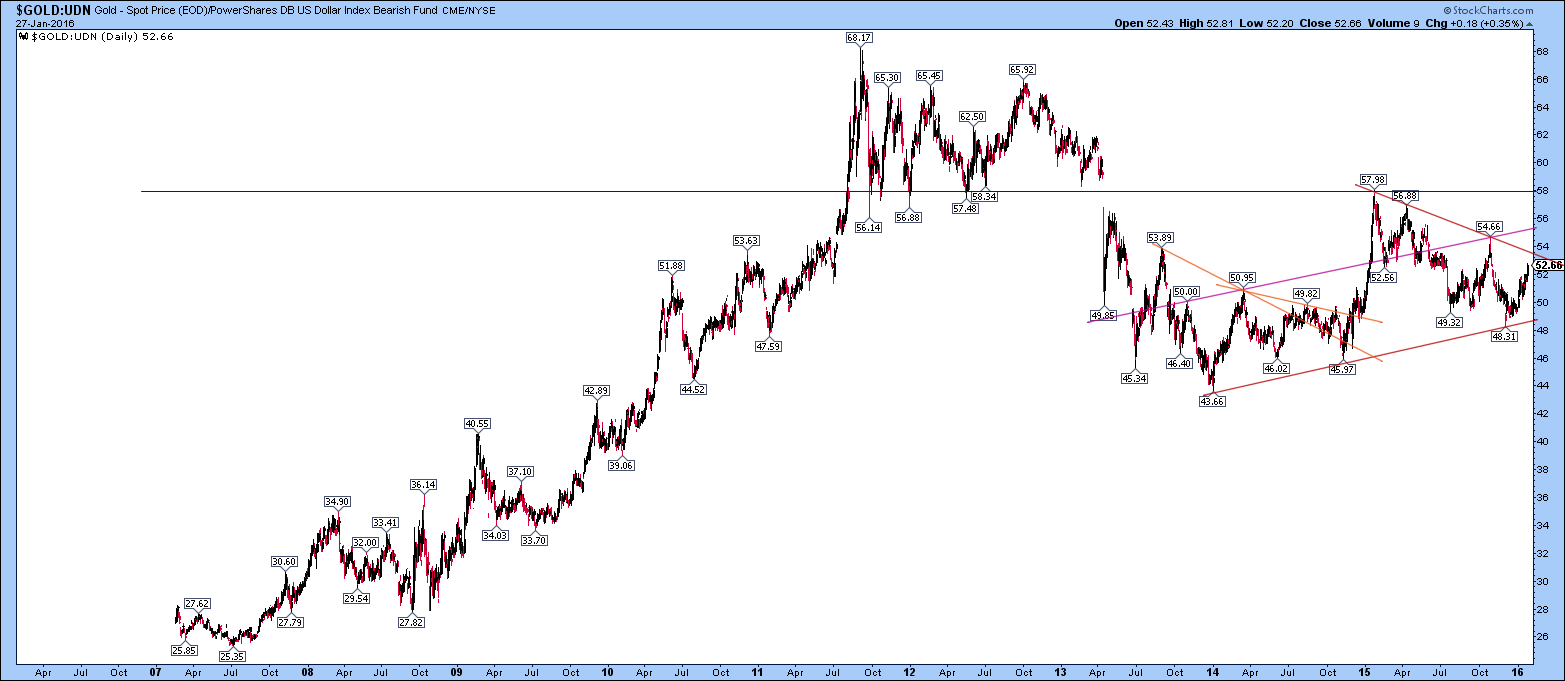
It looks like an almost perfect bear market rally to the resistance (that used to be support before the point of recognition of the bear market in April 2013) followed by a triangle or flag formation (shown in red). Is this a bullish or bearish flag? I have no idea. The up-sloping red line is two-year support. The pink line may delineate a trading channel parallel to that red line.
Actually there has been a triangle formation before (two possibilities with the down-sloping orange lines) that broke out to the upside.
The movement upward to the blue resistance line against this basket of currencies (EUR, JPY, GBP, etc) happened on the latter part of the big rally in the US dollar towards the end of 2014.
The USDX chart at the same time is an interesting comparison, because the 10-year chart is right near its highs right now. It’s interesting to see a longish term chart like this have the price currently stuck up in the top right hand corner.

Now, if I scrawl up-sloping lines on the Gold:UDN chart, I get a sense that the current trend is not much different in slope from some of the action during the 2001-2011 roaring bull market. I am trying to see if I can get my rose-tinted glasses to tell me that we are still seeing bullish action in gold.

This chart is a very different picture from the chart of gold in US dollars. The above chart looks much more bullish on the surface but it also shows potential formidable resistance at the April 2013 breakdown point.
However, I also sense bullish sentiment creeping into the gold space right now, so are we going to have a bull trap here? Articles have been online saying there is good Indian and Chinese gold demand but today I read one that says that has already abated and there are discounts in India.
…
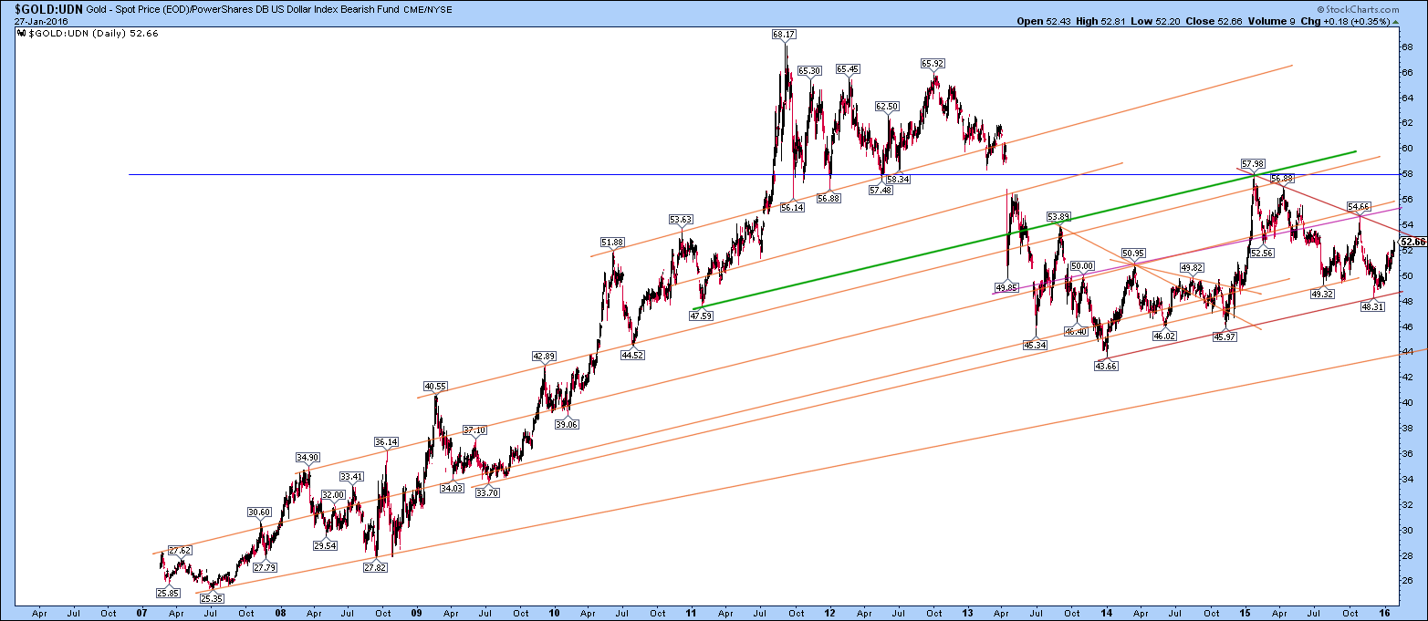
There is a really interesting little twist. I just added one more line (green) because I like playing around with my basic little graphics package.
This line joins 3 pretty important points in the gold price action – I am going to mention the price levels in USD, though they are not on this chart:
1) The bear trap ($1309) from early 2011 following the peaks of a possible 3 peaks and a domed house formation. I always thought that the behaviour of gold changed in late 2010 when it seemed to roll over in actually 4 similar peaks around 1400-1430, pulled back to $1309, then went BOOM off to 1577, then 1920. See http://1000gold.blogspot.co.uk/2015/12/3-peaks-and-house-patterns-revisited-in.html
2) The first decent rally after the April 2013 crash (to $1434)
3) The early 2015 rally (to $1308 – oops- nearly the same price as the first point!) that actually marks that blur resistance line on the chart against other currencies above.
There is quite a lot of elegant geometry in that green line and it is parallel to the recent trend:
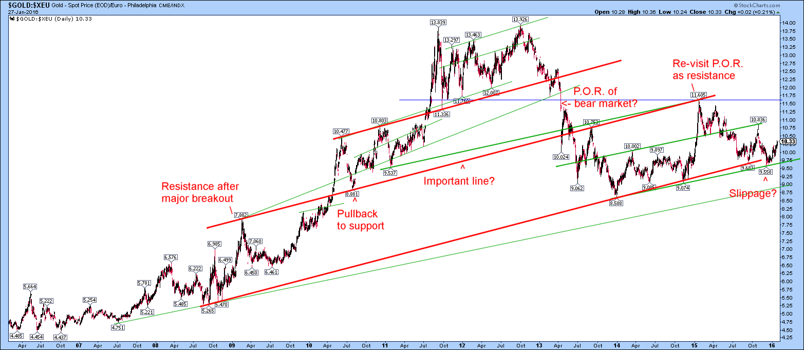
I am just checking what this looks like on the gold chart in Euros: not quite the same but not so much different. Here it is a bit rough and ready (all these are linear scale so may look a little different on log charts) but food for thought:
Brilliant
Thanks, Fully!
Great to see how well gold has been doing outside the US Dollar system….higher lows for TWO years: ~$43 to ~$48