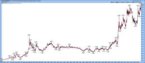
I just looked at this chart and it shocked me.
Gold:CRB long term chart (46 years). Rocket ship.

I have been looking out for anything that has broken way out from the past 45 year trend since Nixon took the USA off the gold window in 1971 and maybe this is it. Something that may tell us we are in a different world from 1971-2008 and we can throw most of what we think we know out of the window (not technical analysis but maybe fundamental analysis and economics).
Yup. That period, beginning in 1971 launched THE GREAT INFLATION. (Unrestrained credit growth)
And getting a handle on that idea, and Peak Debt, is how Plunger and I came to our views that things are, or will soon, be changing.
Debt expansion, debt saturation, then what?
And … this is one area where Armstrong’s history lessons are valuable …. he describes what tends to follow from his knowledge of Rome and other ancient history. No one alive has a better historical background AND detailed familiarity with the way the current financial system works to anticipate what’s ahead.
what exactly is it saying? isn’t it saying that gold has become vastly more valuable/more valued than all other commodities—-for 37 years gold’s relationship/relative value to commodities was pretty flat and then like a rocket gold’s value shot up or conversely the value of commodities plummeted …it does look like a dramatic sea change in gold’s relationship to all commodities
If I were just seeing this chart for the first time I would definitely say: “I had better buy some gold, because gold’s relationship to all commodities has grown massively and it is putting in a massive head and shoulder’s bottom right before my eyes” Yup, it definitely says “gold is IMPORTANT and owning it will be important”.