Bearish curves on gold chart from last 2+ years plus comparison to 1929-1932 Dow chart.
Bearish curves on gold chart from last 2 years
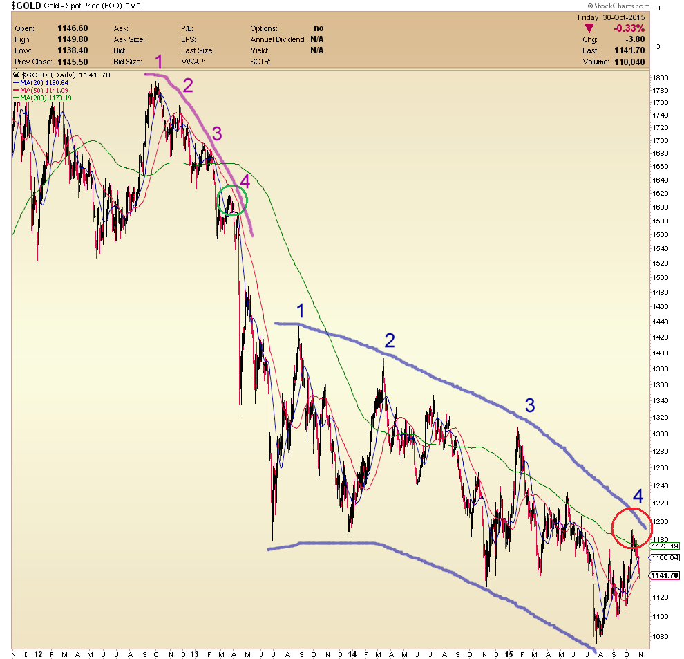
Looking at this weekend gold chart, I noticed that there are bearish curves on gold chart from last 2 years. Ol’ Jim Sinclair used to say about 10 years ago that one should have a set of parallel rulers and some French curves to do charting.
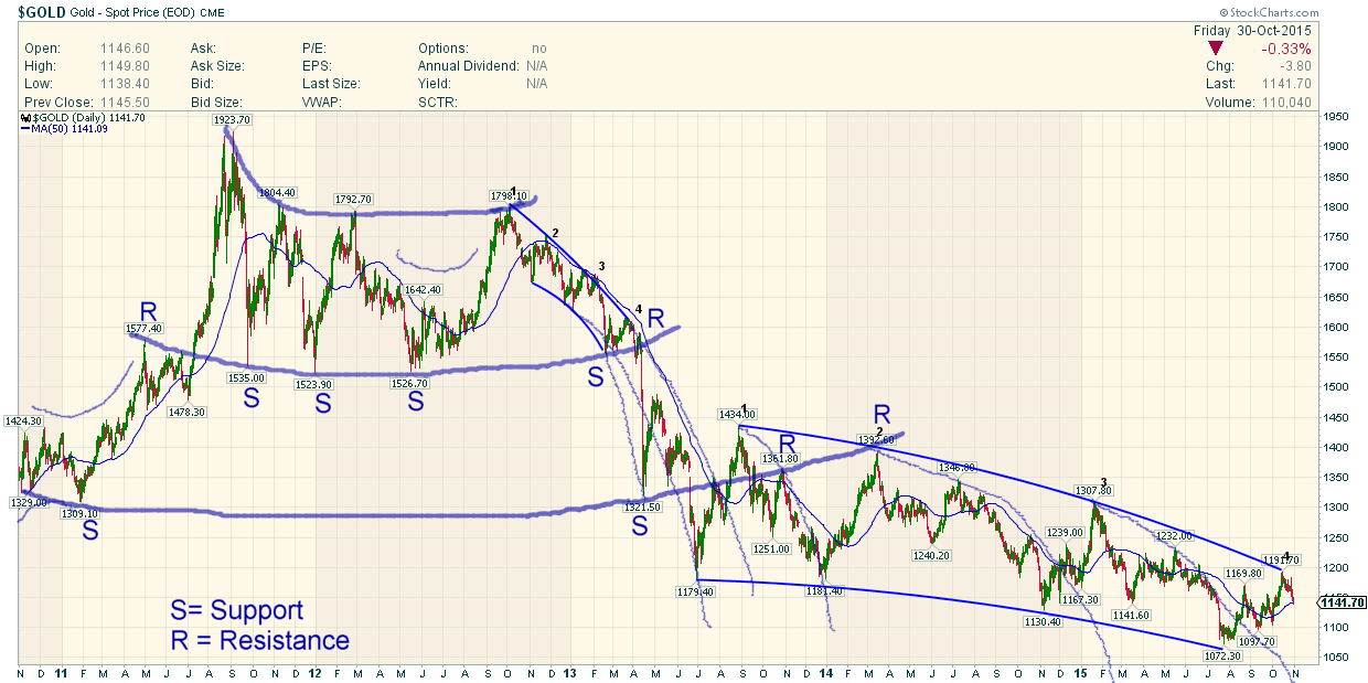
I am now adding in FullGoldCrown’s improved version of my above schematic, now with proper curves!:
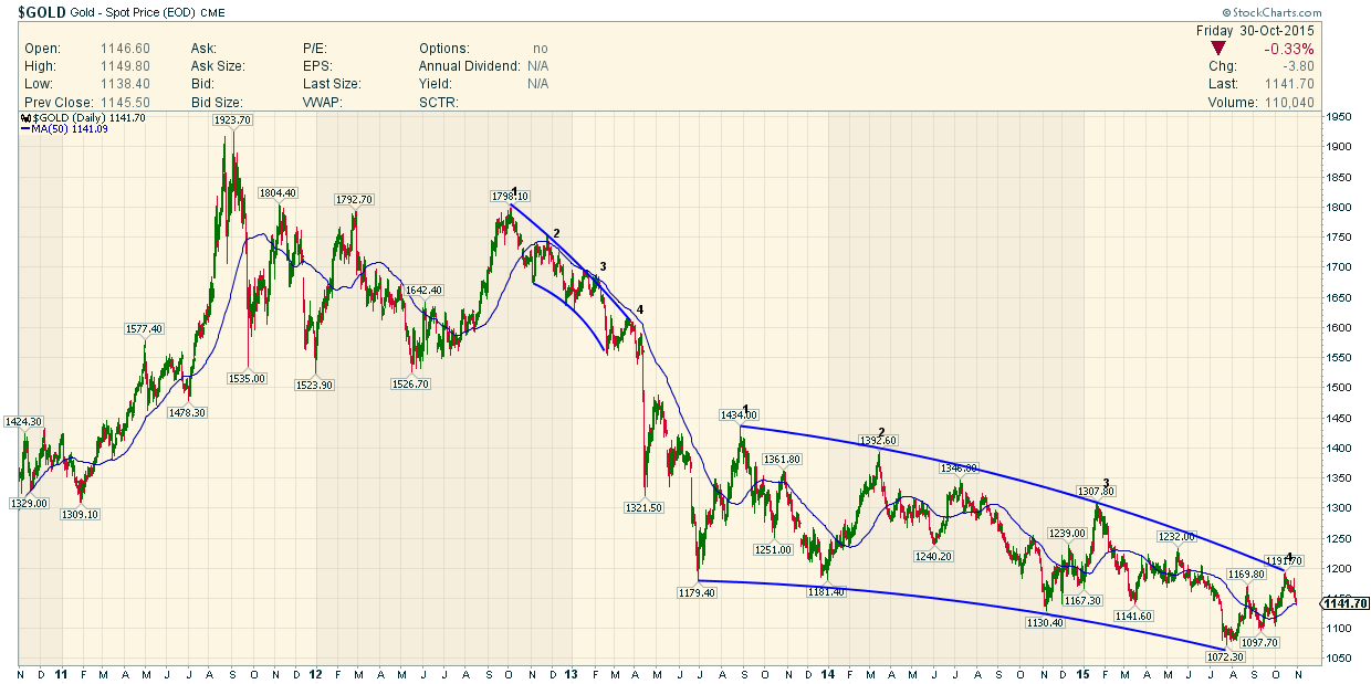
Instead of drawing a falling wedge, one might instead encompass the last 2.5 years of price action between two steepening down curves.
Well, here are some curves on the gold chart that do not look too good.
If the recent high circled in red is the high for this current move, then there might be a lot more downside to come. This recent up cycle looks a lot like a stunted version of the previous up cycle from January 2015:
Looking from an even more bearish perspective, this last 2+ years of action mirrors the action in late 2012 to early 2013. We are again at the 4th high of a series of falling highs. Last time, the 4th high was the failure to hold above $1600. This one is the failure to get to $1200. Geronimo?
I am beginning to realize that you can draw almost anything on one of these charts but I do not like at all the downside acceleration of both the highs and the lows. It is ongoing as far as I can see. Who knows when it will end?
The 2012-2013 down move culminated in the mid-April crash in gold on 12 and 15 April 2013. Immediately preceding the crash there was a failure to hold above $1600 (high number 4 in purple/green on the chart) and just after that an abortive little bounce that went to about $1590, failing to reach $1600. That ushered in a $270 drop within a very short space of time.
This time around, we have the recent rally to $1190 (high number 4 in blue/red on the chart). The price failed to hold over $1180 which is key horizontal resistance dating back to the lows of June and December 2013. Very soon after we had a little bounce that failed to reach $1180. This might be an indication that gold is about to break down severely.
Last week’s sharp selloff could be very bad news. Unless the price rallies to above $1180 or at least spends at least a number of weeks trading sideways, there is a chance of an imminent second crash in gold based on this view.
However, the breakdown in April 2013 crashed through a level of support that had previously held 3 or 4 times in 2011-2013, i.e. $1520-1540. This time there is not a level of support to compare to this one. In this case, it might be postulated that the $1030 level (the highs from 2008) might be the key psychological level that may fall this time around.
To Rick’ Ackerman’s $817 target by the end of the year perhaps?
The width of the channel as measured when drawn as a falling wedge in previous posts was about $250 at the start and $170 recently. The $250 is about equal to the original April 2013 crash down move ($-270 from $1590 to $1320) so perhaps I could propose the secondary down move might be of the order of $170 from wherever the bottom of the channel is currently. It is not far from $1000 on the curved channel above and a little higher is you draw it as a straight falling wedge (maybe (1050?). It also depends on the time taken for the move. A down move to $1000-$170 or $830 is well within the realms of possibility.
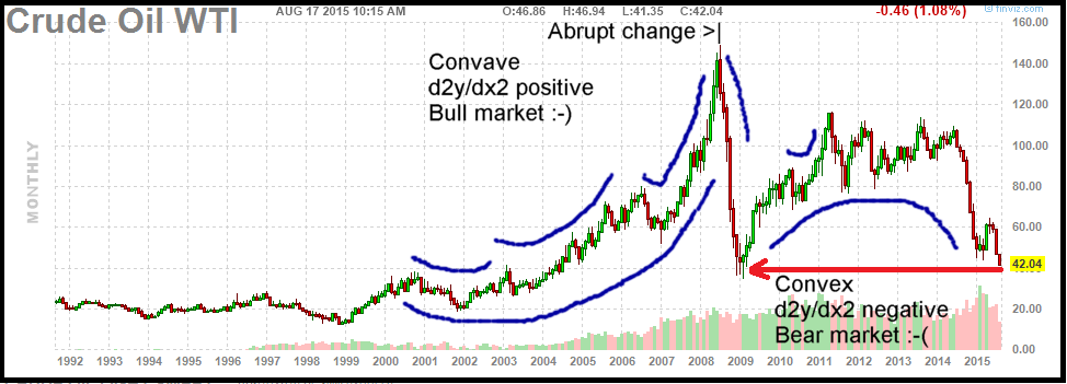
Here is a crude oil chart that relates to my comments below in one of the replies 3 & 4:
and I am going to experiment with potential parabolas and curves a bit more on the gold chart and see if it leads anywhere(!):
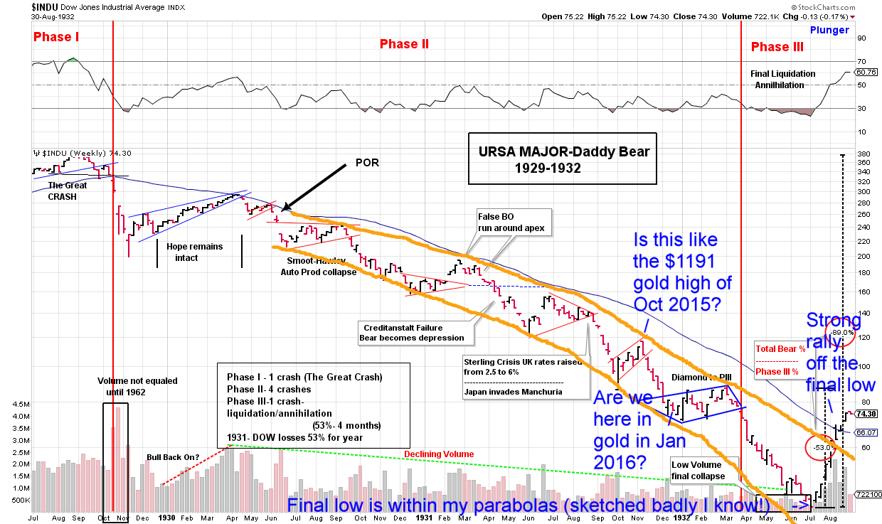
Here is a 1929-32 Dow chart plundered from Plunger’s post that appears to be bounded by parabolas also. Maybe this is a guide to the present day gold bear market:

It used to be here but there is a broken link.
http://goldtadise.com/?p=342366
It’s a very important chart so I reproduce it here and credit it wholly to the Plunger!
I don’t want to graffiti on it but here is what I mean. I also notice that very first rally after the final bear market low was strong enough to break out above the UPPER line:
Nice Work DavintheUK
Really fine TA
I am going to draw some parabolas and post them for you
did you know there is a parabola feature in stock charts ?
Thanks Full Gold Crown! Nice curves! That’s what I would have drawn if I had had the software! I am going to appropriate your improved chart into my post! Actually I didn’t know stockcharts had a parabola feature but I am just a free user anyway.
I guess it’s kind of an example of curve fitting. I don’t know how this compares to straight line trend analysis but markets don’t always move in straight lines. It might look different on a log chart as well but they would definitely still be curves on a log chart, I am sure.
What I don’t like is the downside acceleration of the highs and lows. If the 4th high is already in at $1190 (really a failure to maintain a price above the important level of $1180) then I would call it ominous in its implications. Perhaps it suggests a further, lower trading range is coming for gold?
I am going to leave a couple of further comments about my post but I have put them down here instead of in the post itself because they are on a slightly different topic.
Firstly, it is interesting the FullGoldCrown has drawn parabolas. A parabola is like the behaviour of a projectile under gravity. So, gold is under gravity; bad news for goldbugs. The price is like height and it accelerates to the downside. A parabola has a second derivative that is a constant, like the constant force of gravity pulling an object towards the ground, i.e. d2y/dx2 is a negative constant. That is for a miserable n-shaped parabola. For a smiley parabola with a u-shape, the acceleration is to the upside and is a positive constant. Hmmm. In both cases the first derivative (the speed or velocity dy/dx) is changing at a constant rate and the price or height ‘y’ is changing at a non-constant rate.
I have sometimes wondered why this isn’t applied more to chart analysis but I guess it is because prices are always jumping up and down fairly randomly and short term volatility makes it nearly impossible. I am guessing that curve fitting therefore has to be done between certain price points chosen by a person or algorithm that uses certain short term turning point to try to fit the curve and that is always going to be subjective. However, drawing a simple trend line or pitchfork is the same because you have to decide if it fits or doesn’t ‘look’ right.
Of course, one could also do this with smoother prices like moving averages but then you have a built-in delay in the data. Nothing is perfect, eh?
When the second derivative = 0 ,you change from acceleration to deceleration and vice versa. That is an important turning point, so I would think that it would be valuable to be able to calculate the second derivative of the price action if possible. When first derivative = 0, it is a high or a low, also important. Though in a spike top, it could go from high positive to high negative in a flash but on shorter term charts, maybe you could see a curved change that could be modelled somehow.
If you get a polynomial fit, you can take the first, second and further derivatives and plot them – but I don’t know how useful that might be.
I don’t know how this sort of analysis would deal with spike highs and lows gaps or other discontinuities, unless they tend to happen for instance when a derivative of price reaches a certain level. After all that is what we would call ‘momentum’, isn’t it?
I have for some time looked at the convex and concave nature of charts, which are really manifestations of d2y/dx2 is negative or positive, respectively. Bull markets tend to be concave and bear market convex but not always. This would also equate to Rick Ackerman’s type of analysis where he does his Trident Trading style ABCD patterns with matching AB and CD legs and then says for example that bullish action is when the price exceeds his D target to the upside. Well, that is acceleration isn’t it and d2y/dx2 > 0, giving him a high that exceeds his straight line target. Similar if price doesn’t reach a downside target because d2y/dx2 > 0 again and price is being pulled upwards.
The silver chart around 2003-2006 is a wonderful example of concave bullish chart action. It’s made up of lovely u-shaped formations where d2y/dx2 > 0 nearly all of the time, except at the price spikes. Sadly, the same is not true now!
Does anyone here have anything to say about this kind of mathematical analysis, whether it is done, whether it is worthwhile? I don’t have the tools to do it myself.
I was tiddling around looking at this phenomenon with the long term crude oil chart that I found somewhere on the web (see the bottom of my post above).
It struck me that the entire market action went from 2nd derivative is positive to 2nd derivative = negative at the spike top in mid-2008 and the action has been convex (almost) ever since. That for me is a strong sign that the whole move in oil from late 2008 to 2013 was just a bear market rally.
In gold, I felt that the action changed at gold topped out at $1430 in November/December 2010. That was a sign of an imminent top, perhaps? It also corresponds to the 3 (well actually 4) peaks of a 3 peaks and a domed house type formation in gold in 2010-2011. The target for that was $1155 and a similar but less clear formation is silver gives a target not yet reached of $12.44. $1155 would have been a great downside target for a short trade when this pattern had already formed in 2011.
I have seen and heard people putting a saucer type (concave) formation on this gold bear market (from $1800 in September 2012 until now) and I fell for that for a while.
That would be bullish and suggest that gold is very slowly turning upwards, as in years 1999-2001.
However, looking more closely, I have my doubts about that because of the acceleration in the highs and inthe lows of the last 2.5 years of consolidation.
The downtrend did slow and there was a little bounce in the second half of 2013 with the rally from $1180 (June) to $1434 (August) and even though it gave it all back, the next low was again $1180 in December.
So $1180 held but since then has given way, first to $1130 and now to $1070. The progression of these lows respectively goes $+0, -$50 and $-$60, which is downside acceleration.
That holding at $1180 was like a failed kind of bear market rally that didn’t even rally but just held on and then the downtrend has resumed and is still accelerating. Therefore I don’t buy the saucer formation theory. To me it looks like lazy analysis.
Dave ….are you a Rocket Scientist ?
A lot of this is going over my head ad I am sure the heads of others
But don’t give up on this as you seem to be on to something
Parabolas are part of Chartology
Rambus uses them too .
Many charts hold resistance at the parabolic line
We have a member at the chartology forum Parabolic Chuck who has made a lot of money spotting parabolas
You need to get a Stock Charts Subscription and start playing with the Parabolic tool
Cheers Fully
Thanks FullGoldCrown. No, I just a very bored materials scientist. For me now I think science is not a good career. Finance of some kind would have been far, far better.
I am getting bearish on gold here right now. It’s funny, because the recent rally brought false hope and excitement to the goldbugs yet one more time, only to be defeated at the very important level of … $1180. I see that an ominous. Gold needs to take out the upper blue line on my chart (well, _your_ chart) pronto near $1190 or it’s in big trouble I think. It’s going to take a good reversal to do it; looks unlikely, don’t you think?
I am wondering if we are going to get a downmove into a lower range again, with $1180 or even $1070 on the top and maybe 900-ish on the bottom, to be kind.
Didier Sornette – now he is a real rocket scientist!
http://www.safehaven.com/article/1250/prediction-the-future-of-the-usa-stock-market
http://arxiv.org/pdf/cond-mat/0310092v2.pdf
Forget all the formulas – look at pages 39 & 41 and compare with the bounces in gold from Sept 2011- late 2012
and interesting John Hussman article on 2013-2014 stock market here:
http://www.hussmanfunds.com/wmc/wmc131111.htm
Time will tell!
Yes that is the equation for acceleration in Physics dy/dx.
You may look in to stockcharts chart school for equations for various momentum indicators and see any one of them you recognize which fits your requirement.
One of the moments indicator is True Strength Indicator (TSI). Then there are others as well.
There is a trend indicator which works well but is a lagging indicator. At tab chart school for all indicators math equations are provide. Check it out.
http://stockcharts.com/school/doku.php?id=chart_school