Very Close To Turning Bearish On PM’s

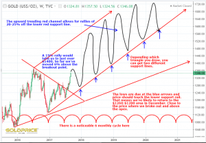
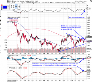
Well, it’s a case of having to play it safe now, My first (linear) chart of gold price says we can fall about another $30 before breaking below our critical uptrend support line…

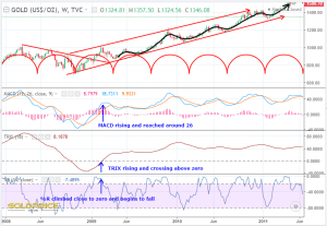
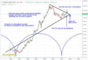
But…the log chart has proven very important for the last 18 years. It says that anymore downside, with a close below approx. $1280 on a weekly basis spells serious trouble. That’s serious, with a capital S (closely followed by H-I-T.)…


Gold (Non-Log View)

When you plot the support line on s non-log scale you can see the ‘hot support line’ just doesn’t fit with anything in the past. It just projects into ’empty space’. The more recent price action allows price to move a little lower before it hits this shorter term support.

Gold Getting Critical- Levels To Watch Very Carefully

A fairly simple chart, with some (by no means all) support and resistance levels to watch…

The upper two lines on that chart, which I had identified as a possible bull flag some weeks ago, broke to the downside. From a bearish perspective, the recent moves could be interpreted as a backtest, with a large move down ahead.

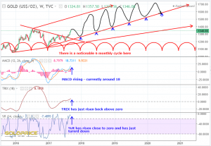
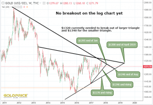
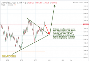
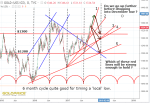
With the Trump/Kim Jong Un summit and FOMC this week, are we about to get a catalyst ? The chart below is fast becoming my most important chart to watch. I know that cycle analysis might support a final plunge before we take off, but that would require a break the very hot, long term support line. Maybe we need a false breakdown, to shake out the market and destroy sentiment (which is already very low). When such a hot support line comes up to meet a huge area of overhead resistance, gold (in my view), isn’t destined to carry on grinding sideways. I expect one of 2 outcomes no later than Jan/Feb 2019. Gold will either be held below resistance, fall through the support it’s currently sitting on, and sink to the bottom of the ocean (sub-$1000), or it’ll burst upwards like the proverbial ‘beachball held under water’ confirming (at last), that we really are in a new PM bull cycle.


Uranium Sector Could Be On The Brink Of Huge Gains

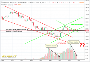
The whole sector appears to be set up for some impressive gains. Here’s one I picked at random. Mega Uranium…

As long as the TRIX uptrend holds, history tells us to expect a 100-400% rally (that’s what happened at each of the orange highlighted circles). Double bottom at historic, all time lows. A bit like gold, it looks like we’re getting close to surging through overhead resistance into clear air. This isn’t a recommendation to buy, although I have about half a dozen uranium miners in my portfolio. As they say – do your own due diligence 😉

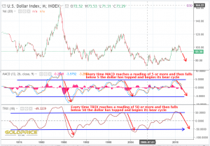
Dollar Milestone Upon Us

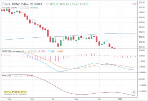
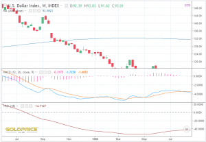
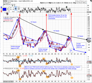
It’s all in the chart.  MACD falls below zero at point 1, followed a few months later by TRIX at point 2. This coincides (on all 4 red lines), with the break below the uptrend lines on the indicators. It looks to me that the dollar has a date with the zero line and a break below the uptrend line in July. If that happens, it will give me a very high degree of confidence that we’re on course for the 80 region (albeit, a few months later than I originally thought). I believe Graddhy (on Twitter) has been expecting it to happen by the end of the Summer. If it doesn’t happen, and TRIX bounces off the line, we have a whole different scenario unfolding. We’ll know sometime in July/August.

Gold And Silver – Looking For Clues

This is getting quite exciting really. I know it’s been like a graveyard in here recently, but that’s telling us something. This is exactly what you get after 2 years of going nowhere in a market. It could go on for another 5 to 10 years of course, but I’m betting on a big move in the next 6 months. I decided to take a look at Dr Copper to see if there are any possible clues there, and then the broader CRB (commodities index). Here’s what I see…

I just can’t see how an upside breakout and successful backtest can be seen as bearish in any way whatsoever. A $5.50 target is what that chart is telling me.  It may take another price retreat before the final push through the hot zone into clear air.

Next, I wanted to see how the broader commodities space was looking. This is what I’m seeing on the CRB chart…

Once again, I just can’t see any bearish signs. I’ve tried, but I just can’t see it. We’re already at historical lows. The indicators are in an ideal position to support an upside breakout. I then zoomed into the more recent price action on the CRB index for more immediate clues (again, keeping an open mind, and looking for reasons to be bearish)…

It’s no good – I’ve completely failed as a bear. All I’m seeing is bull 😉

If I’m right, we are in a position, both in time and price that would be conducive to a rally of historic proportions. That doesn’t mean it’ll happen of course, just that it’s within the realms of possibility.

Hope that’s helped to clear some of the tumbleweeds in here 🙂

Reasons To Be Bullish

  1. Fed Balance Sheet v Gold

2. Gold/Silver Ratio still high and has a long way to fall

3. Gold Mining Index – Bollinger band width indicates a large move ahead. At the start of each large move down, the money flow index was at, or close to the red line. Unsurprisingly that isn’t the case at the moment. We are still languishing at historically low values. If a large move is coming, which direction looks the most likely ?


Another Look At Sir Rambus Chart

Just been looking at the chart Parabolic Chuck Posted. Just shows how two people can look at the same chart and see two completely different outcomes. Based on what happened last time, it looks as if we’re ready to launch higher rather than plunge lower. Here’s the same chart with my scribbles added…

Millrock Resources

Spotted this one in my portfolio up 39% today !

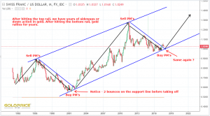
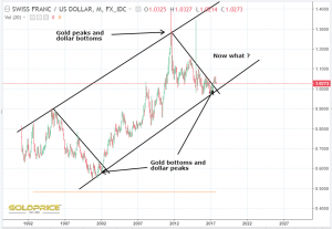
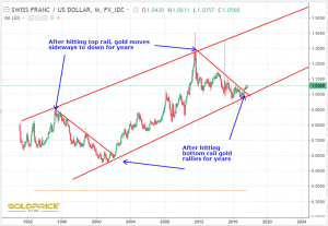
CHF/USD Channel Surfing

This is how I’m seeing it…

Dollar Clues

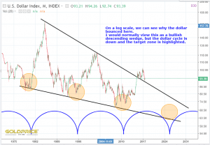
The Rambus chart which Fully recently posted made me take another look at the dollar chart. I have to admit, my 80 (ish) target for the end of May clearly hasn’t happened. Price is behaving differently to the last two downturns after the dollar cycle peaks. Does this mean we haven’t peaked yet ? On the log chart, price has bounced off the long term downtrend line. On the non log chart it’s bounced off a zone of horizontal support. Dollar volatility appears to be subsiding, allowing the amplitude of each wave to decrease. There are two big reasons why I think the dollar top (for this cycle) is behind us. First, the moving averages have crossed over decisively, second time appears to have run out. You could, perhaps argue that we may have another 6-12 months before the dollar cycle peaks, but I don’t think so. Cycles experts will have a view on this based on the way cycles can be left or right translated.

The red and green lines at the bottom and top of the above chart, are of equal length, so the green zone indicating a dollar top, could, perhaps be pushed to the right, but moving average crossover argues against this. However, as long as we remain above the red downtrend line, it’s not possible to turn completely bearish on the dollar. Here’s another way of looking at it…

And finally, I took a look at the Rambus fractal…

My bearish view on the dollar is (for now) still in place. I expect the next wave down to breach that support line and, in doing so, make it clear that the dollar cycle is still working and we have several years of downside ahead of us. This needs to happen in the next 6 months, otherwise the scenario will be very different. Always keeping an open mind.

Gold – A Bounce Is Due

We seem to be in the timing band for a move upwards…

There are 3 possibilities. Stating the obvious – up, down and sideways. The difference here is that we’ll soon be able to start ruling out some scenarios. In the next 6 months we’ll know if the ‘years of grinding, range-bound, sideways action’ is still a possibility. A sharp move up or down could happen anytime in the next 6 months of course, answering all our questions. To my mind, a large move is more likely than not. Bollinger bands are pinched tighter than a camels butt hole in a sandstorm. That usually points to an imminent move.

Here’s a look at what’s happened in the past when Bollinger Band Width has been very low (Note just how low it is now, and how long it’s been this low)…

The End Is In Sight – Golds Decision Day Looms

Questions, questions, questions…

Late this year or very early next is D-Day for gold. It might break up or down before then of course, but long term, huge support is on a collision course with that stubborn overhead resistance zone. The bulls and bears are about to have a battle which will answer all our questions. Buckle up.

Line In The Sand

When viewed on a log scale, a parabolic trend is shown by a straight line rising from bottom left to top right at 45 degrees. The current price action has left us resting right on that line (the best fit on this charting software shows 44 degrees, but that’s close enough for me). This has to be a hugely important line in the sand. The red arrow shows us resting right on the parabolic uptrend line.  The importance of this line is clearly shown by the way it’s acted as resistance and then support over many years. There’s very little room for manoeuvre here, and a clear break below could spell some serious trouble. I’m bullish at this point by the way, but you have to look at all possibilities.

Dollar and Gold Charts

Hi all – Just back from a holiday/vacation (Malta and Gozo). Great to just clear my mind for a week or two. Not much has changed since my last post really. I have to admit though, this dollar rebound is significantly stronger (and longer lasting) than I expected. If it doesn’t turn back down very soon, I’ll have to have a serious rethink. The 95 area is pretty significant. All things considered though, I think gold is holding up pretty well, and a turn looks imminent to me. This is what I’m seeing in the two charts…


Silver

A couple more bounces to go ? Probably turn back at (or before) $17, another drop to around $16.20, then time for the bulls to stand up and be counted.

Edit: Chart updated with my view on likely direction of breakout

Gold’s ‘Red’ Zone

Is fast approaching. It’s where support and resistance zones meet. The support and resistance lines in chart formations are quite frequently breached, temporarily. False breakouts, or breakdowns as they’re sometimes called. I prefer to visualise support and resistance as zones, with the very upper and lower boundaries of these zones marking the most up to date, known position of the final ‘lines in the sand’. Surf has a very good, possible bull flag forming under the ‘neckline’, which is building in my chart below in, and just below, the turbulent upper zone, where you tend to get lots of short term chopping and changing of direction. Anyway, here’s the chart, and yet another way of looking at it. I hope it helps.


A Few Random Charts

Just picked a few from my portfolio and put a few notes on. Nothing too detailed.

The Dollar Is Struggling

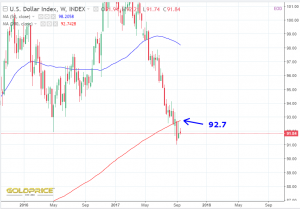
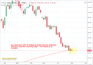
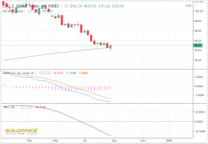
Just above the 50 week moving average and seemingly unable to hold onto 93. The bulls and bears are fighting it out tooth and nail. This price area looks to be pretty decisive. A significant move in either direction should lead to a resolution of this PM ‘coiled spring’.

And a reminder of where I think we’re going. Gold in Australian Dollars…

Trump Pulls Out Of Iran Deal

A turning point in the markets ?

Dollar Stabilising ?

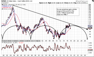
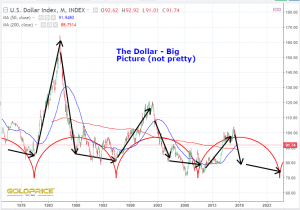
Another way of thinking about it would be to say that the Dollar Index is stabilising at lower values. It can either trend towards zero and oblivion, rocket skyward, and also cause chaos, or stabilise. One thing is clear from this chart, the amplitude is decreasing. The difference between cycle lows and cycle highs is becoming less and the upper and lower, curved black lines are levelling out.

Rambus Article – Some Thoughts

If you haven’t read the Rambus post, that Fully highlighted earlier, you really should. It gives a superb, and in my view, vital, alternative scenario. He’s clearly hugely experienced, and this gives great balance to a lot of the gold bull/dollar bear possibilities. I use that term ‘possibilities’ deliberately, because the future is rarely clear-cut. I have a strong bias, expecting a gold bull into 2026 as you may know, but closing your eyes to all other possibilities would be foolish.

So, getting to the point. The ONLY thing I can think of that I would question, is why use a log chart for the dollar index. I do it often enough, but surely, from a mathematical (and therefore, charting) point of view, the only reason to use a log chart is if the thing you’re charting is behaving in an exponential fashion. Gold for example, or the stock market. If it’s numerical value is changing by orders of magnitude (you keep needing to add another zero to the numbers), then a log chart is valid. That’s not the case with an index like the US Dollar. Quite the opposite in fact – the DXY has been peaking at 100 to 160 for the last 3 cycles/50 years.

If that’s the case, perhaps the reason the dollar has bounced here lies elsewhere. In fact, I showed it on two separate charts yesterday. If you use the more appropriate, non log, linear chart scale, we are nowhere near hitting that resistance/support line yet (extension of the black line on my chart below). But, and this is the interesting bit, we are bouncing at a confluence of the long term horizontal support and rising, bull market uptrend. Here’s the chart (note the meeting of the red lines and then the blue lines)…

So, there are three things I’d conclude,

1). This is exactly what happened last time, and it didn’t stop the dollar bear cycle unfolding

2). Either way, it amounts to the same thing – the dollar needs to drop here for the gold bull to really get started

3). If it doesn’t, we’re screwed

Am I Imagining This ?

If I am, just say and I’ll shut up. It’s been nice to see some PM follow through today, and the dollar, once again turned away from the 50 week moving average after yesterdays close shown below…

Anyway, back to the point. The more I look, the more convinced I am, that a big move is coming. Bigger than many expect, and very soon, as in days/weeks. We’ve seen the silver COT positions lately, and we know various markets are at crucial technical ‘hotspots’. A convergence of markets on important resistance/support/moving averages etc (like the dollar chart above). I could be completely wrong, but I’m sensing an end to the boredom. Here’s yet another chart that points to a massive build up of pressure (market forces). We could be about to see PM’s flushed down the toilet, but my money is on a rapid spike upwards for all the reasons I’ve been documenting. Here’s the SLV chart, with Bollinger Bandwidths added…

Seriously, at this rate, the SLV price chart will be a flat line in a few weeks. Another apex dead ahead, combining with a cyclical upturn, historically low price volatility, dollar pushing the limits of what is historically permissible during it’s cyclical bear, COT’s etc, etc. If those aren’t setting the alarm bells ringing, nothing will.


FOMC Reaction

Well, whether it was hawkishly dovish or dovishly hawkish, it seems to have had the desired effect. Let’s see if it follows through in coming days.

And that 50 week moving average was tagged to perfection…

I’m not saying we’re in the clear, but it’s a good start. The battle continues…

Edit: 

PM’s puked into the close as the dollar broke through the 50 week moving average. False moves ahead of a proper reversal tomorrow ? fakeout ?

shakeout ?  what the hell do I know ? Time for a beer, before I go completely crazy !


Fireworks ?

Is it just me, or could we have quite a big reaction here ? It feels very significant to me.

Gold Is Close To All Time Highs

Gold is traded in dollars (traditionally). That is slowly changing though with (for example), the Shanghai Gold Exchange, and increased trading using local currency in Asia. I noticed that my portfolio value hasn’t really dropped in the last few weeks. In fact it went up 2% in the last fortnight or so. I keep forgetting that my balance won’t necessarily alter as the dollar value of PM’s and the rest of my investments changes. The weaker pound has seen the GBP value go up. This is the gold price chart we’re all used to seeing, still $600 or approx. 30% away from the peak in 2011…

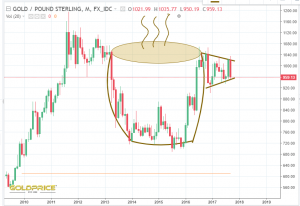
But in GBP it’s about £200 or 20% off the highs…

This got me thinking. Gold is mined in places like Canada, Australia and South Africa, and many other places outside the US. If the ‘value’ of gold is doing well in those areas, that must surely be a positive for them because they pay all their wages and local costs in the currency of the country they mine in (as far as I know). Some experts in this side of the equation might want to comment here. But, in many cases it looks like gold in other currencies is ready to make new all time highs. Another way of looking at this is to say gold is static, stable and constant, all fiat currency is losing value when measured against it. It takes ever increasing amounts of paper to get hold of a nice shiny gold coin.
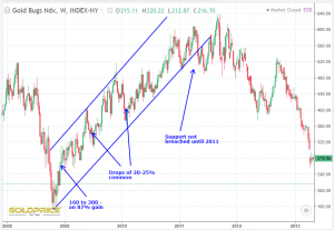
Here’s gold in Canadian Dollars just about 10% off new highs…

In South African Rand it’s about 17% off the highs now…

In Aussie Dollars were almost there, just another $50 (less than 3%) to go, then it’s blue sky…

One by one these are going to break out during this cyclical upturn in commodities (in my view). This may also help to explain the relative strength in the miners at the moment. It’s a very good sign.
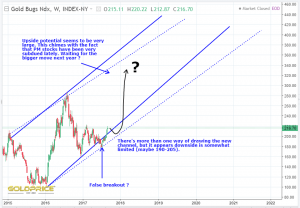
This brings me back to our current ‘mini crisis’ with a rising dollar and falling gold (priced in US dollars). I’m a good deal less worried after taking a look back in history at the behaviour of the dollar index during its last cyclical bear. RTV prompted me with his excellent chart. I hope he doesn’t mind me reproducing it here…
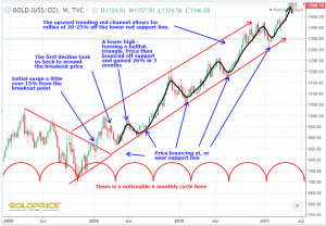
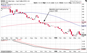
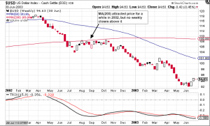
As you can see the dollar behaved exactly as expected and hit it’s cycle low, and bounced up and out of it. The (very) important question now is, just how high will the dollar go and for how long ? Dollar bulls, no doubt, think we could see a rising dollar for week or months, with some believing we’ll see new highs. After looking at the evidence, I think we could see the dollar roll over much sooner than that. Let’s have a look back and see what happened in this exact situation in 2002…

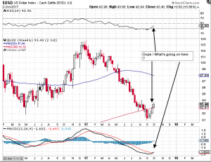
So we hit the apex, bounced, and almost immediately resumed the plunge. We’d barely even moved out of the cycle low. This is the same chart for today…

Will the 50 week moving average be the turning point ? I’m not sure, but the evidence strongly suggests trouble ahead for King Dollar.

That’s more than enough from me. I’m quite excited to see if this plays out the way I think it will. Think I’ll grab a strong coffee, and chill out for a bit.


Gold Cycles

I know that some real cycle experts read the articles here, so they may help to shed some light on this. I haven’t seen very many posts highlighting golds daily/weekly cycles. I’ve been trying to analyse the last 2 or 3 months in terms of short cycle counts, and, to be perfectly honest, unless I’m missing something, I just don’t see anything that is really useable. Every time you think you you’ve identified a cyclical pattern, it fails and heads in the ‘wrong’ direction. Zooming out, the cycles become much clearer and more definite.

This all makes perfect sense to me. It’s a bit like trying to forecast the weather for 2 weeks ahead. Say May 15th. It’s possible to say with some degree of confidence that the trend is towards higher temperatures and lower rainfall, but that individual day may turn out to be the same temperature as today, with some light rain showers. That means that the day to day forecast is almost impossible, but on average, the 13th, 14th and 15th May are warmer and drier than the 1st, 2nd and 3rd.

Put another way, larger, longer term trends are much more powerful and will tend to prevail. Short term hourly or daily fluctuations are much weaker and easier to get completely engulfed by outside influences.

The USD – A Crucial Point Coming Up Right Now

From an earlier post…

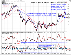
The 50 week moving average needs to stop this advance. If it doesn’t, all bets are off and the dollar cycle is going to be very right translated, which is very bullish and could indeed take it to 160. Nail biting stuff if you hold PM’s. Here’s a close up of the action…

One clue could be the stocharstic indicator. It’s into overbought territory on daily/weekly/monthly and even this 5 year timescale…

Only when you zoom out to the 20 year timeframe does the stocharstic show low values. Notice how it behaved during the last dollar bear cycle…

This is a massive test for the dollar. The bulls and bears will be watching this very closely, because a turn down from here will open up the possibility of a move back below the long term support that gave us this bounce in the first place. That would be the final nail in the bull case.

Aussie Dollar – The Bigger Picture

I don’t like the short term chart. It’s bearish and shitty. So let’s zoom out, and see if there is any hope on the horizon. Turns out there might be. Major support in the 73 area (approximately another 3% drop from here).