A Look At GDXJ
Following Fullys earlier GDXJ chart, which appears to show a possible breach of support, I thought I’d have a closer look. On a shortish time frame, linear chart, it doesn’t look too promising, but these patterns build out over quite a long time, so I believe the log charts are often better. That’s because everything ‘financial’ out in the real world is growing exponentially (money creation/debt etc). This is what I see…
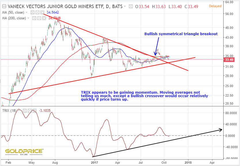

This is another chart that says a move is coming very soon, just like the dollar and gold charts. It feels like we’re always waiting for ‘THE’ move to happen, but it’ll only be hindsight that confirms all of this. Keep an eye on the support line on my first chart. We really don’t want to see that broken. That wouldn’t be good. Not good at all.
Love that second chart !!
Good stuff Northstar. And to think that the masses are unaware of the highly anticipated move.
nice , looks like low volume with sideways chop better than the previous low vol drop. Sideways too long and gravity prevails. dji,s&p need some study as they are our nemesis.