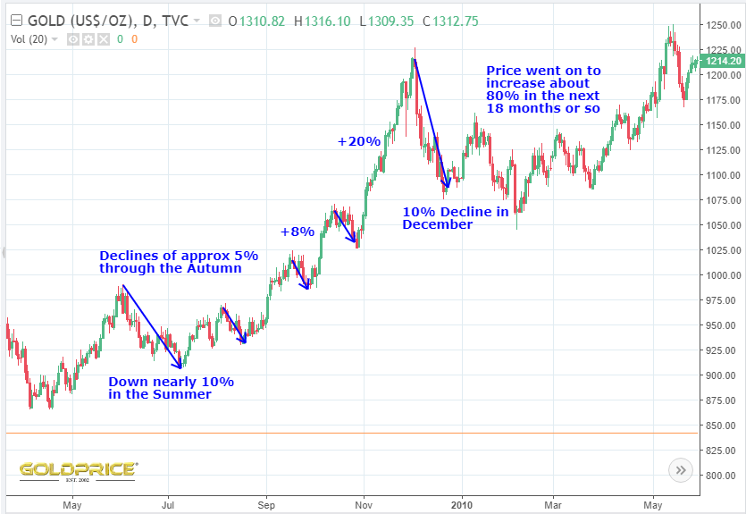
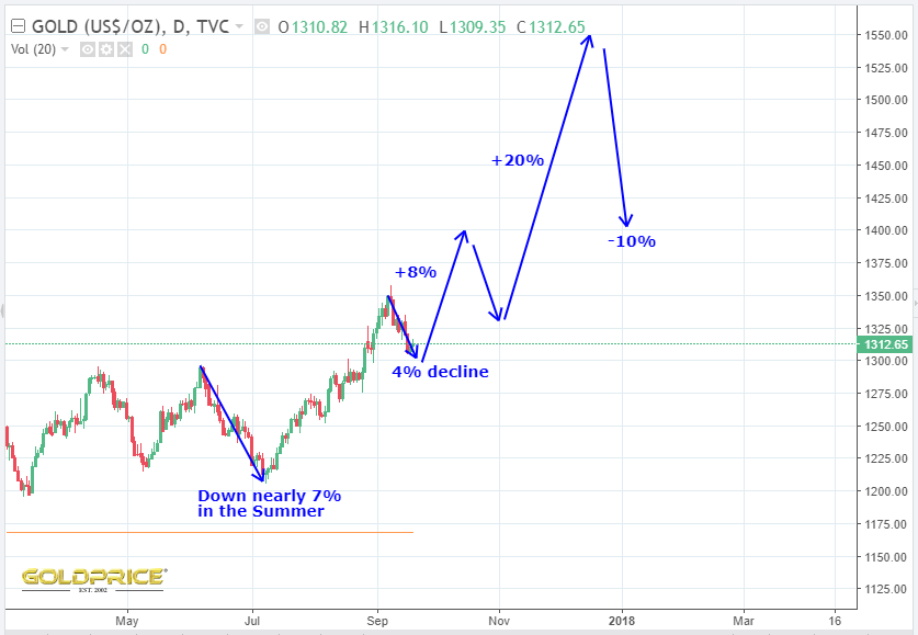
2009 – A Useful Guide ?
Well, whilst we’re waiting for Fed fireworks, I thought I’d have a closer look at 2009 price action in gold. In general, the pattern from 2007 onwards has been a very good fit for our current recovery from the late 2015 bottom. Just for fun, if we follow the action in the first chart, it gives us what you can see in the second chart. No particular reason why it should match exactly, but it’ll be interesting to see how things unfold…