>GOLDTENT< WE CAME FOR THE GOLD
LGB ..YES
LIBERATION DAY
COMPLETELY SHATTERS THE VACCINE INDUSTRIALCOMPLEX
SIX WAYS
THE NAZIS NEVER WENT AWAY
JOIN THE DISCUSSION
Goldtent TA Paradise
GOLDTENT THE MOVIE
GOLDTENT STATEMENT OF NON VIOLENCE
WE ARE THE MEDIA
READ OUR DISCLAIMER
THE WIZARD OF RAMBUS
CONTACT
ZIONISM NEOCONSERVATISM AND AMERICAN HEGEMONY
DEEP STATE STARTED THIS WAR
THE UNIPARTY UNMASKED
JEFFREY SACHS EXPLOSIVE TESTIMONY AT THE EU
O CANADOGE
THIS IS WHAT DRAINING THE SWAMP
MAJOR STUDY CONFIRMS
$CANADIAN GOLD PRICE
THE DEEP STATE AND TRUMPISM
CANADIAN GOV'T FORCED TO ADMIT
2 MEDICAL BOMBSHELLS
COMPLETE COMPENDIUM
WACKOS
CATASTROPHIC BOMBSHELL
Polls
 Loading ...
THE CHOSEN ONE
EIGHT DYING PRESIDENTS
MEDIA BIAS CHART
TRUMP TRIUMPH
WARPSPEED STOPPED THE FEMA CAMPS
MASS TRUMP PSYCHOSIS
THE WOLFOWITZ DOCTRINE
WHAT'S ACTUALLY IN THE "VACCINES"
THE CULT OF MODERN MEDICINE
MASSIVE STUDY : WORLDWIDE EXCESS DEATHS
HOW MANY VACCINES ??
A REPUBLIC VS A DEMOCRACY
NUCLEAR WEAPONS ARE A FANTASY
WHEN THE FINANCIAL SYSTEM IMPLODES
NO VACCINES HAVE EVER SAVED LIVES
CANADIAN TREES CLEAN 10 MORE CARBON
THE THEORY OF EVERYTHING
THE OBLITERATION OF VIROLOGY
THE PARASITE PARADIGM
SHEDDING IS REAL
A BRIEF HISTORY OF THE ISRAELI PALESTINIAN REGION
"ORGANIZED" RELIGION
DEFINE WOKE
1000 PEER REVIEWED ARTICLES
1.600 SCIENTISTS DESTROY THE CLIMATE GHOULS
VACCINES IN GENERAL
WHERE DID THE FLU GO ?
CANADIAN TRUCKERS FREEDOM CONVOY
* THE GREAT AWAKENING
CHOLESTEROL AND STATINS
THE GERM THEORY
PSYCHOPATHS
PCR TEST WAS COMPLETE BULLSHIT
JEFF CHILDERS
THE ANTI-VAXXERS
UM...SORRY GUYS BUT
BE YOUR OWN DOCTOR
- * DMSO HANDBOOK *
- * THE RANT *
- * THE UBIQUITOUS PHARMACEUTICAL SOCIETY
- 100% CANCER REMISSION (MONOCLONAL ANTIBODY)
- 2ND SMARTES GUY CANCER PROTOCOL
- ANTI PARASITIC DRUGS SHOW STRONG ANTI CANCER EFFECTS
- ANTIPARASITIC VETERINARIAN DRUGS SHOW PROMISE FOR CANCER TREATMENT
- BLOOD PRESSURE SCAM
- BREST CANCER AND THE VAXX
- BRUSH YOUR TEETH DAMMIT
- C D S ( CHLORINE DIOXIDE SOLUTION )
- CBD GUMMIES AND TIGER WOODS
- CHLOESTEROL : A BIG PHARM BIG CON
- CHLORINE DIOXIDE DETOX
- CURCUMEN
- DISSOLUTION OF SPIKE PROTEIN ( NATTOKINASE)
- DMSO : MIRACULOUS PAIN TREATMENT
- DMSO2
- EARTHING
- FENBENDAZOLE Q AND A
- FIBROUS BLOOD CLOTS TREATMENT
- FLCCC VACCINE DETOX PROTOCOL
- HEALING POWER OF ILLNESS
- HEALTHY GUT BACTERIUM MICROBIOME
- INFLAMATION
- IT'S DEPRESSING : ANTIDEPRESSANTS KILL
- IVERMECTIN AND FENBENDAZOLE TO PREVENT CANCER
- IVERMECTIN PILLS HERE
- IVERMECTIN PROPHYLACSIS
- IVERMECTION CURES CANCER ?
- LIPITOR WARNING
- METHYLENE BLUE
- MICRODOSING LITHIUM BOOSTS YOUR BRAIN AND PREVENTS ALZHIEMERS
- MRE ON DMSO
- NATTOKINASE …SPIKE DETOX
- NATTOKINASE : THE HOLY GRAIL FOR SPIKE DETOX
- NATTOKINASE DISOLVES MICROCLOTS
- NEW STUDIES AND PROTOCOLS
- Ranking the Top 19 Terminal Cancer Repurposed Drugs
- SHEDDING IS REAL : WHAT CAN YOU DO ABOUT IT ?
- SSRI ANTI DEPRESSANTS ARE A HORROR STPRY
- TETANUS
- THE VEGAN SCAM
- TOP TEN DETOX ITEMS
- TREATING COPD NATURALLY
- TREATING COPD NATURALLY
- UVBI ( ULTRAVIOLET LIGHT BLOOD IRRADIATION )
- WHY HERBS AND SUPPLIMENTS WORK ( McCULLOUGH)
- YES VIRGINIA..A CURE FOR CANCER
THE TREE OF SHARED INFORMATION
BAD BATCHES
THE SPIRITUAL REASON
17 THOUSAND PHYSICIANS AND SCIENTISTS
WHY SOME HAVE ADVERSE REACTIONS AND OTHERS DON'T
WHERE DOES ELECTRICTY
GEOGRAPHICAL WONDER
THE REAL ANTHONY FAUCI
ANTIVAXXERS
* WELCOME TO FORT DETRICK
* STATISTICAL TRICKS
* THERE IS NO CLIMATE EMERGENCY
* THE BASIC LAWS
* TOM LUONGO'S THESIS
* ADVENTURES OF GOLDBALLON
- **THE COMPLETE WORKS OF THE ADVENTURES OF GOLDBALLOON
- ARTIC SKIING IN RUSSIA
- AZERBAIJAN ROAD TRIP
- CHECHNYA
- COMPLETING THE LOOP IN TAJIKISTAN
- DIOMEDE ISLANDS : FROM USA TO USSR IN A BALLOON
- ENNEDI CHAD
- ENNEDI MALI 2
- FAIRY MEADOWS
- FROM THE ROOF OF THE WORLD
- ISTANBUL AIRPORT ART
- KALININGRAD
- KAMCHATKA
- KARELIA RUSSIA'S REMOTE NORTHWEST
- LITHUANIA LOVES UKRAINE
- MIDNIGHT AT THE OASIS
- MONGOLIA
- MOROCCO
- MOROCCO2
- MOSCOW FEB 2023
- NECTAR OF THE GODS
- NORTHERN PAKISTAN
- ON TARGET FIXATION
- PARMIR MTNS TAJIKISTAN
- SEVASTAPOL CRIMEA
- SEVESTOPOL CRIMEA
- SIBERIA 2
- SKIING IN SIBERIA
- SPRING IN mOSCOW ( ANOTHER LOOK)
- ST PETERSBURG RUSSIA 2014
- ST. PETERSBURG RUSSIA
- STONED
- TAJIKISTAN
- TAJIKISTAN 6
- TAJIKISTAN PARMIR MOUNTAINS
- TAJIKISTAND MOUNTAIN CLIMB
- THE BALKANS
- THE CRADLE OF CIVILIATION
- THE INTERVIEW
- THE LAST OF THE SIBERIAN SNOW 2024
- THE MIDDLE OF EVERYTHING
- THE STONES AND THE DOORS
- TIKSI SIBERIA
- TOP OF THE WORLD PART 2
- TREAVELS AT THE EDGE …MOROCCO
- TRUCK ART
- TURKEY 3
- TURKISH DELIGHTS
- TURKISH DELIGHTS
- UKRAINE 2015 …UNBOUNDED BEAUTY
- ULAN-UDE RUSSIA
- WINING AND DINING IN FRANCE
- YAJIKISTAN : GOING DEEPER
- YAKUTSK
- YAKUTSK SIBERIA
* MASKS HARBOUR PATHOGENIC
* WHAT IS A WOMAN
* WUHAN MILITARY GAMES
* OPTIMISM
* THE FREEDOM CONVOY
* NATURAL IMMUNITY IS KING
* 34% OF CANADIANS UNVAXXED
* COVID: ISRAEL VS PALESTINE
* THE THREE STAGES
* 100 MILLION AMERICANS
* GROUND ZERO
* COVID VACCINES CANNOT WORK
* HISPANIOLA
* PUBLIC HEALTH
* WHO ARE THE VAXX REFUSERS
NATURAL VS ARTIFICIAL IMMUNITY
THE ORIGINS OF COVID
POSTING INFORMATION
2009 – A Useful Guide ?
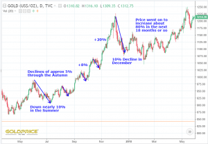
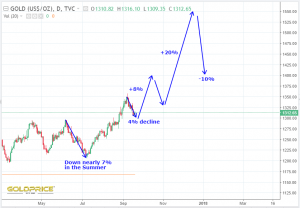
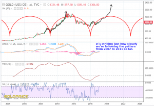
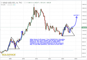
Well, whilst we’re waiting for Fed fireworks, I thought I’d have a closer look at 2009 price action in gold. In general, the pattern from 2007 onwards has been a very good fit for our current recovery from the late 2015 bottom. Just for fun, if we follow the action in the first chart, it gives us what you can see in the second chart. No particular reason why it should match exactly, but it’ll be interesting to see how things unfold…
GDX – Shorter Term Prospects
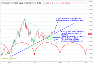
Are not so rosy. At this point I think it could go either way. Geo-politics may play a big part, as well as the continuing dollar struggles. I’m pretty confident longer term i.e. that the big picture trend is up. I’m less confident about the next 2-3 months. There is considerable evidence to suggest a downtrend developing into a December low. The question remains, do we go straight down from here, or, maybe more likely, up first and then down. It may turn out that any down move is very limited, but the chart below shows a couple of potential targets to bear in mind. How things play out over the coming weeks will determine the starting point of my first green up arrow in my earlier post. I certainly wouldn’t take my earlier chart at face value either, it’s intended to suggest the overall trends of upward price action and weakness going forwards, coupled with the fact that I think we will be making new highs in the next 2-3 years, or at the very least, challenging the old highs.
Perspective
Things could be choppy for the next few weeks/months. I’m fairly confident we’re going to see some sort of low point in December. What happens between now and then I’m less sure about. We’re probably getting close to a short term low, and it remains to be seen how much we can recover before that end of year low. I will acknowledge that greater forces could take hold and prevent that end of year dip from being a big deal – it’s something to be aware of though, and prepared for. The 2007 to 2011 analog is a very close match at the moment. If it were to hold, we wouldn’t see that end of year dip. I’ve included that chart below, as it’s worth being aware of. My preferred ‘model’ is weakness into year end, but I, for one, will be quite happy if it doesn’t happen.
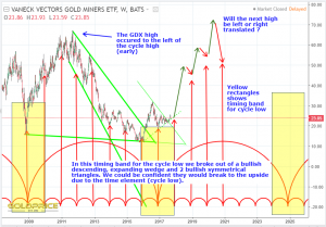
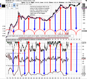
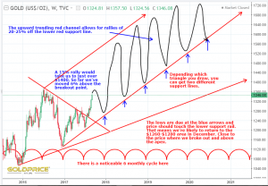
The second chart below shows quite clearly (I think), how the cycles are crucial. They act like a magnet drawing price up into the cycle high and repelling price back down into the cycle low. This chart is telling us in simple terms that the price pressure is upwards for the next few years. Sit tight and be right
Looking Down – Getting Mentally Prepared
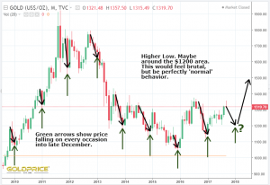
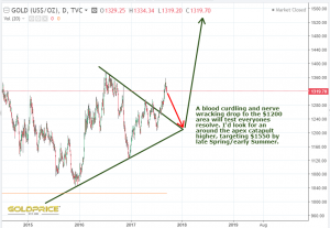
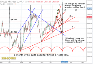
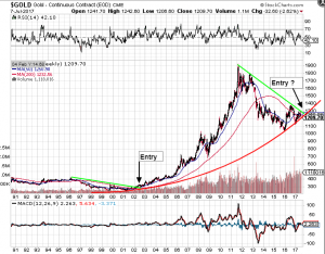
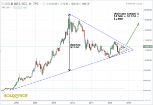
I’m a little bit disappointed we didn’t get closer to $1400 on this latest rally, and there may still be a possibility we reach higher in the coming few weeks. However, I’m expecting the long running history of late December lows to take us through a very frustrating period. I’m sure there will be a lot of pessimism around and bearish articles. The dollar will, no doubt stage some sort of ‘relief rally’. I haven’t looked at dollar resistance levels yet, but it may begin to feel like we’re backing a loser here in the tent. If you look at the charts below, you can see that in the grand scheme of things, a drop to $1200 would be nothing out of the ordinary, and give us a higher high. That crucial symmetrical triangle has one last role to play – to draw price to it’s apex before the rubber band finally catapults price to $1550, with all that stored potential energy. That’s my working theory – we need to be mentally prepared for this. Now lets see how it plays out
De-Dollarization
I think we already knew this, but a timely reminder http://www.zerohedge.com/news/2017-09-16/suddenly-de-dollarization-thing
PM Stocks – Less Downside ?
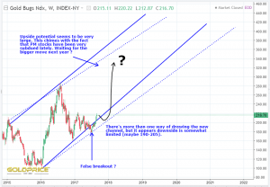
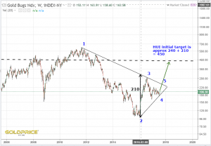
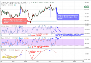
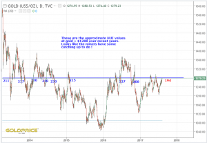
In response to a couple of very good questions from Mamare and Gallo, I’ve had a look at what we might reasonably expect from PM stocks if we see similar behaviour to 2009-2011. The first thing to note is that drawing the support and resistance is open to interpretation. However, the end result is much the same. We don’t really want the support line to be broken of course. That means the downside should be very limited. The stocks would be outperforming the metal if we see $1250-$1280 gold and the HUI support line holds. The upside is very big at this point. I’m using linear charts here, so if we get a ‘parabolic’ move developing at any point things would get even more interesting. At this point though I’m going to avoid getting carried away, and just focus on a move similar to 2009-2011. You need to remember that we have many more years of ‘bull’ to go (into the mid 2020’s), and we’ll get some ‘scary’ corrections along the way. This trend channel could be a good guide to get us going though. Here’s my two charts to ponder…
Looking Down As We Go Up
As I’ve said many times, I believe we are still in the early stages of an exciting new gold bull. I’ve also said that as we march upwards, I’m going to be looking down so that we don’t panic every time there’s a normal correction/consolidation.
Spoiler Alert – I think we are going back to the $1260-$1280 region by December
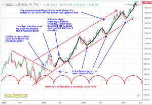
I’ve been looking very carefully at the most recent point on the gold chart that fits with where we are today. That’s the breakout in 2009.
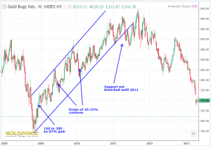
The following chart shows that period and what followed. This is really important, because if, as I believe, this is a good guide, it can give us some really useful clues about what to expect if we have a healthy bull ahead of us.
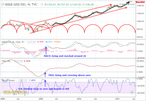
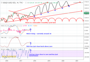
Superimposing all of that onto current price action gives us this as guide…
The ups and downs appear more exaggerated, but that’s just because the scales are slightly different. The recent rally out of the bullish triangle may have a little further to run. I looked more closely at how the indicators are lining up compared to 2009…
We appear to be getting close to a short term top. When price turns, and it may already have peaked, it’s a slide back to that support, wiping out most of the recent gains. We need to be realistic in our expectations – after that December low, we’re likely to see a much bigger surge in price. Rome wasn’t built in a day as they say. I’ll just sign off by sending my thoughts to anyone in the path of any of the terrible hurricanes heading through the Caribbean and towards the US, as well as large parts of South Asia. With recent, significant sea level rise, places like Miami are, in time, going to be unfit for habitation. It’s a very sad position we find ourselves in.
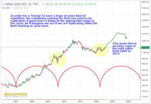
Fractal Of Hope
Still plenty of non-believers. Every correction/consolidation should carry on getting people worried for a while yet. It’s early days in the new (or continuing) bull. The charts have been screaming breakout and rally for months, with nothing (to my mind at least), supportive of a meaningful move down. Things can happen to catch us out though, so I never say ‘never’.
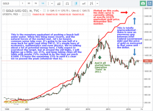
The following chart shows why I think the 2008/09 pattern may well be a fair guide as to where we may be going. For a pattern to repeat it needs a repeat of the environment which caused it. I believe we are at a very similar point in the gold cycle which will push price up as it did then. There are a million things that could make it rise at a different rate (most of them making it rise faster). However, I drew over the top of the 2008-2013 move and copied it across to the present day. It’s one possible roadmap. Interestingly it takes us to the $1500-$1550 region by April and then on to somewhere around $2500 in 2020. I think the biggest likelihood is that we will overshoot this by some distance. I’ll call this my fractal of hope.
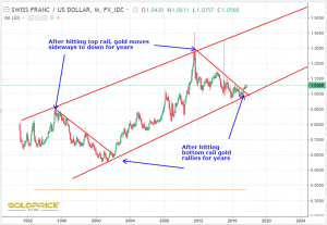
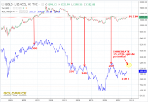
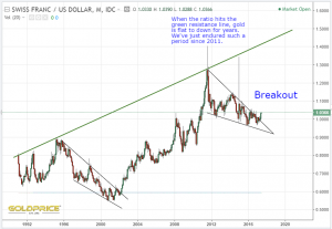
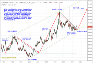
Just for good measure, here’s an update of the CHF/USD ratio chart that I’ve posted a couple of times.
Taking Stock
Actually, if we’re talking about PM stocks, I’d take as many as you can ! So where are we now ? This is a huge pattern we have in gold and the dollar.
Both go back for many decades, and have been following some great cyclical and ‘chartology’ rules. On a shorter timescale (days/weeks/months) things happen to move price against the expected trend, but, in the end, the larger forces win out. Unless I’m missing something, we’re embarking on a very big move for gold and the dollar (and many other asset classes). Every dog has its day I guess. What we want to see now is a steady uptrend in price with ‘bull flag’ type consolidation on the way up to the $1550 region.
The mainstream haven’t caught onto this yet, and very little is being made of the dollars predicament. That’s all good. As awareness rises, it’ll add fuel to the fire. From a charting point of view, it doesn’t get much clearer than the following two examples…
As always, I’ll be keeping an eye on support levels (looking down as we go up), but at this point, I’m comfortable that we can expect an upward trend for PM’s into 2019/2020, with normal pullbacks before the first big correction, where I will probably exit some positions for a while. We don’t need to worry about that yet though.
Gold Open Interest…
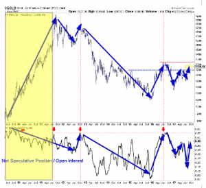
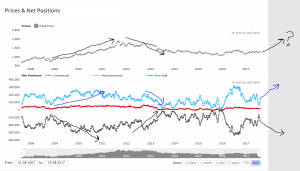
…Is getting quite high. Is that a problem ? Over recent years (bear market), the gold price and open interest have moved in almost perfect harmony. I was interested to see in the Daily Gold article by Jordan, that in the biggest and best part of the previous ‘bull run’ in 2009/2010/2011, the OI had previously reached a high level and declined steadily throughout, whilst gold doubled. Therefore, it might be reasonable to expect it to rise to a high level again, in preparation for a long and steady decline whilst gold doubles again. Just an idea
Edit: Chart above courtesy of Daily Gold (I’ve added the yellow rectangle and blue arrows).
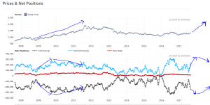
Net positions shown below (forgive the ‘scribbles’, but you get the idea).
Historic Weather Events
The incredible scenes in Texas over the last few days are indicative of what is to come. My heart goes out to communities worldwide who are being affected, with around a hundred times as many fatalities in southeast Asia over recent days compared to Texas, and getting very little media coverage here in the UK for some reason. Global surface temperatures are rising steadily (and faster than some of our more ‘hopeful’ models). Sea ice melt is now accelerating and has passed the point of no return. The arctic will be ice free in just a few years, allowing commercial shipping to route directly across the geographic North Pole. Sea levels will rise disastrously. For those of you in the US – keep an eye on Miami – its fate will befall many coastal cities globally during the lives of our children and grandchildren.
Damaging weather systems draw their energy from the oceans. Just a one degree temperature rise in ocean temperature is enough to dramatically increase a storms destructive power. Imagine what a 3, 4, or 5 degree rise will do. Its basic, junior grade physics. Warm air can hold more moisture than cold air. The air above our planet (up to 60,000 feet above the Earth surface) is getting warmer. It can hold trillions of gallons more water than it could 50 years ago, and in 10 years time, it will be capable of holding trillions more. Severe weather events will become more severe. It really is simple physics.
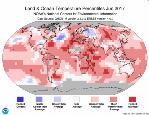
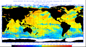
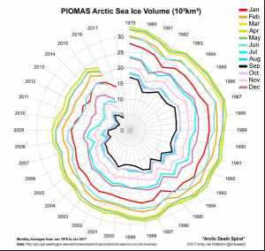
First image shows global temperature anomalies – basically its getting warmer. Image 2 shows that the oceans away from the poles are warming. Closer to the poles they’re cooler than normal – just what you’d expect with all that melting ice pouring into the oceans in those regions. Image 3 shows the rapidly decreasing sea ice volume in the Arctic.
There will continue to be skeptics, but I’ve been in weather and climate science for 30 years now. It may be natural, it may be anthropogenic, but it IS happening, and we WILL pay the price.
Back to PM charts now
EDIT: This was to adequately answer Fullys question in my earlier post. Feel free to ignore.
Its More Than A Pretty Pattern
For anyone betting on gold/PM’s/commodities going down, and inflation staying low over the coming years…
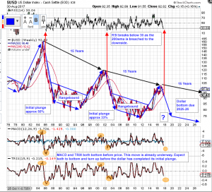
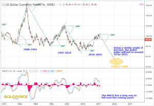
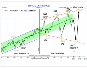
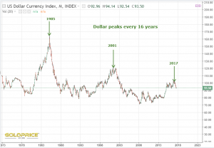
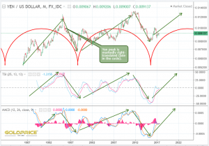
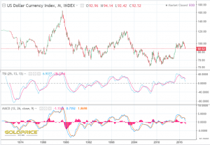
This isn’t just a pretty pattern. It’s a very long established, predictable, reliable currency cycle. The dollar cycle is key to where we’re going in PM’s and pretty much everything else. I fully understand the fact that the Yen/dollar ratio is a better fit with gold price movements, BUT, as an overall road map, it’s true to say that the gold price does not reach its peak at the same time as the dollar. There is an inverse relationship. Gold price highs in the 80’s, 90’s and more recently 2011 all coincided, roughly, with the dollar being at low points in its 15 year cycle. Bearing that in mind, and however you slice it, we are now past the peak in the current 15 year dollar cycle, and the targets over the next 6, 12, 18 and 24 months are all progressively lower. My guess, or estimate, is that we’ll plunge to somewhere between 50 and 75 in the coming 2 years, then a down-sloping range until the mid 2020’s. Overlaying the gold cycle on this will give us a target date for a peak in gold. It could be mid 2020’s but ‘right translation could take us into the late 2020’s. What is happening today/this week/this month is noise in the overall trend.
I like the fact that there are a lot of ‘worried’ posts appearing. We can’t do any of this without the ‘wall of worry’. If we’re feeling it, the big fund managers will be too. One step at a time. bullish wedge breakout – check, $1300 breakout – check, back tests – needed, followed by a much larger surge on high volume. If you’re betting against these developments, you’re betting against this…
Could this all important cycle just break ? Yes. Pretty much anything COULD happen, but just how likely would it be ? How could it be achieved, and what would it cost ?
The Dollar
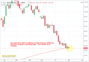
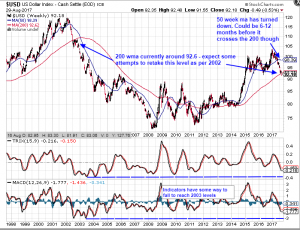
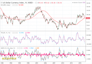
has regained it’s 200 week moving average.
To Da Moon Vs Cautious Optimism
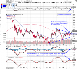
All joking aside, (and pictures of rockets blasting off). I keep saying ‘as we go up, keep looking down’. With that in mind, I’ve got a couple of charts here, with some simple notes on them. It’s really interesting to see the dollar trying to regain its 200 week moving average as I type. By the way, I mistakenly typed ‘dma’ the other day, when I meant ‘wma’ – apologies for that. Anyway, back to the point – if the dollar fails to retake and hold that crucial level, it will open the trapdoor, back to the 80 region, as Spock, Graddhy, and others have been saying for a while.
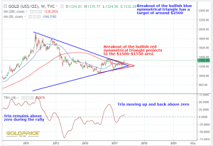
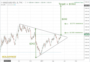
At the same time, gold is battling to hold above the $1300 area. Personally, I’m happier that this ‘battle’ is taking place today, rather than tomorrow. The monthly close is all important from a technical, charting perspective of course. With such quick moves, gold needs to work off some short term overbought indicators, with the dollar doing the same, but from an oversold point of view. Longer term charts all show the indicators some way to go before being overbought on gold or oversold on the dollar, as you can see below.
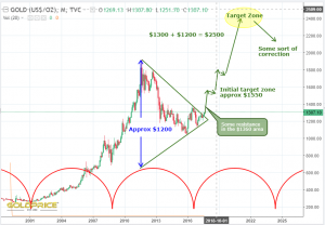
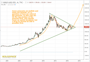
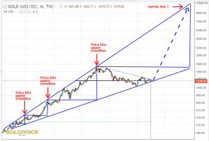
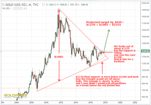
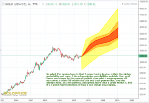
All we can do is let this play out. Once that triangle is in the rear view mirror, we can relax a little more. The bullish triangle in gold is much bigger than what I’ve drawn on the chart above, of course – I’ve just drawn the ‘important bit’. Once we get into the upper $1300’s and particularly the $1550 area, we can start to make some realistic assessments about how high we might get in the next few years. Once the direction of travel is fully confirmed, we can have another look at targets. My view is that we will easily make $1550, with $2500 highly likely, and then much higher targets with a low confidence level at this point So far so good. Lets see what the rest of the week brings.
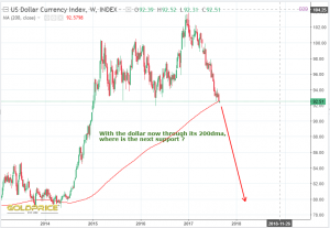
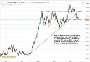
Dollar Loses 200dma – Fresh Air Below
OK, I’ll acknowledge there is a ‘non-zero’ possibility of a sudden reversal and the dollar regaining its 200dma, but it needs to happen fast. That’s a whole lot of nothing that it’s sitting on. Remind you of anything ?
Here’s how the chart looks…
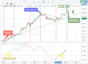
My next chart hasn’t changed much in recent weeks – I’m thinking $2500 is my favoured target, but we can keep this under review.
Not that I want to be a spoilsport, but, as I said a while back – as we go up, we need to keep looking down Wylie Coyote (the dollar) has a long way down, and soon, if it can’t grab onto that 200dma. Gold needs to bounce off the upper line of that symmetrical triangle on any pullback (currently somewhere near $1260). If it were to fall below that, we would need a serious rethink. As things stand though, it’s all progressing as expected, with the dollar and gold cycles doing the heavy lifting for us.
Pulling Together The Evidence
I’d like to pull together some charts that I’ve posted recently, which I think have merit. I’ll paste them all in below, and then we can try to draw some conclusions and put it onto one chart.
They’re roughly in the order that I posted them, and the first one was from early June…
So after all of that, what do I conclude ? Well, it appears to be on track for a continued drop in the dollar. It’s resting right on it’s 200dma, so we’ll know for certain very soon. The CHF/USD ratio has broken out and is telling us PM’s will rise. The gold cycle is doing its thing and providing a tailwind for us. There are various time and price objectives for gold. As Spock said in a post today, the earlier targets are ‘higher resolution, and the further out you go, the lower the resolution is. That’s another parallel with weather forecasting, so I’m going to finish with a graphical representation showing the range of possibilities going forwards as I see them. Once again, like weather forecasting, this is part art, and part science. I’m doing my best to fully acknowledge everything I’ve seen, heard and read, as well as using my own analysis, some of which you can see above.
The Dollar – This Is It
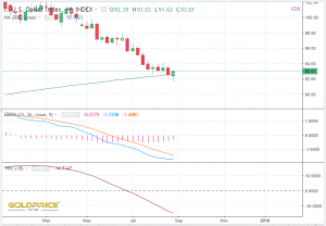
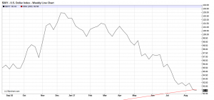
The mighty dollar is resting right on its 200dma…
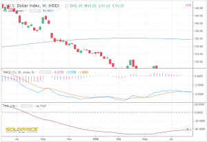
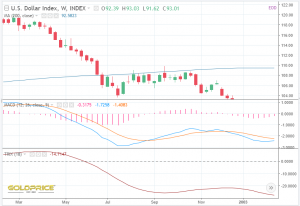
If it’s on the way to new highs it won’t lose the 200dma. If it drops from here, there really can be no more debate about whether or not the dollar cycle is still ‘working’. Just in case you think the TSI and MACD are very low and ‘ready to turn up’. Here’s the dollar index when you zoom out a bit – both those indicators can fall much further…
I’m not saying it’s impossible for the dollar to rally and make new highs. I’m saying that it’s a very low probability outcome. It’s hard to dismiss a cycle that has been in place for decades. If this cycle is still ‘working’, I’d bet my bottom dollar that the gold cycle is still ‘working’. If this is a once in 50 years ‘post bubble contraction’ then yes, the cycles probably will be disrupted. Game on.
Gold Target And Timing
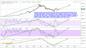
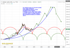
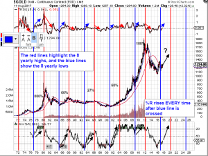
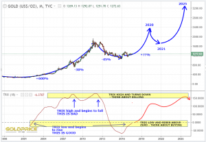
I’ve been looking more closely at the cycle timings and trying to achieve a ‘best fit’. I’m sticking with my target of around $2500, but I’m highlighting that it may be reached in Summer 2019. 2020 is still possible, it just depends how things develop into the cycle highs – they do have some ‘wriggle room’. There are other, even more ‘bullish’ interpretations, but I’m going to discount them unless things start to accelerate ahead of my expectations. We’ve seen another weekly close above the breakout (now support) line of the massive bullish symmetrical triangle. For that reason, I’m discounting any ‘bearish’ projections. If we find ourselves back inside the triangle, I’d be seriously worried. I don’t expect that to happen though. The dollar is locked into the down phase of its 16 year cycle, and gold is in the opposite position. The stars should be aligning here. The miners are still lagging, so once we clear the $1300-$1315 area, I would expect a surge in the miners and a big surge in silver, which has a lot of catching up to do. If I’m right, the next few weeks/months are going to be fun. Below is a log chart of gold, with the cycles shown by the red and blue lines at regular intervals. Notice also the TSI rising and crossing above zero for the first time in 16 years (as you would expect at the birth of a new cycle). Following a correction sometime late 2019-2020, I’d expect the final, spectacular phase of this bull cycle to commence, and then complete in the mid 2020’s. We can develop these thoughts as events unfold.
As I’ve already said, gold will need a VERY good reason not to rally hard here.

