Pulling Together The Evidence
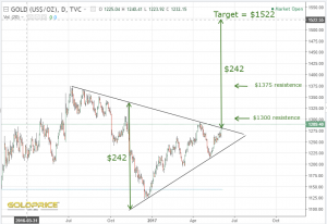
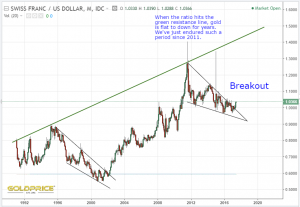
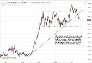
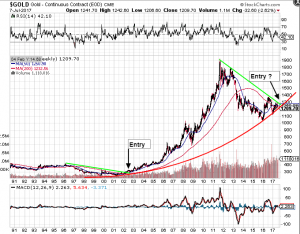
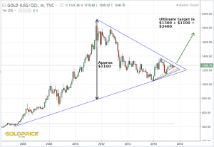
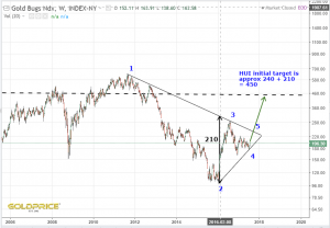
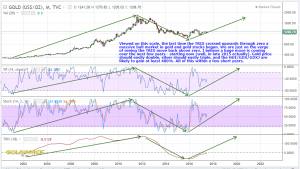
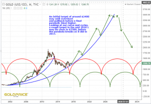
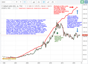
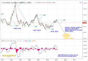
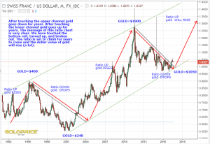
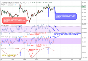
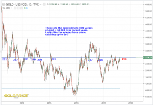
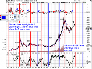
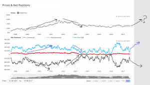
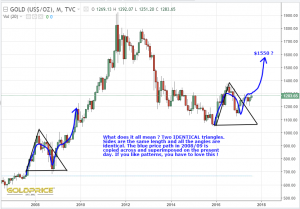
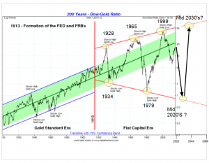
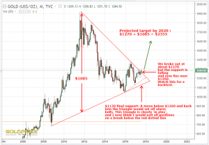
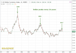
I’d like to pull together some charts that I’ve posted recently, which I think have merit. I’ll paste them all in below, and then we can try to draw some conclusions and put it onto one chart.
They’re roughly in the order that I posted them, and the first one was from early June…
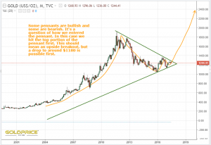
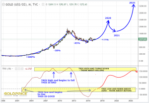
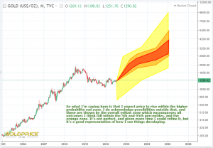
So after all of that, what do I conclude ? Well, it appears to be on track for a continued drop in the dollar. It’s resting right on it’s 200dma, so we’ll know for certain very soon. The CHF/USD ratio has broken out and is telling us PM’s will rise. The gold cycle is doing its thing and providing a tailwind for us. There are various time and price objectives for gold. As Spock said in a post today, the earlier targets are ‘higher resolution, and the further out you go, the lower the resolution is. That’s another parallel with weather forecasting, so I’m going to finish with a graphical representation showing the range of possibilities going forwards as I see them. Once again, like weather forecasting, this is part art, and part science. I’m doing my best to fully acknowledge everything I’ve seen, heard and read, as well as using my own analysis, some of which you can see above.
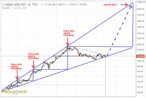
Beautiful summary. Love the monthly charts showing possible $10k range targets
Cheers Nick
Thanks. A real keeper. The suspense is real!
Thanks MM
I like the last chart, as it demonstrates the lower resolution higher level objective. As we progress the resolution increases.
Thanks Spock. I’m going to develop this further in coming weeks. Your analysis has been awesome.
Thanks Northstar! Appreciate all your hard work and effort!
Thanks. Team effort
Thanks Northstar. I think you had done more than enough of academic study and chart work. Now it’s time to sit tight and let Gold/Silver do the heavy lifting.
Yep. Time for talking is nearly over. The market needs to show itself