Banro Up Over 50% !
Well, this is nice…
Well, this is nice…
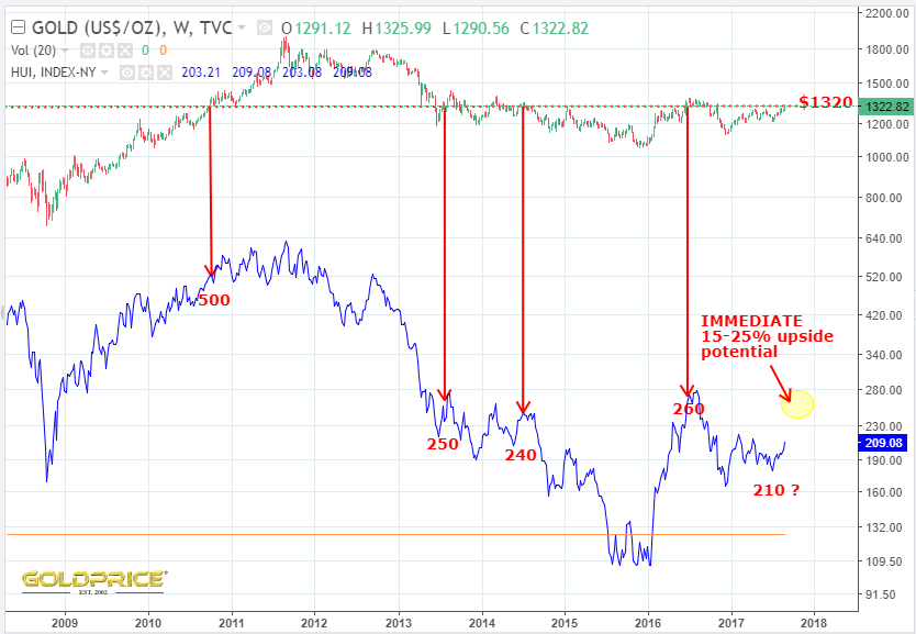
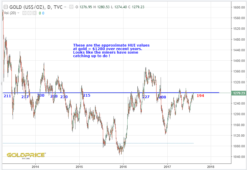
Interesting to see where HUI was at $1320 gold in the recent past. We could see 15-25% upside in the next day or two.
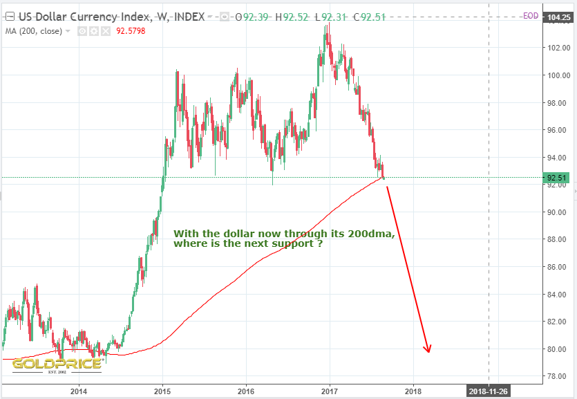
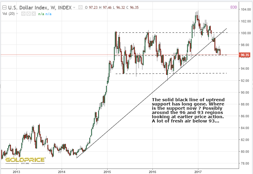
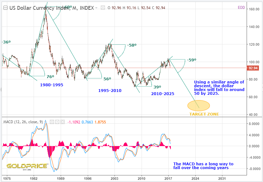
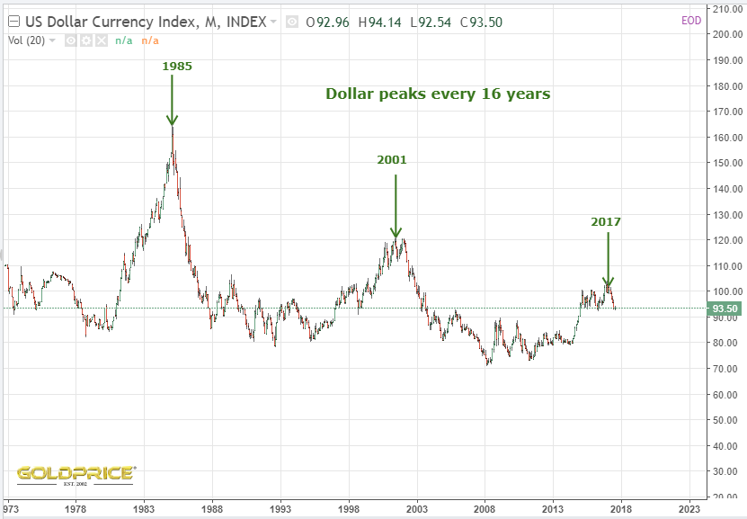
OK, I’ll acknowledge there is a ‘non-zero’ possibility of a sudden reversal and the dollar regaining its 200dma, but it needs to happen fast. That’s a whole lot of nothing that it’s sitting on. Remind you of anything ?

Here’s how the chart looks…
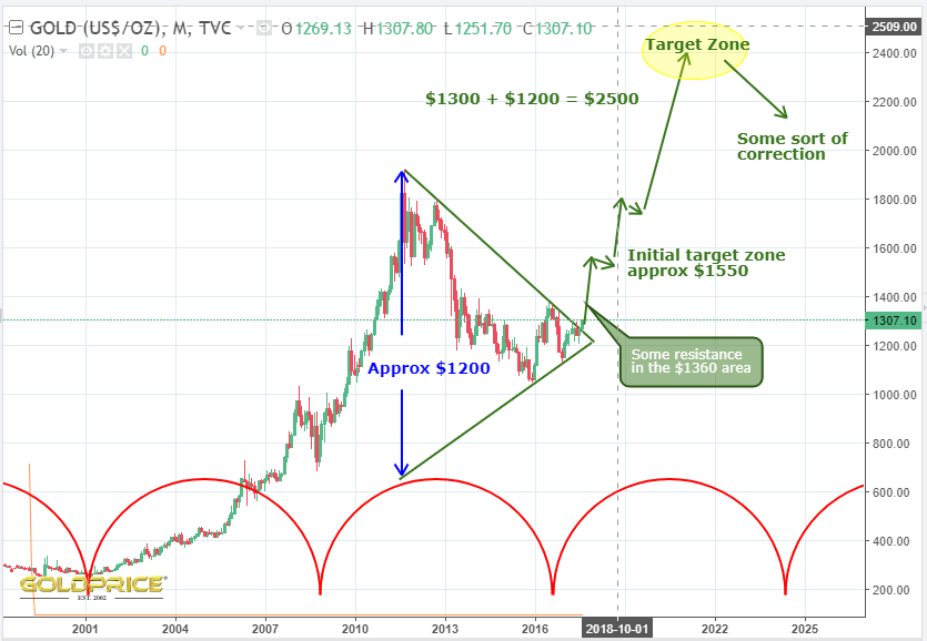
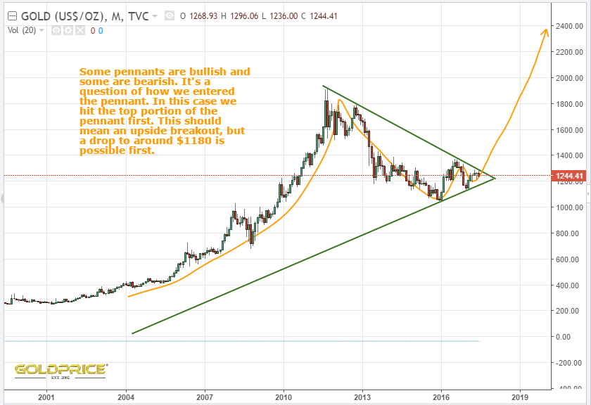
My next chart hasn’t changed much in recent weeks – I’m thinking $2500 is my favoured target, but we can keep this under review.
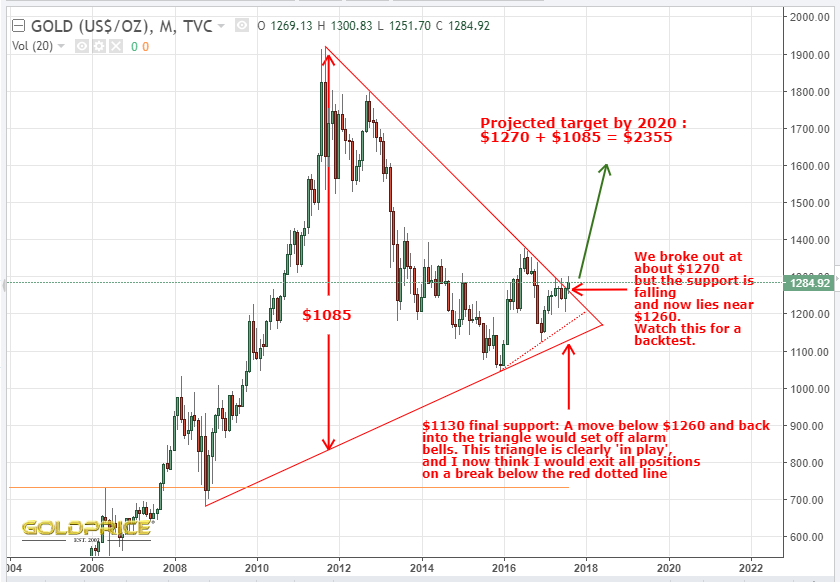
Not that I want to be a spoilsport, but, as I said a while back – as we go up, we need to keep looking down Wylie Coyote (the dollar) has a long way down, and soon, if it can’t grab onto that 200dma. Gold needs to bounce off the upper line of that symmetrical triangle on any pullback (currently somewhere near $1260). If it were to fall below that, we would need a serious rethink. As things stand though, it’s all progressing as expected, with the dollar and gold cycles doing the heavy lifting for us.

Ah, that feels better 
If this doesn’t reverse and close back above, the writing really is on the wall…
I’d like to pull together some charts that I’ve posted recently, which I think have merit. I’ll paste them all in below, and then we can try to draw some conclusions and put it onto one chart.
They’re roughly in the order that I posted them, and the first one was from early June…


 .
.
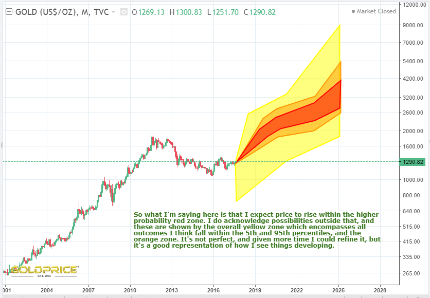
So after all of that, what do I conclude ? Well, it appears to be on track for a continued drop in the dollar. It’s resting right on it’s 200dma, so we’ll know for certain very soon. The CHF/USD ratio has broken out and is telling us PM’s will rise. The gold cycle is doing its thing and providing a tailwind for us. There are various time and price objectives for gold. As Spock said in a post today, the earlier targets are ‘higher resolution, and the further out you go, the lower the resolution is. That’s another parallel with weather forecasting, so I’m going to finish with a graphical representation showing the range of possibilities going forwards as I see them. Once again, like weather forecasting, this is part art, and part science. I’m doing my best to fully acknowledge everything I’ve seen, heard and read, as well as using my own analysis, some of which you can see above.
Keep it simple. It’s all in the chart
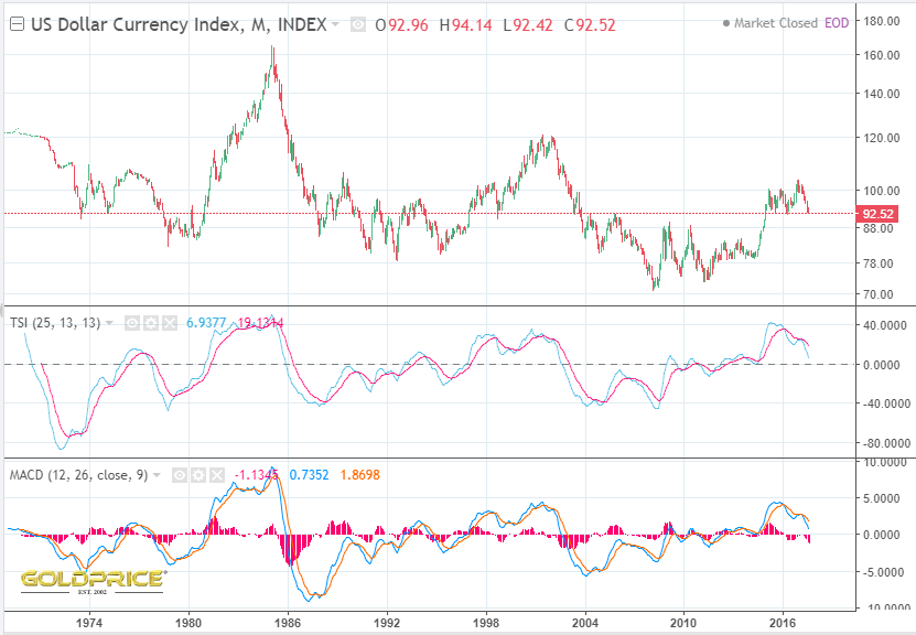
The mighty dollar is resting right on its 200dma…
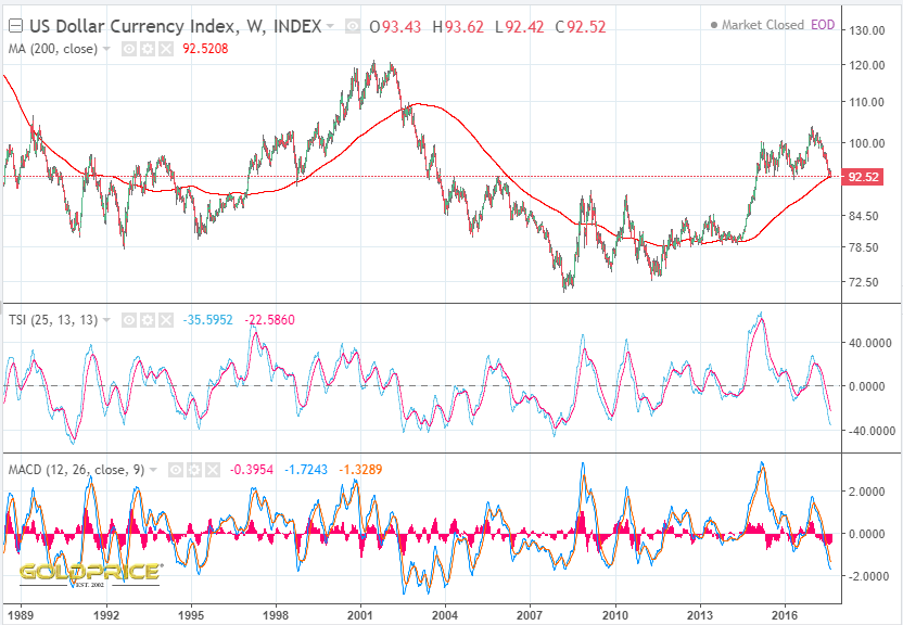
If it’s on the way to new highs it won’t lose the 200dma. If it drops from here, there really can be no more debate about whether or not the dollar cycle is still ‘working’. Just in case you think the TSI and MACD are very low and ‘ready to turn up’. Here’s the dollar index when you zoom out a bit – both those indicators can fall much further…
I’m not saying it’s impossible for the dollar to rally and make new highs. I’m saying that it’s a very low probability outcome. It’s hard to dismiss a cycle that has been in place for decades. If this cycle is still ‘working’, I’d bet my bottom dollar that the gold cycle is still ‘working’. If this is a once in 50 years ‘post bubble contraction’ then yes, the cycles probably will be disrupted. Game on.

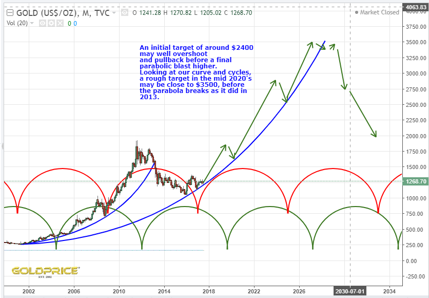
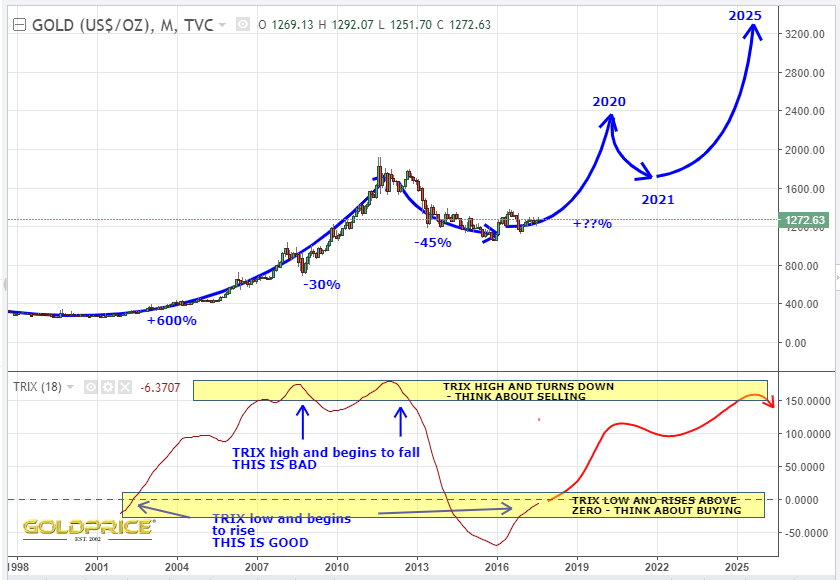
I’ve been looking more closely at the cycle timings and trying to achieve a ‘best fit’. I’m sticking with my target of around $2500, but I’m highlighting that it may be reached in Summer 2019. 2020 is still possible, it just depends how things develop into the cycle highs – they do have some ‘wriggle room’. There are other, even more ‘bullish’ interpretations, but I’m going to discount them unless things start to accelerate ahead of my expectations. We’ve seen another weekly close above the breakout (now support) line of the massive bullish symmetrical triangle. For that reason, I’m discounting any ‘bearish’ projections. If we find ourselves back inside the triangle, I’d be seriously worried. I don’t expect that to happen though. The dollar is locked into the down phase of its 16 year cycle, and gold is in the opposite position. The stars should be aligning here. The miners are still lagging, so once we clear the $1300-$1315 area, I would expect a surge in the miners and a big surge in silver, which has a lot of catching up to do. If I’m right, the next few weeks/months are going to be fun. Below is a log chart of gold, with the cycles shown by the red and blue lines at regular intervals. Notice also the TSI rising and crossing above zero for the first time in 16 years (as you would expect at the birth of a new cycle). Following a correction sometime late 2019-2020, I’d expect the final, spectacular phase of this bull cycle to commence, and then complete in the mid 2020’s. We can develop these thoughts as events unfold.
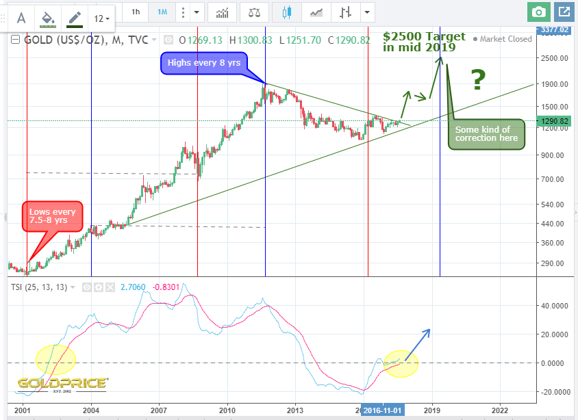
As I’ve already said, gold will need a VERY good reason not to rally hard here.
It needs a very good reason not to though. I love simplicity, and the more you look at these cycles, the more convincing they are. You can ignore week to week, and month to month moves. The regular heartbeat of the gold and dollar market has continued unbroken for half a century. The dollar has topped and PMs have bottomed – that’s the simple message of these charts. Give me an explanation for this cycle breaking down for the first time in many decades. One that is strong enough to overturn and break such a long run of regular highs and lows. These 4, 8 and 16 year cycles aren’t a coincidence. The market forces and political forces that create them are very powerful. Bear in mind our exponentially rising debt burdon and the need to inflate it away before we are consumed by it (which, will end up destroying the currency anyway).


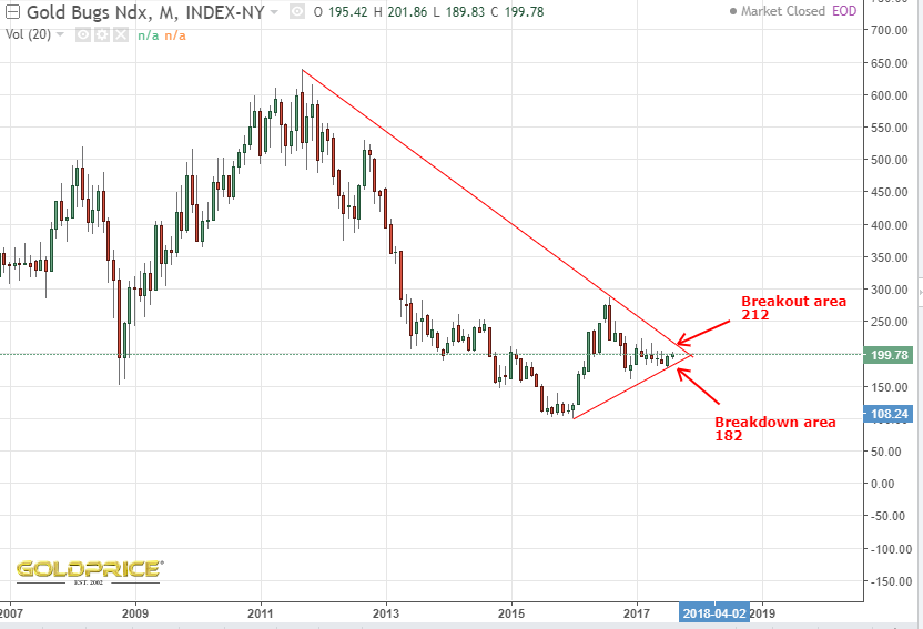
Getting very tight in that wedge !
As long as this holds, and the breakout is confirmed, we’re on for $2000+ in the next couple of years. I think a back test to $1260 would be healthy, and a pause for a week or two. Anyway, the market will reveal itself in good time. Sit tight and be right as they say

Not happy when I saw a noticeable hole in my portfolio. My account is showing zero for Uranium Resources. Apparently they have changed their name. Hope my money reappears at some point https://globenewswire.com/news-release/2017/08/21/1090559/0/en/Uranium-Resources-Changes-its-Name-to-Westwater-Resources-and-Announces-New-Chairman.html
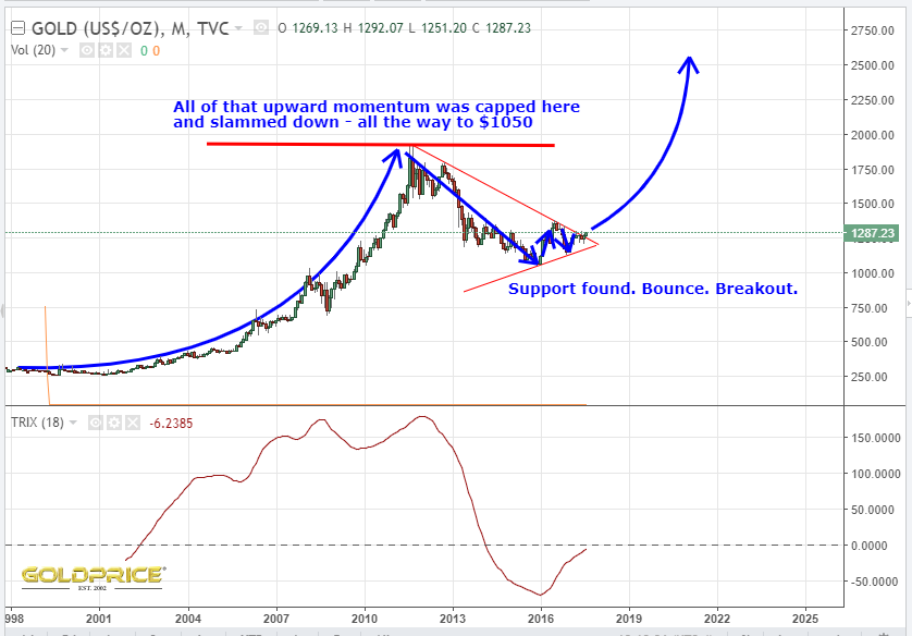
Fully posted a link earlier. I read it too fast and thought it was posted recently, but realised my mistake when I looked at his gold chart.It was published around about the time gold hit it’s $1050 low. In it he says…
‘Since gold has been in a bear market since 2011, the latest chart pattern that has formed is the two-plus years blue falling wedge, which I consider to be a halfway pattern to the downside when all is said and done. Just look at the left side of the chart during the bull market years when each consolidation pattern broke out to the upside. Now look at how our current bear market is unfolding opposite to the bull market. This is how markets work.
On a bullish note, gold could be forming the last consolidation pattern within this bear market. If the blue falling wedge breaks out to the downside, which I expect it will, this next impulse move down may very well complete the bear market. As you can see, I’ve labeled this four-year bear market as a possible bullish expanding falling wedge. You can compare this possible bullish expanding falling wedge to the same pattern that formed the low for gold during the 2008 crash — it’s the same pattern, just on a longer time-frame. Even though I’m bearish for the short-to-intermediate term, I can still see the bull market continuing when the top black rail of the potential bullish falling wedge gets broken to the upside.‘
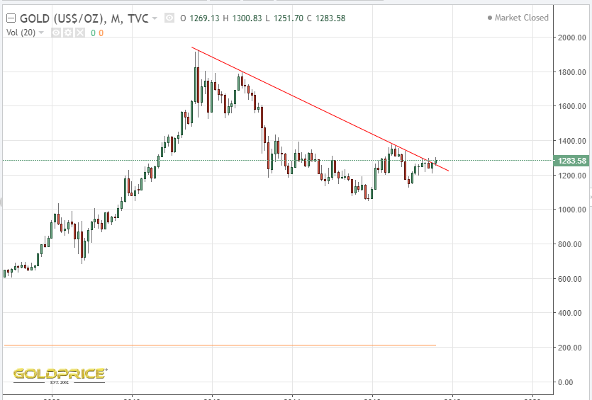
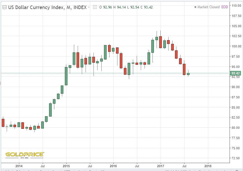
He included these 2 charts…
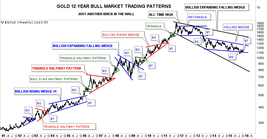

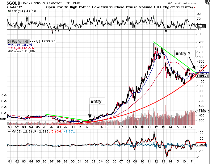
As we now know, he was right to an extent. The dollar did breakout upwards, but (due to the long established, and predictable dollar cycle), it has come all the way back to where it started. He wasn’t right about gold though. The falling wedge didn’t break down, but up. It hasn’t proven to be a halfway pattern to the downside. Gold has risen over $200. I’m not entirely sure why gold didn’t fall a little further or at least stay around the $1000 mark for the rest of 2016. Like Rambus, I would’ve expected it to. The gold cycle would’ve certainly allowed it. At the time, I remember reading an article by ‘Zeal’ on the Market Oracle website, which demonstrated that whatever gold was going to do, the PM mining shares were at an ‘absurd low’ that just could not be maintained, and that the upside over coming years is huge. I did my own research and was convinced. I put all my savings into a a portfolio containing most of the HUI and GDX companies. HUI was about 120 at the time. It feels now, to me, that gold began it’s upward charge too early, and the weak action recently has been the result. You need all of the wind behind you. It’s like weather forecasting – to get a CAT5 Hurricane, rather than a tropical depression, you need all the causing factors to be in place, not just a few of them. This is EXACTLY the same. However, if I’m right, the long term cycles that I’ve been banging on about, are about to reassert themselves hastening the dollars continued fall, and bringing about golds renewed bull. Here are the gold and dollar charts, so you can see what happened after the Rambus post.
At the same time, we have geo-political tensions rising, we have a US president in ‘trouble’, we have a debt ceiling debarcle approaching, the stock market is euphoric, the national debt is off the scale and rising EXPONENTIALLY, the dollar cycle is in its declining phase and the gold cycle is in it’s rising phase.
A CAT5 hurricane is in danger of developing.
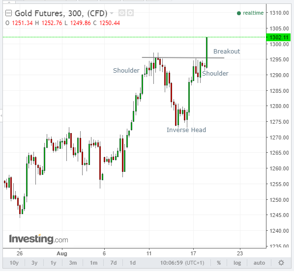
Gold futures have broken through $1300. I have my rocket on standby
I’m positioned in a good number of Spocks Rocks, Uranium, 3D printers, base metals and some larger gold silver producers. I recently took a position in these 4 HUI constituent companies. Eyeballing the charts, they look potentially pretty good after taking a real beating. Buy low, sell high ? and, as always, do your own due diligence
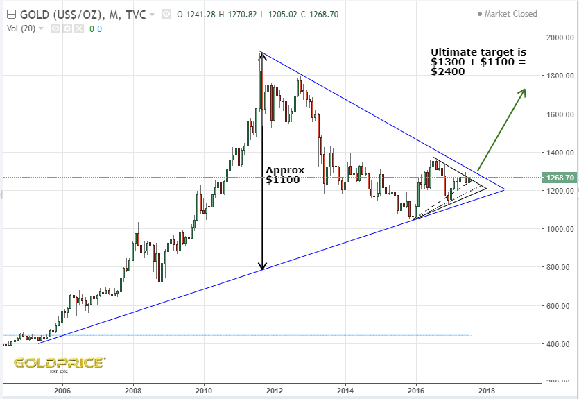
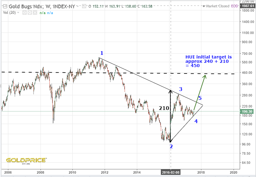
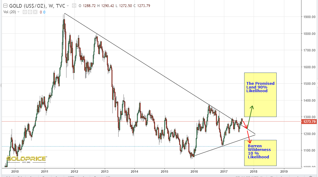
…That we already broke out of a very big chart pattern. The price action into this bullish, symmetrical triangle goes back about 20 years. The bigger the pattern, and the longer it takes to build out, the more significant a breakout is. Newsflash – we broke out already. Unless I’m missing something, and unless we see an ‘around the apex’ move down, this should mean the bull is on. The charts are talking to me again (I really should see someone about that).
So here we are in the $1270-$1290 area. Yesterdays pop was nice, and I got my little rocket out again (been hiding it away recently). Is it just me, or do you get the feeling that this is the final chance for gold to prove itself ? All the bullish charts I’ve posted, all the evidence I’ve shown – I fully acknowledge that it’s not impossible for me (and other bulls) to be wrong. If we’re right though, this is perfect timing. PM traders are about to return from their Summer sipping cocktails on some tropical beach. The SM is seeing signs of weakness if you look under the surface, the cycles are in our favour and $1300 is in touching distance. The time for talking is almost over. It’s a high volume surge and rocket launch for PM’s, or its crash and burn. On the launchpad, countdown is commencing…

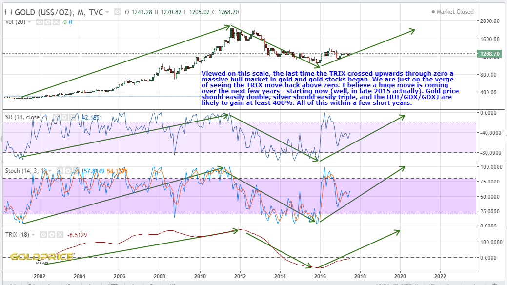
Still developing the fine detail, but this is roughly how I see things going. Don’t pay too much attention to the precise dollar gold targets, but somewhere $1500-$2500 by 2020. Im favouring closer to $2500. Possible sharp drop for a year or so then a final top in the mid 2020’s. Looking like TRIX will cross zero by the end of this year. That’s a major buy signal. As always, a large downside move, below support at the $1180 region negates all of this. Otherwise, I’m happy.

After reading Plungers excellent article on Talk Markets, I had to have a rethink. I’m in broad agreement that the SM is in a precarious position. Decreasing volume and reliance on a handful of ‘mega stocks’ is not good. The market may have a rapid burst higher, but, in my view, it would be short-lived.
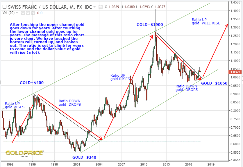
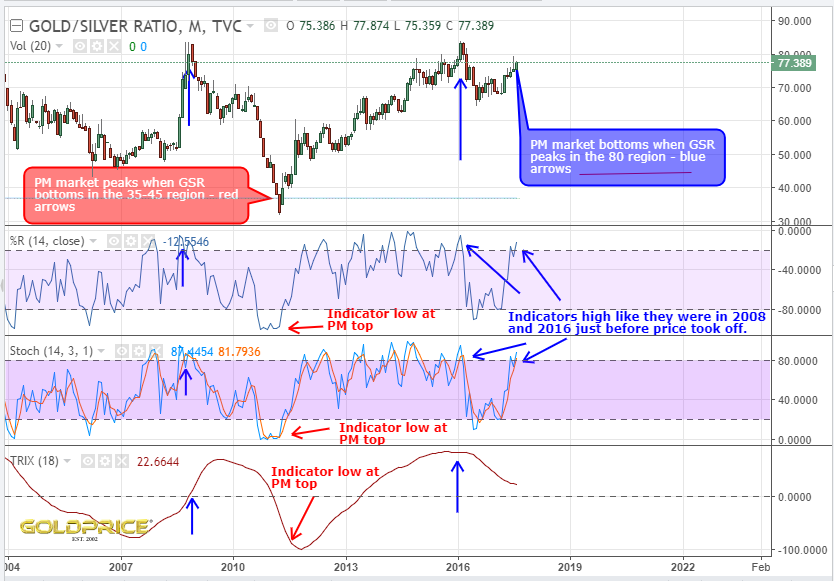
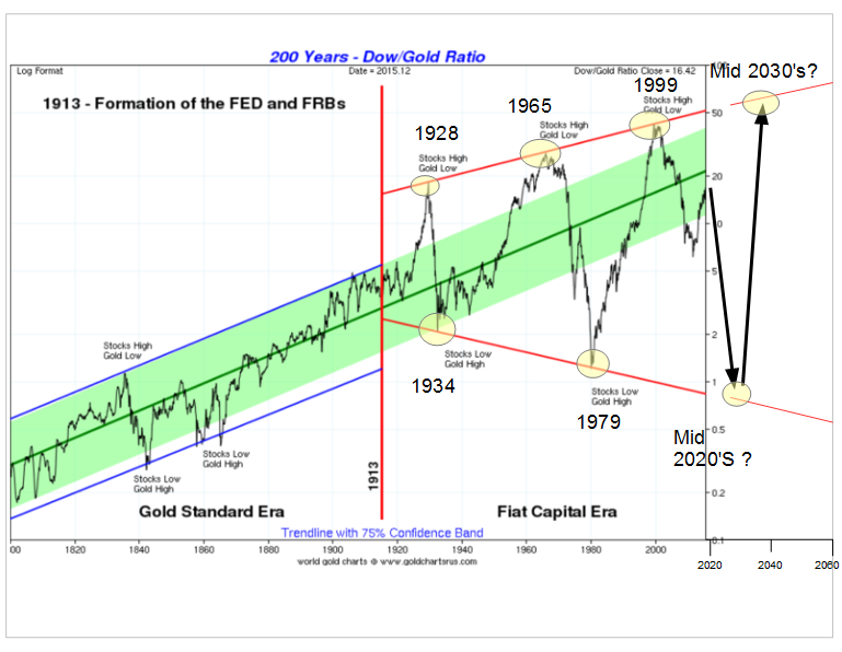
When considering the outlook for both the stock market and gold, you really do have to consider the ratio chart for the pair. It’s crucial, because it demonstrates whether one is overvalued or undervalued in relation to the other, and on a massive timescale. Up until the FED and Federal Reserve Bank came along, the pair traded in an up-trending channel and could be considered relatively stable. Post 1913 we saw much greater volatility, with successively higher highs and lower lows. Since 1913 we see a high in the ratio every 35/36 years. The first two lows in the sequence were approximately 45 years apart. If that repeats, we should see a low in the mid 2020’s. I’m reasonably confident in this because, as you can see in the chart, we haven’t hit the bottom support line yet, or even come close.
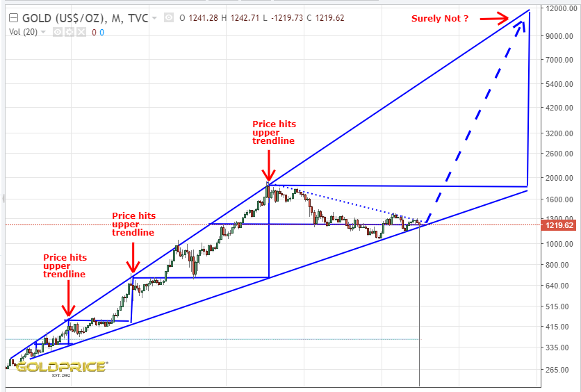
This is a ‘megaphone’ pattern, with a top resistance line trending to infinity (it’s a log chart), and the bottom line trending to zero. Interestingly, they tend to be bearish. This implies the ‘outcome’ is zero. In other words, gold is the ultimate winner. That’s not really very good, and a clear sign that within the next couple of cycles there will be a total collapse of our monetary system, unless a way can be found to stop this beast.
Back to the ratio chart. If the ratio does indeed move down to a low in the mid 2020’s , the chart indicates a value close to 1. There are a variety of ways it can happen. Gold stays where it is and the SM plummets from 22000 to 1300. The SM stays where it is and gold goes up to $23000. They meet somewhere in the middle. SM goes up, gold goes up a lot more. Gold falls and the SM falls even more. I think you see how it works.
Question is, which is most likely ? What do you think ? What is this chart telling us ? At the moment, I believe that whatever the mechanism, it’s gold that has a lot of catching up to do.

Credit to goldchartsrus.com – I’ve modified their original version to add the years of the highs and lows, along with the future projection.
This is how I see it. No need to repeat the reasons for my bullish stance at this point. All we can do now is sit and wait.
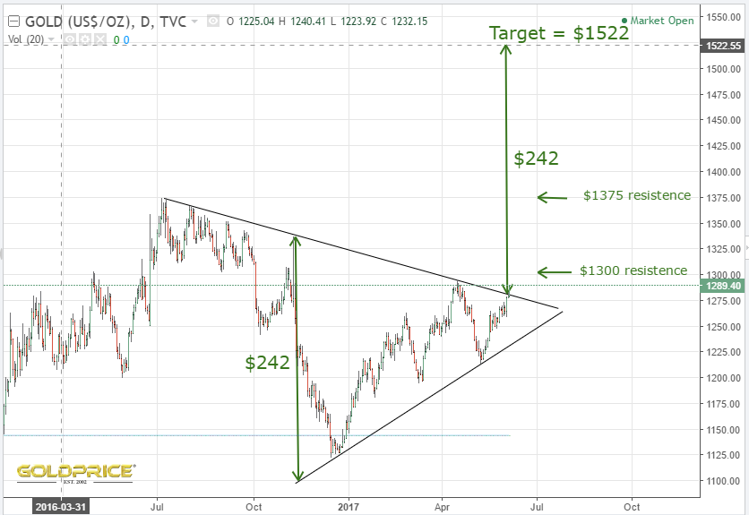
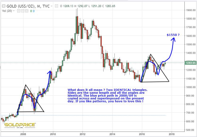
The 2008/09 similarities are striking. Could diverge of course, but at the moment it’s quite an impressive repetition. The blue squiggly line on the right is a copy and paste job from the one on the left, and so is the triangle. A repeat would see us at $1550 early next year. One to watch maybe ?

You decide…
On a late Summers day, while the farmers make hay
we found a small spark, some light in the dark
that began to show us the way.
lines on the charts, that tug at your hearts –
gold will rise again, one day.
Well, according to my chart (copied again below), that day is pretty much here. So this is my challenge…
I have a chart which goes all the way back to the time the US came off the gold standard in the 1970’s. There is a ‘rule’ that you can apply to the chart for that entire duration that hasn’t ever been broken – when gold price moves from a blue line to the next red line (approx 3 years), the price rises and peaks at that red line. A move down, so that we are lower in 2020 than we are now would be the first time the rule has ever been broken. Anyone that thinks we are going to see prices fall – show me a) Why this chart will fail for the first time ever, and, b) Show me an equivalent chart, going back 50 years that proves your point. It needs to not just suggest a lower price 2 years from now, but it needs to demonstrate that by moving lower it is somehow behaving in a way that has been demonstrated in the past. If this can’t be done it shows that we are either going up, as my chart suggests, or the next 2 years will be completely unprecedented in the history of the gold market post 1970’s.

I should say, that I’m not a bull, blinded by the glitter of PM’s – I’m trying to be pragmatic and consider all angles. I would appreciate finding a strong counter argument – the charts just aren’t giving it to me. I’ve read lots of bearish predictions, but haven’t found one that stacks up in terms of showing how this chart will get broken for the first time ever. In isolation, I can find things to suggest gold might go down, but only short term. It’s the price in 2020 versus todays price I’m interested in. So, come on, someone, pick up the gauntlet 
Below you can see a chart similar to the one in my earlier post. This time, I’ve used vertical red lines to highlight the regular cycle highs, and blue lines to highlight the regular cycle lows. You’ll notice that for the last 50 years EVERY time we cross the blue line, (cycle lows) the %R (300) and TRIX turn up to confirm the coming price direction. All of the large price drops have happened in the process of moving from a red line to a blue line.
Price has gained EVERY time we’ve moved from a blue line to the next red line. We have just crossed a blue line. The worst price gain we’ve seen in this 3 year part of the cycle was in the mid 1990’s at 27%. Frequently we see gains of 60%, and occasionally a lot more. I think that around $1500 is a reasonable expectation. Any more would be a bonus.
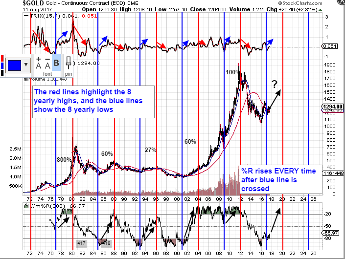
I’m deliberately keeping the language/terminology simple – I hope I’m not coming across as condescending, but I want it to be as clear as possible. None of this gives us a 100% guarantee that price will go up, but it’s about as close as you can get. If price doesn’t advance from now until the cycle high in 2020, moving from the blue line we’ve just crossed, to the next red line, it’ll be the first and only time this pattern has been violated in the last 50 years. That must give us some degree of confidence. Of course, there’s always a first I suppose…
To be honest, most aren’t very helpful on this 50 year timescale, but a couple were, especially if you fiddle with the settings, and alter the Wm%R to 300. So what we’re looking at is overbought/oversold conditions as they develop on a 300 day rolling basis. By extending out the time frame this way, you are getting rid of a lot of the daily/weekly ‘noise’ and focusing on the ‘main signal’ or trend. This main signal or trend is much more reliable and predictable, compared to daily and weekly direction changes. The TRIX on it’s standard setting seems to works pretty well on this timescale. TRIX is also an indicator of overbought/oversold conditions and shows how momentum is moving in a particular direction. I view both of these indicators on these timescales as giving us clues as to the overall ‘direction of travel’.
It’s long been known that markets have cycles. The thing is that price sometimes reacts strongly in a cycle, and sometimes the price movement is weak. Also, the peak and trough in a cycle can be biased to the left or right in relation to the expected peak. That’s not an excuse for it not always working perfectly, it’s an acknowledgement of the fact that the real world is messy and a not 100% predictable. Nonetheless, these cycles are very evident in the gold market. The peaks and troughs on an 8 yearly cycle going back to the 1970’s are as clear as day and 100% reliable – they haven’t failed, so they would need something MASSIVE to make them fail now.
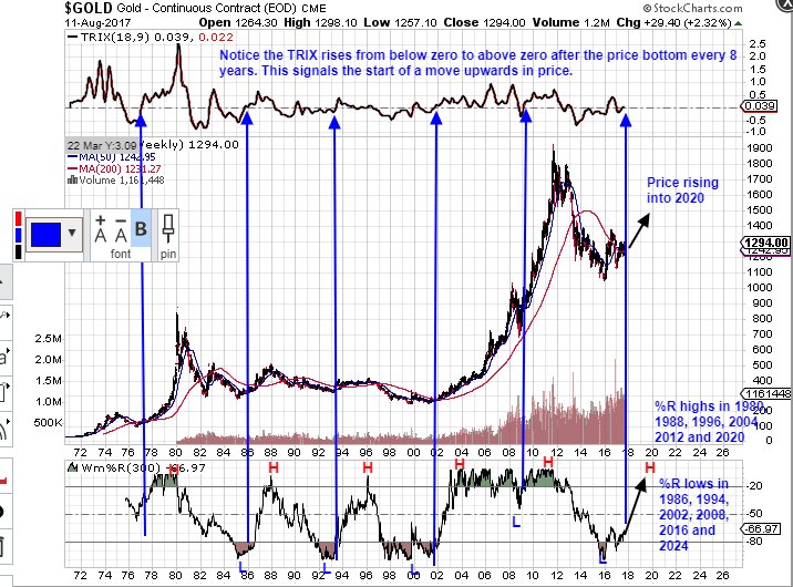
So back to my reason for doing this. Are we in 1983/84 ? The chart says categorically that we are NOT. From the point of view of determining where we are in the pattern this is a killer chart in my view. We cannot be in a position even remotely comparable to 1983/84, and here’s why. In 83/84 we were on our way to a %R LOW and TRIX was FALLING. Today the %R low has just happened, we are on our way to the HIGH and the TRIX is RISING. That’s because of where we are in the cycle. Think for a minute – this cycle hasn’t failed in its entire 50 year span. If %R and TRIX were to turn down now, taking price with it, it would be the first time in 50 years and 6 cycles that this has ever happened. As I said, for me, this is the killer chart. It demonstrates a 50 year pattern that has repeated every 8 years. It doesn’t tell us where the price will be at the peaks and troughs, bit it does tell you WHEN your peaks and troughs will be. 2020 is our next peak, 2024 is our next trough (may be a very small one), and the following peak will be in 2028. That’s 9 years from now.
I would strongly suggest referring back to this in 2 years time and thinking about taking profits at the top in 2020. I’m going to go long again in 2024, and exit the market for the last time in 2028, when I’ll be 59 and ready to retire.
I’ve been asked what my price projection is for 2020. I’ll be posting fairly regularly on this over coming months, as my thoughts develop, but at the moment I’m favouring somewhere in the $2000-$2500 range. We’ll see how fast we start to rise, and then I’ll adjust my thoughts as new data comes in. I suspect that if I have to adjust my target, it will be upwards rather than downwards, but I’ll leave it there for now. Here’s that chart again…

Coincidentally, looking back at recent charts of mine, that 2024 trough and 2028 peak, agrees with one that I posted a short while ago. If it works out, we may be close to $3000 in 2020, dropping back to $2500 in 2024 and then $3500 in 2028. There are scenarios that take us a lot higher of course.

EDIT: Looking more closely at the dates, cycles, peaks and troughs, I would revise the troughs, or low points to 1985, 1993, 2001, 2009, 2017 and 2025.
Study this one, very simple chart and let it sink in. The indicators are TRIX (18,9) and Wm%R(300). The following rules are true all the way back to the 1970’s….
1) %R peaks every 8 years
2) %R hits a low every 8 years
3) Just after the low, the new uptrend is confirmed by TRIX crossing from below zero to above zero. Price then moves UP.
We have just passed the %R bottom. TRIX has just crossed from below zero to above zero, giving us the confirmation of the price moving up into 2020.
This chart is screaming at us and there really can only be one outcome, otherwise the pattern all the way back to the 1970’s will be broken for the first time. How much simpler can it possibly get ?
A really good read. You probably know a lot of this already, but I think it’s great for keeping things in perspective https://seekingalpha.com/article/4097726-mother-resets-coming-gold-market
Hi Goldtenters. My post on $9000 gold got a few responses yesterday, so I thought I’d follow it up with another scenario which needs watching. At this point I’m discounting any scenarios involving a move to $1000 (or less). My bullish bias has been well explained on my recent posts covering a variety of factors. I remain bullish until/unless the long term support near $1180 is challenged.
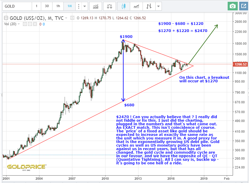
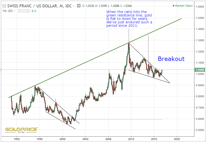
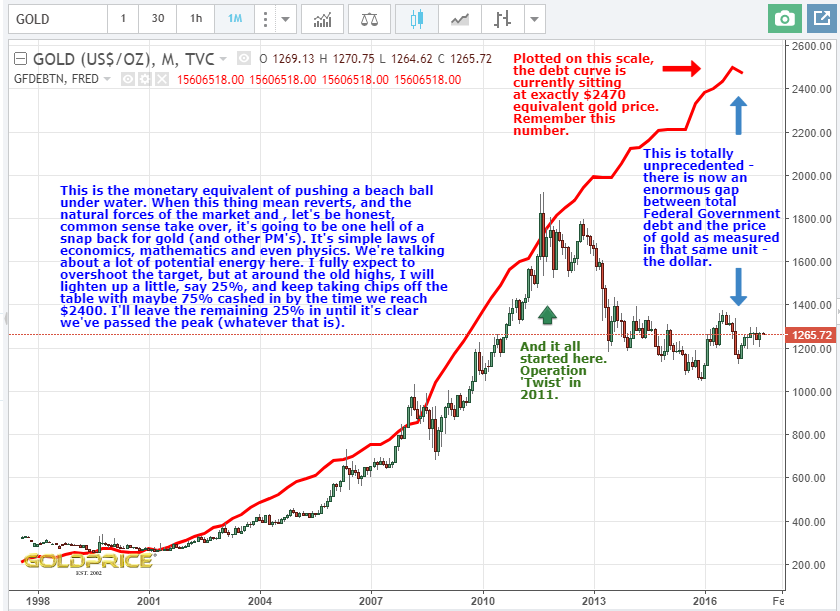
So, if we assume the direction of travel is up, and we discount the ‘parabolic’ $9000 target, where are we going ? I also recently posted in my ‘This Is NOT A Coincidence – $2470 Target For Gold’ that, using simple charting rules we get a target of $2470, which agrees exactly with the apparent gap that’s opened up between gold price and US Federal Government Debt when you overlay them on a graph. The CHF/USD ratio chart is also very strong evidence that PM’s will be moving up.
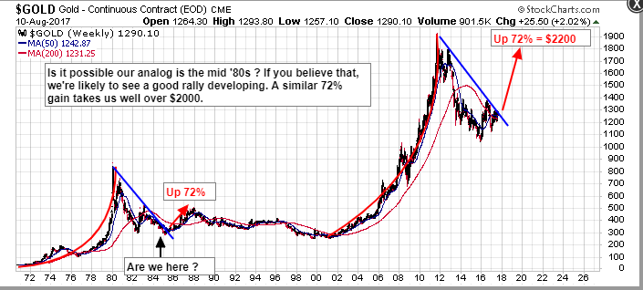
So far, so good. Ken S made a very good point on my post yesterday, and it’s also one I’ve posted before. There is also a case to suggest that we may be seeing gold price behavior similar to the mid 1980’s. At first glance, that might be disappointing, because there was nearly 20 years of ‘sideways’ action. On closer inspection, when price bottomed at $300 in early ’85, it then broke out and climbed 72% in 3 years, to a high of roughly $500.
If we consider $1300 to be a similar breakout today, a 72% move takes us to about $2200. That’s not too far away from my $2470 target. You could apply your 72% move from the $1050 bottom, I suppose, and that would give you roughly $1800. What does it all mean ? What I take away from this is that as we advance toward $2000 we need to be very wary, and alert to what happened back in the 80’s. I happen to believe that we’ll move much higher by the mid 2020’s. Nonetheless, I, for one, will be looking down as well as up, as we move forward.
The other recent charts I referred to as a reminder