Targets For 2020
Below you can see a chart similar to the one in my earlier post. This time, I’ve used vertical red lines to highlight the regular cycle highs, and blue lines to highlight the regular cycle lows. You’ll notice that for the last 50 years EVERY time we cross the blue line, (cycle lows) the %R (300) and TRIX turn up to confirm the coming price direction. All of the large price drops have happened in the process of moving from a red line to a blue line.
Price has gained EVERY time we’ve moved from a blue line to the next red line. We have just crossed a blue line. The worst price gain we’ve seen in this 3 year part of the cycle was in the mid 1990’s at 27%. Frequently we see gains of 60%, and occasionally a lot more. I think that around $1500 is a reasonable expectation. Any more would be a bonus.
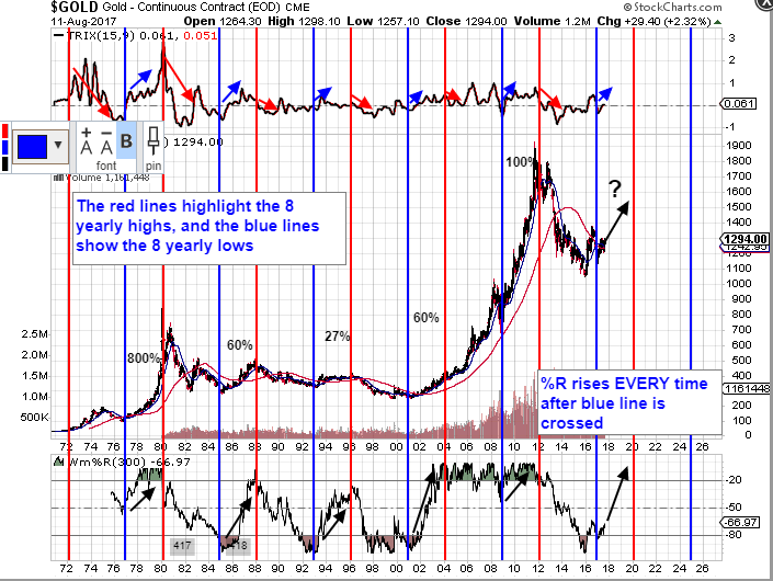
I’m deliberately keeping the language/terminology simple – I hope I’m not coming across as condescending, but I want it to be as clear as possible. None of this gives us a 100% guarantee that price will go up, but it’s about as close as you can get. If price doesn’t advance from now until the cycle high in 2020, moving from the blue line we’ve just crossed, to the next red line, it’ll be the first and only time this pattern has been violated in the last 50 years. That must give us some degree of confidence. Of course, there’s always a first I suppose…
Outstanding. Your analysis is firtrate.
First rate.?
Thank you 🙂
That’s a pretty startling chart. Would hope that you did not jinks the deal by posting the chart!! Would also be nice if the stocks actually started moving UP…perhaps gold/silver metals will lead the charge and the stocks play catch-up…we shall see soon enough. Sooner than the last 12 months!!!
I hope that saying it out loud hasn’t broken the spell too 😉
Fabulous academic effort you had put in NorthStar. Kudos!