Stock Market And PM Prospects
After reading Plungers excellent article on Talk Markets, I had to have a rethink. I’m in broad agreement that the SM is in a precarious position. Decreasing volume and reliance on a handful of ‘mega stocks’ is not good. The market may have a rapid burst higher, but, in my view, it would be short-lived.
When considering the outlook for both the stock market and gold, you really do have to consider the ratio chart for the pair. It’s crucial, because it demonstrates whether one is overvalued or undervalued in relation to the other, and on a massive timescale. Up until the FED and Federal Reserve Bank came along, the pair traded in an up-trending channel and could be considered relatively stable. Post 1913 we saw much greater volatility, with successively higher highs and lower lows. Since 1913 we see a high in the ratio every 35/36 years. The first two lows in the sequence were approximately 45 years apart. If that repeats, we should see a low in the mid 2020’s. I’m reasonably confident in this because, as you can see in the chart, we haven’t hit the bottom support line yet, or even come close.
This is a ‘megaphone’ pattern, with a top resistance line trending to infinity (it’s a log chart), and the bottom line trending to zero. Interestingly, they tend to be bearish. This implies the ‘outcome’ is zero. In other words, gold is the ultimate winner. That’s not really very good, and a clear sign that within the next couple of cycles there will be a total collapse of our monetary system, unless a way can be found to stop this beast.
Back to the ratio chart. If the ratio does indeed move down to a low in the mid 2020’s , the chart indicates a value close to 1. There are a variety of ways it can happen. Gold stays where it is and the SM plummets from 22000 to 1300. The SM stays where it is and gold goes up to $23000. They meet somewhere in the middle. SM goes up, gold goes up a lot more. Gold falls and the SM falls even more. I think you see how it works.
Question is, which is most likely ? What do you think ? What is this chart telling us ? At the moment, I believe that whatever the mechanism, it’s gold that has a lot of catching up to do.
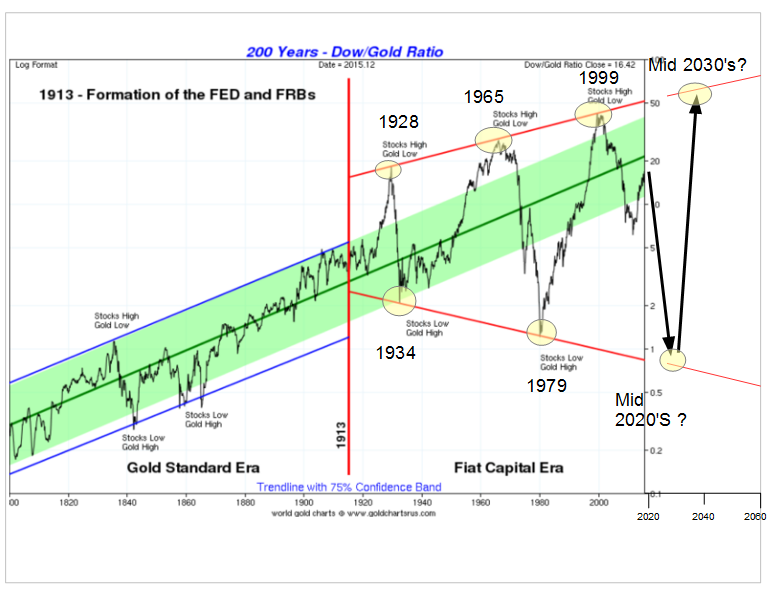
Credit to goldchartsrus.com – I’ve modified their original version to add the years of the highs and lows, along with the future projection.
Impressive chart thanks Northstar
Cheers Fully.
Some more pieces of the puzzle.
Thanks.