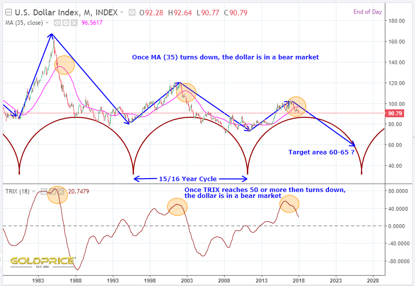
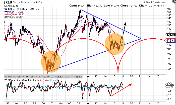
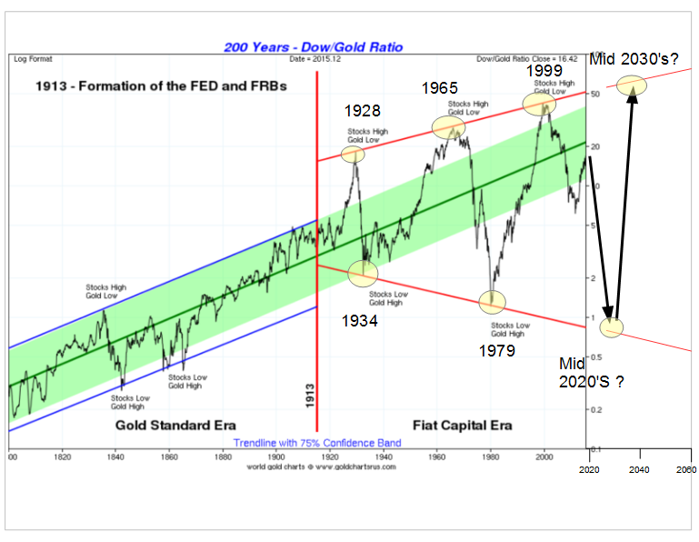
As the old saying goes, history may not repeat, but it rhymes. That’s especially true of financial markets. They’re governed by human behaviour, investment cycles, peaks/troughs and above all, a degree of mathematics. All very interesting, but so what ? Well, it means that we can look back at earlier investment cycles to get clues about where we’re going in the next few months/years. This works less well for day to day trading, because there’s all sorts of ‘low level noise’ which can cause short term ups and downs. For example, a political event or statement of some kind. All of that just amounts to ripples in the ocean though, and they’re drowned out by the larger forces at play.
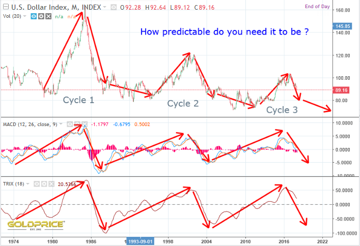
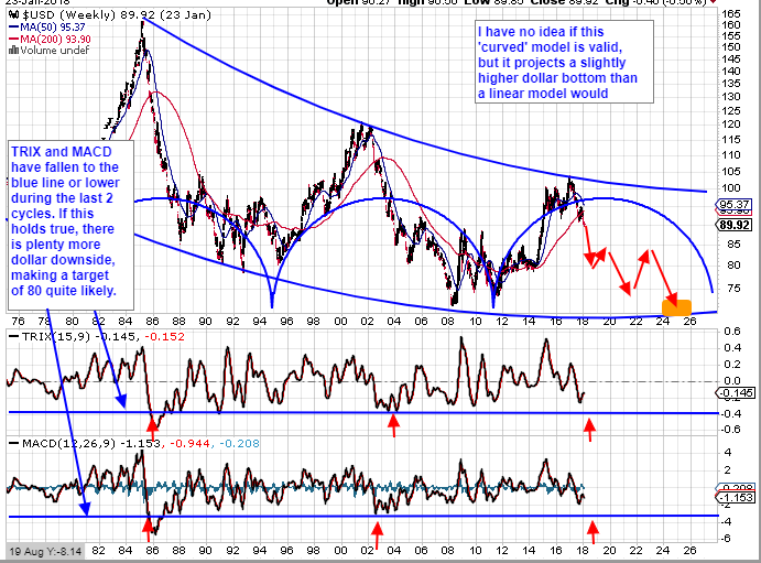
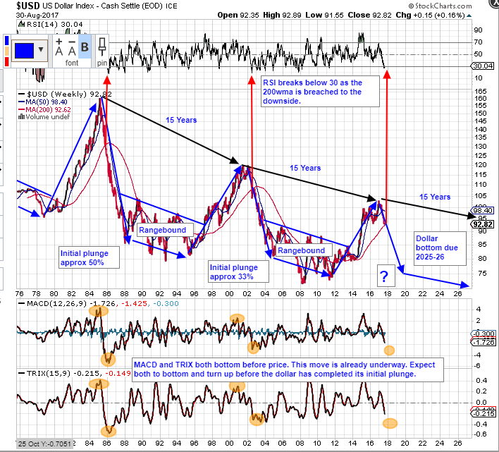
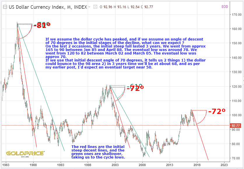
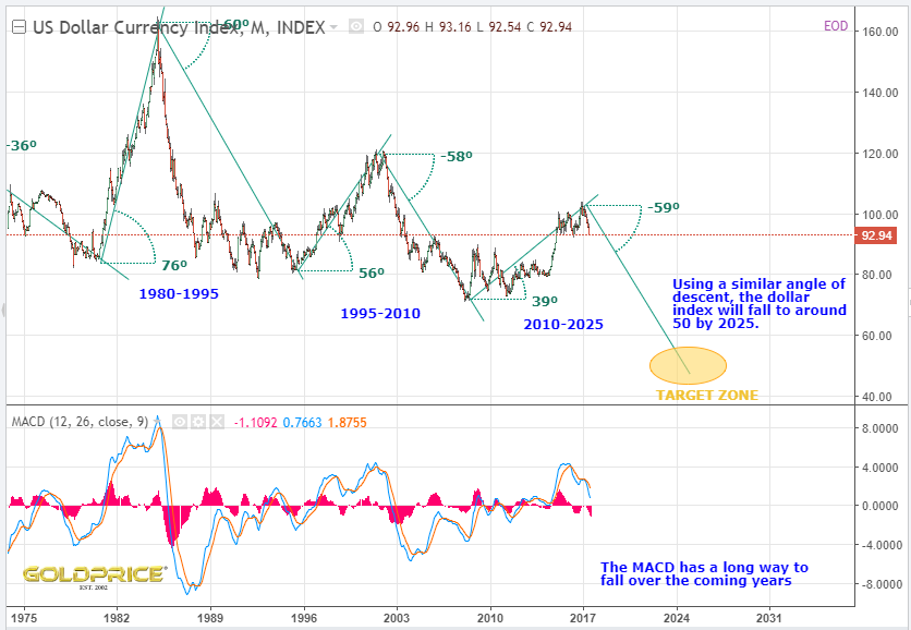
In the modern monetary and financial era (post Bretton Woods, and more importantly when you’re talking about the dollar, post gold standard in the early 70’s), there have been 3 complete dollar cycles. We’re currently in the 4th. we can look at the 3 previous cycles for clues. This is what I’ve concluded…
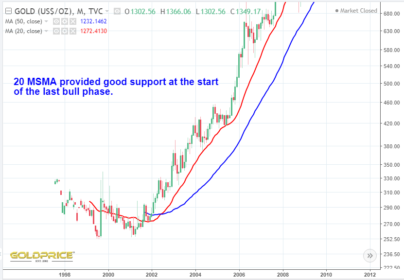
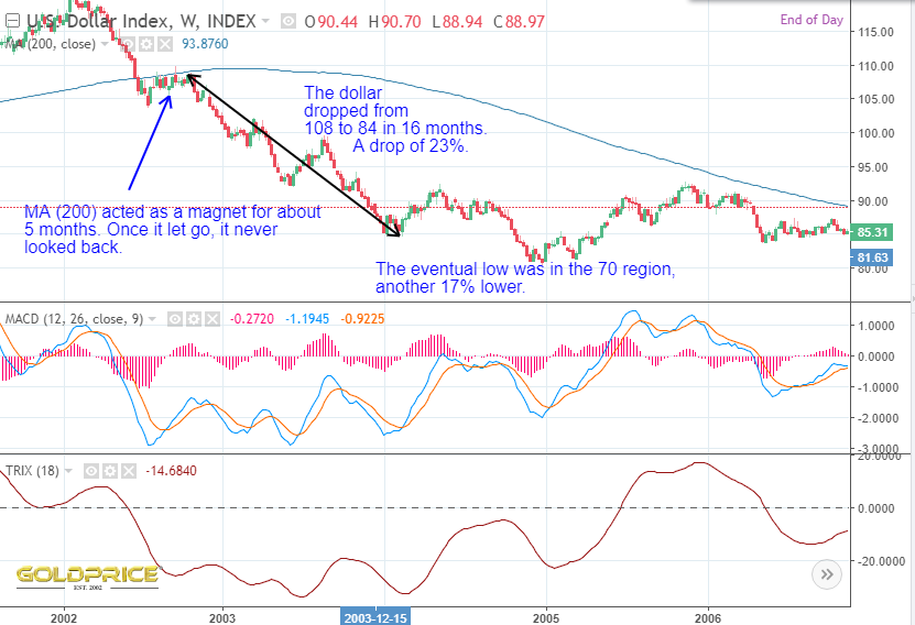
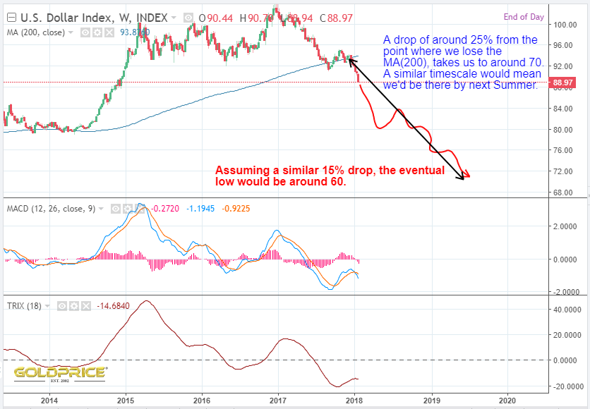
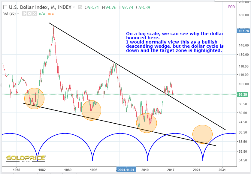
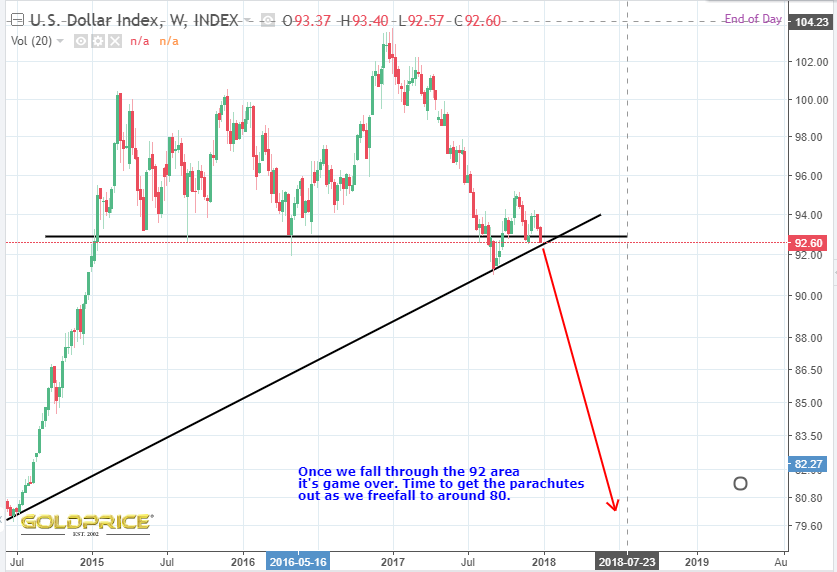
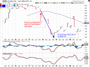
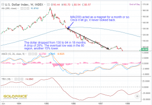
- Once the dollar loses the MA(200) on the weekly chart, that’s it – lights out, look out below.
- There is an initial plunge of the order of 25 %, followed by sideways to down price action for a number of years. I’m wary of the smaller drop in the late 70’s for various reasons, even though it was accompanied by a huge spike in gold.
- The dollar index spikes down another 15% or so to its final low, again, paying less regard to the late 70’s cycle
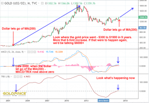
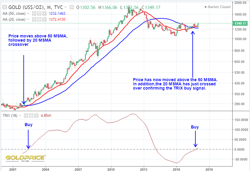
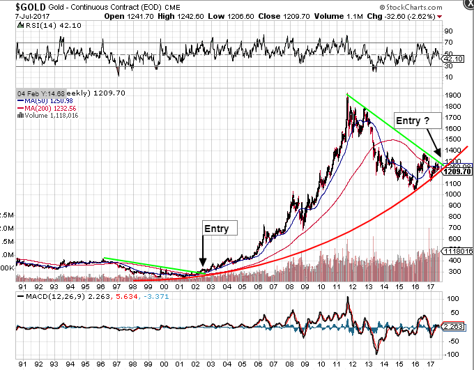
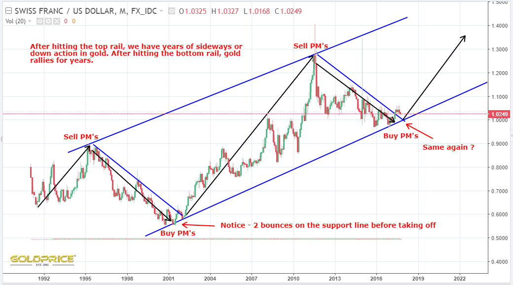
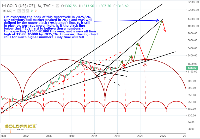
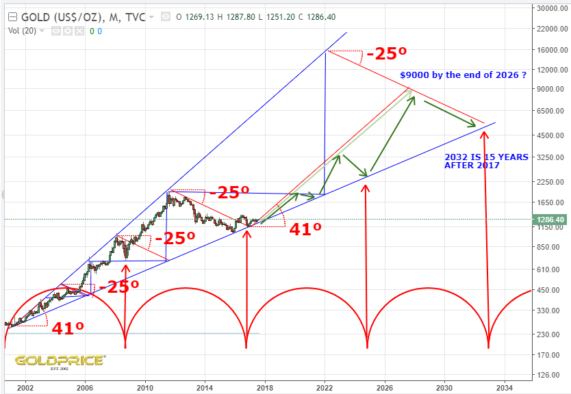
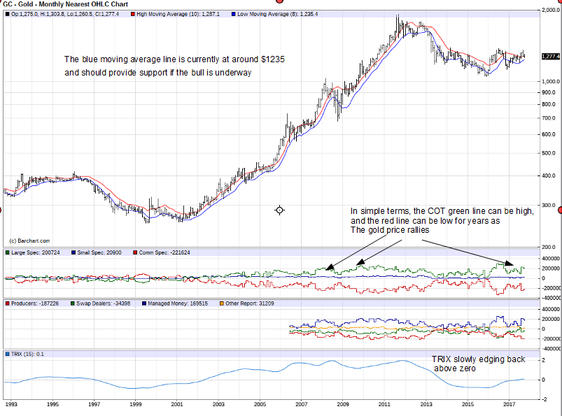
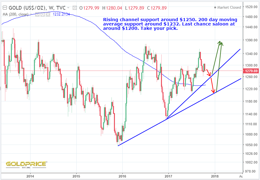
- At the same time (unsurprisingly) gold takes off
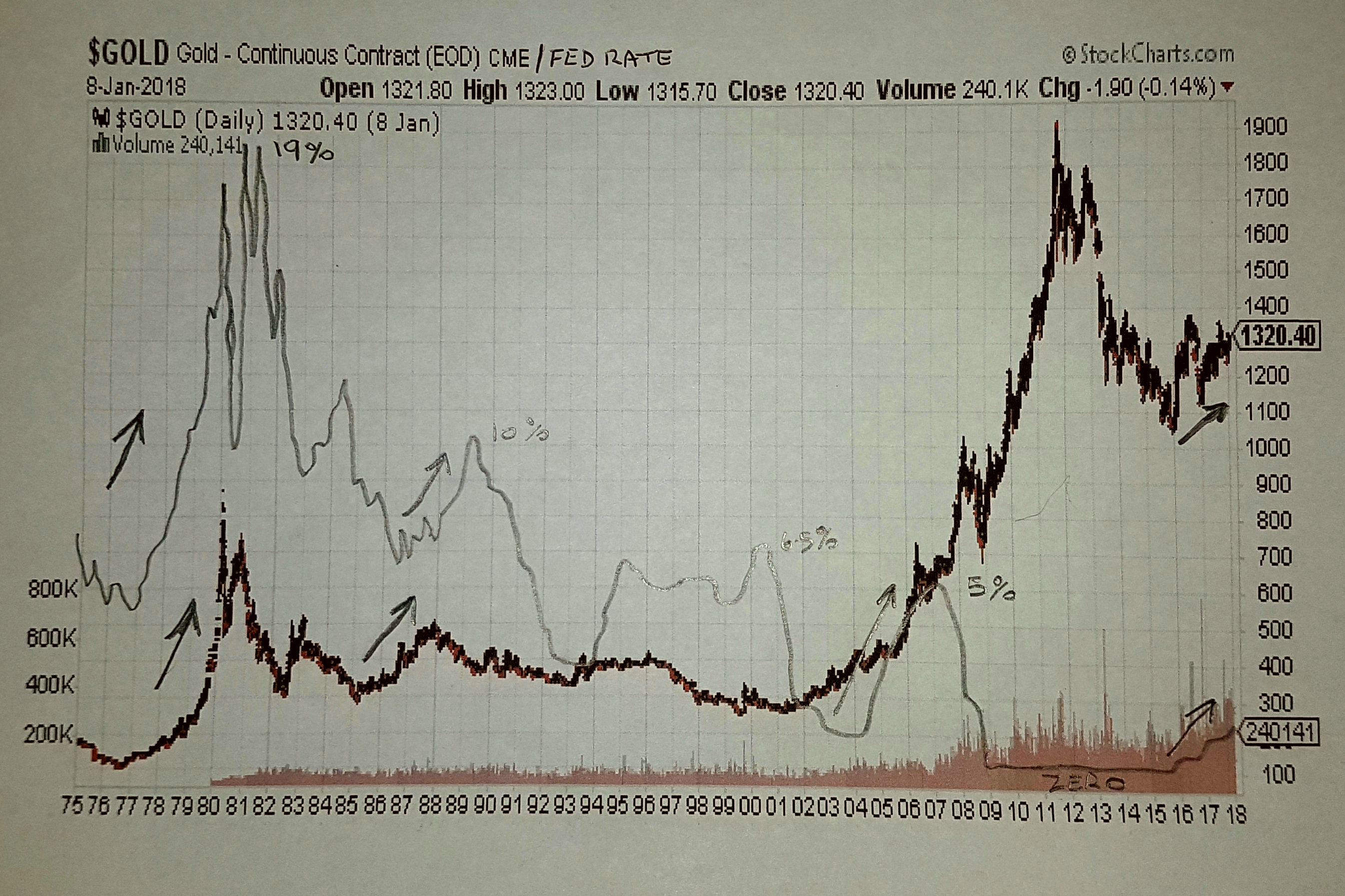
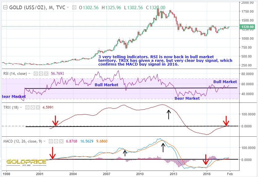
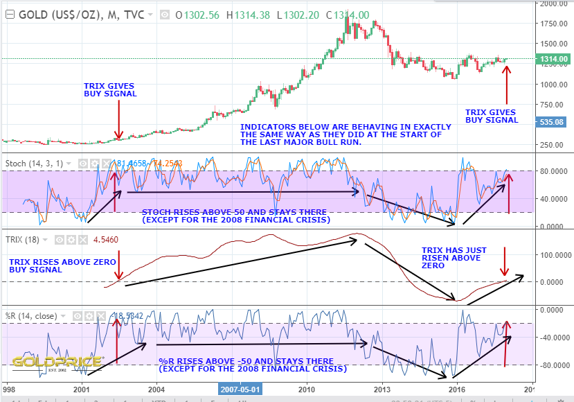
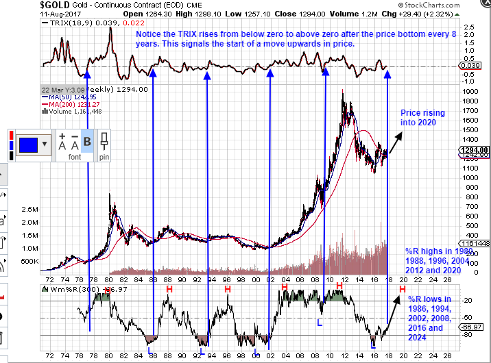
- MACD and TRIX on the gold charts confirm this is happening NOW
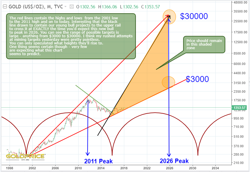
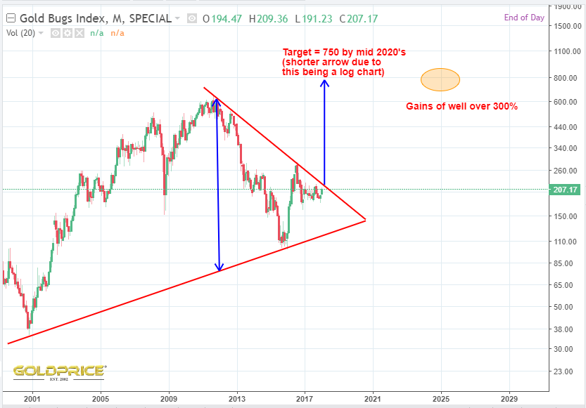
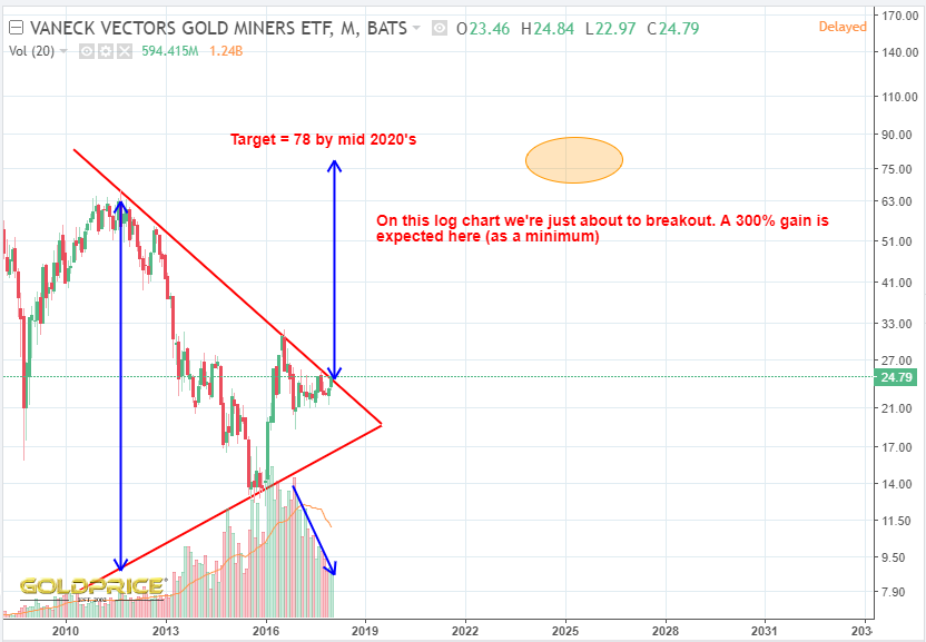
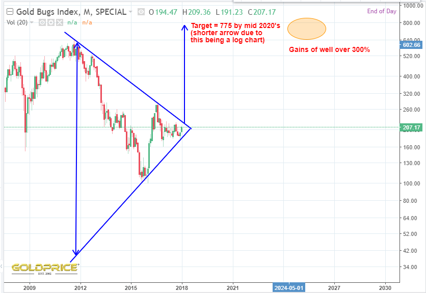
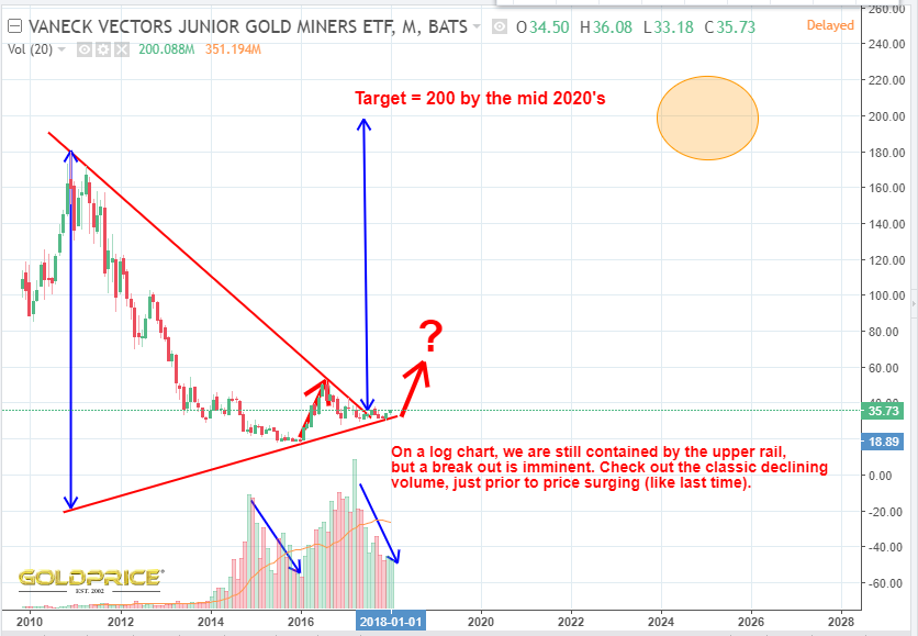
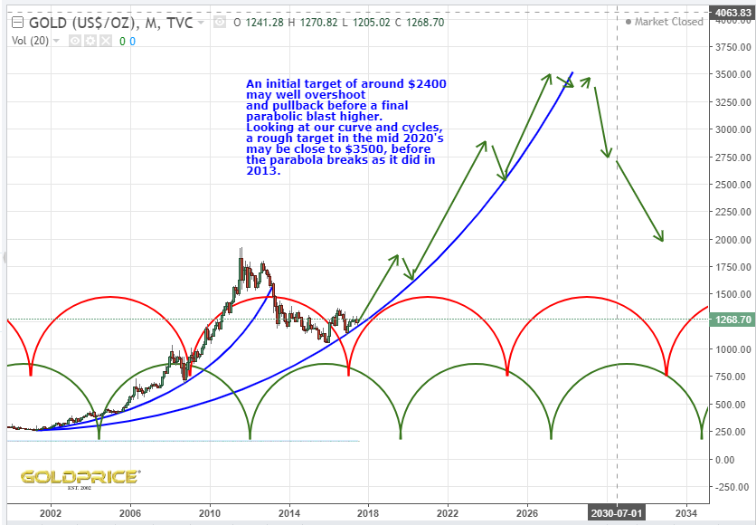
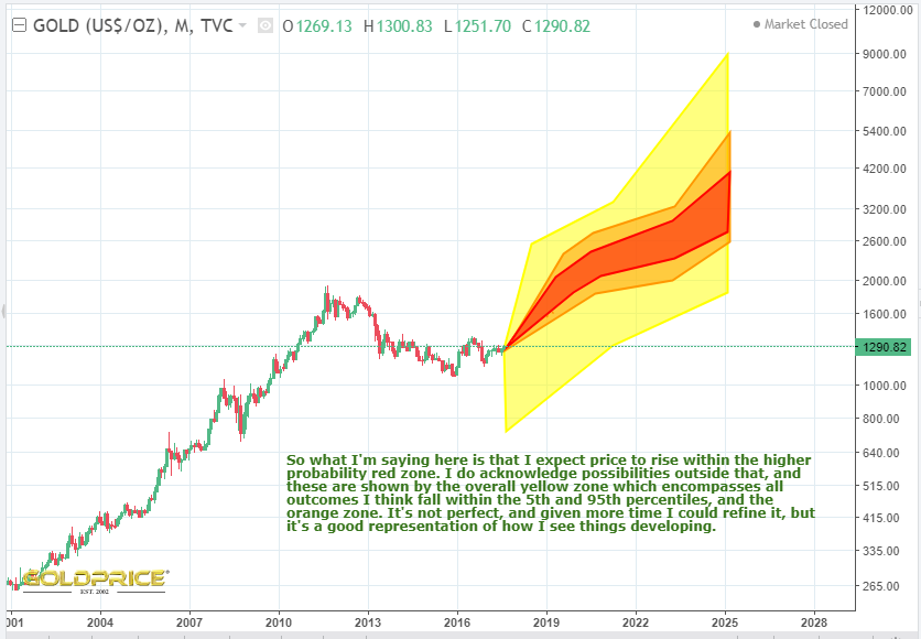
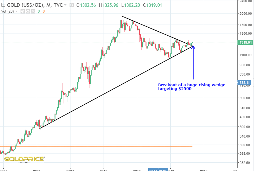
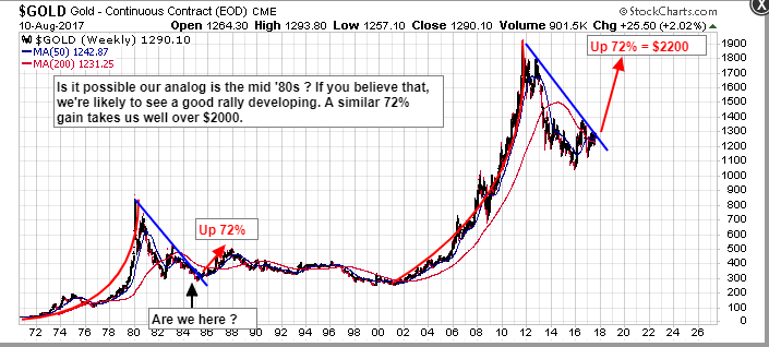
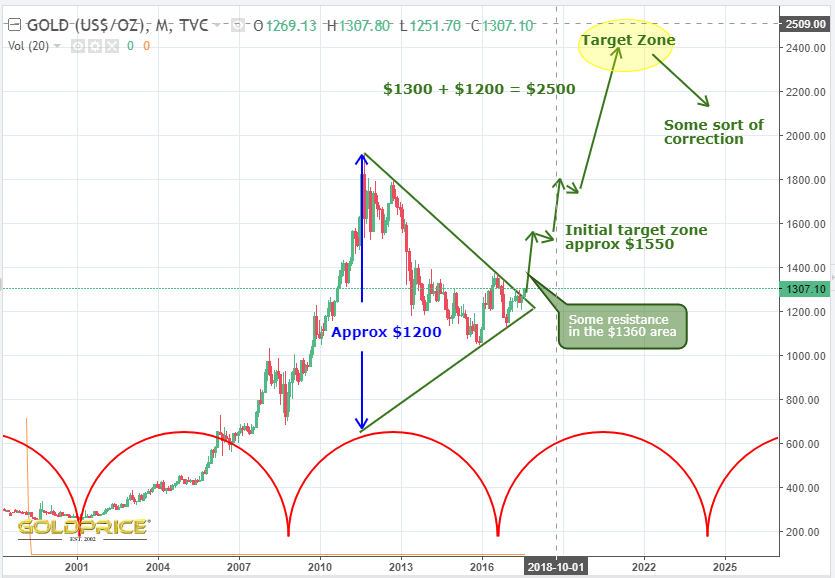
- Golds target in this cycle is a minimum of $1900, but likely a good deal higher. I’m unsure how high at this point – some of my work suggests the $2500 area, but $6000 and $9000 keep cropping up.
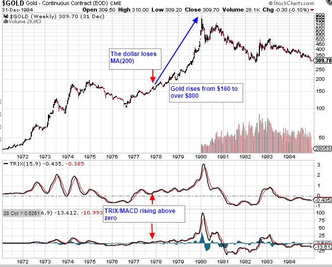
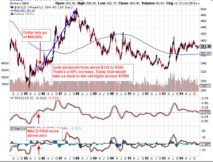
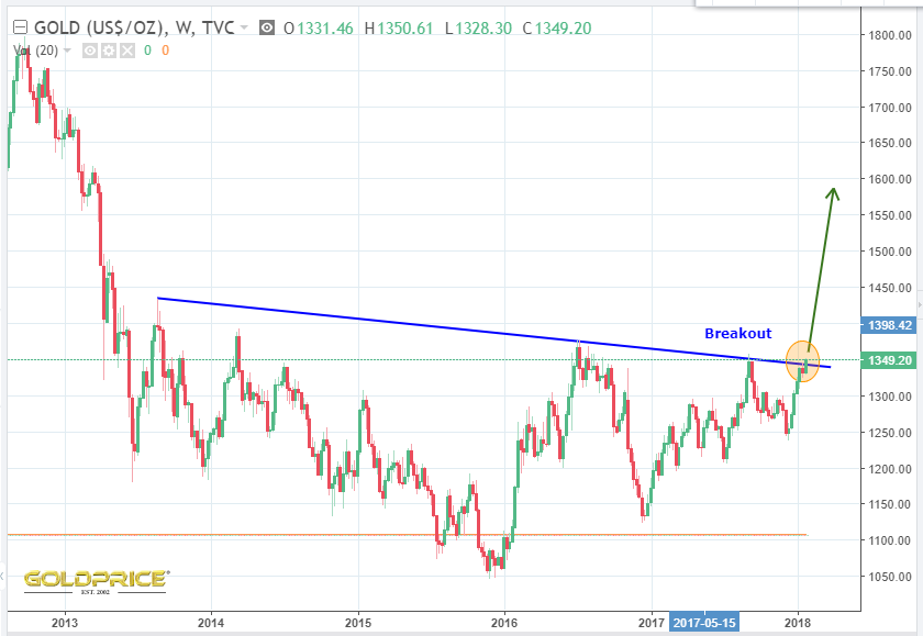
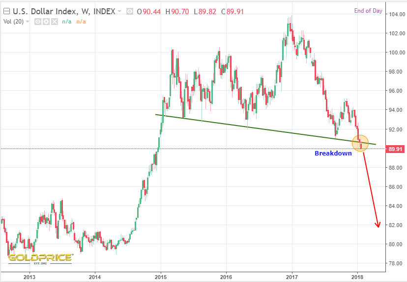
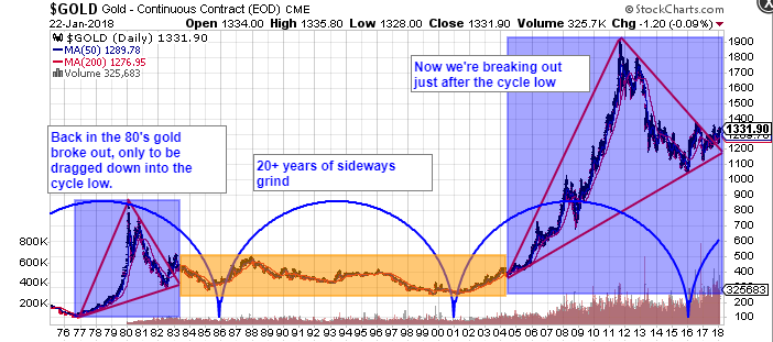
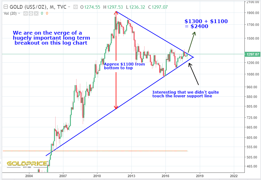
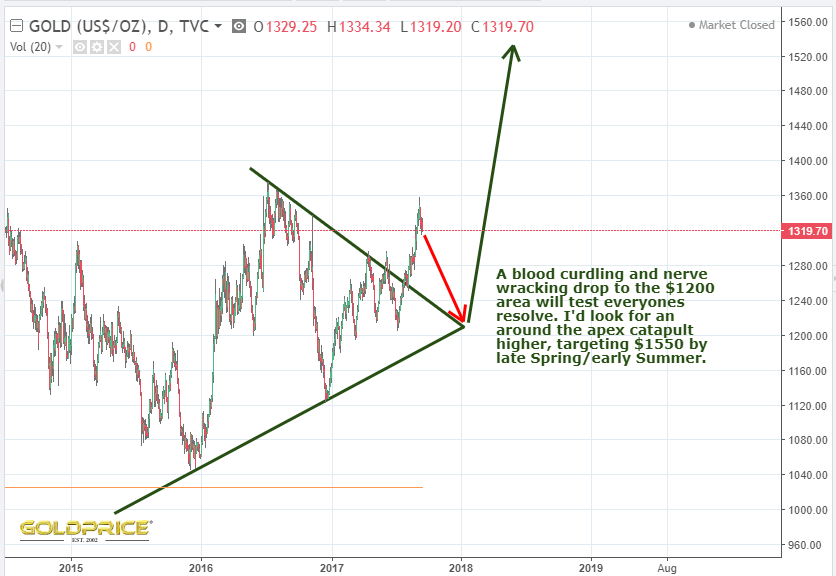
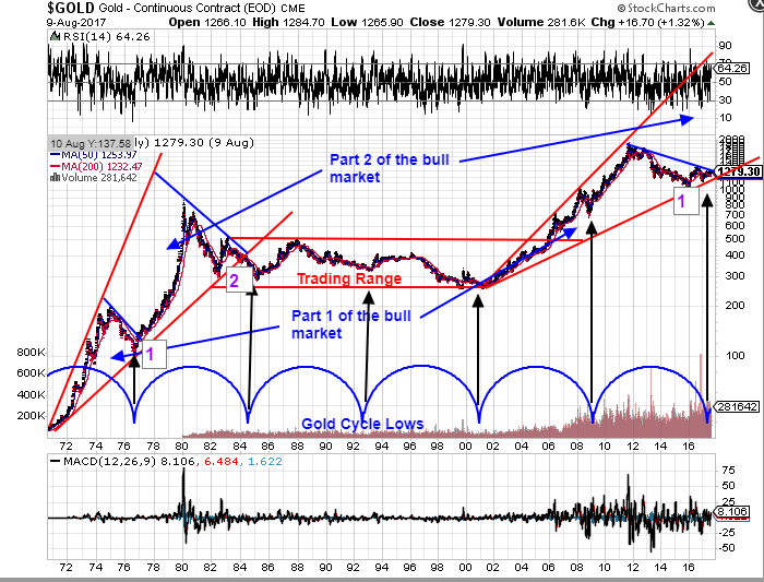
Here are the charts. Look at what happened in 1977, 1985 and 2002. Then look at what’s happening now…
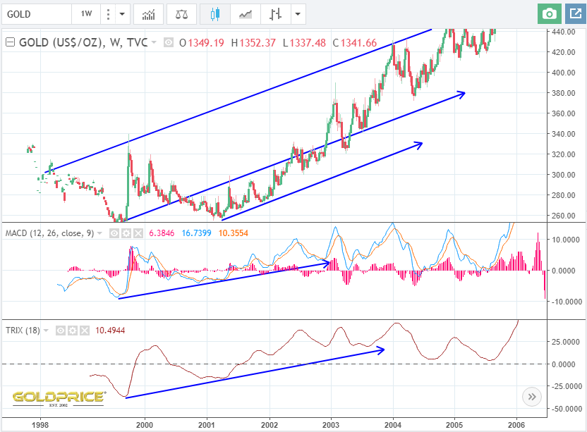
1977

1985

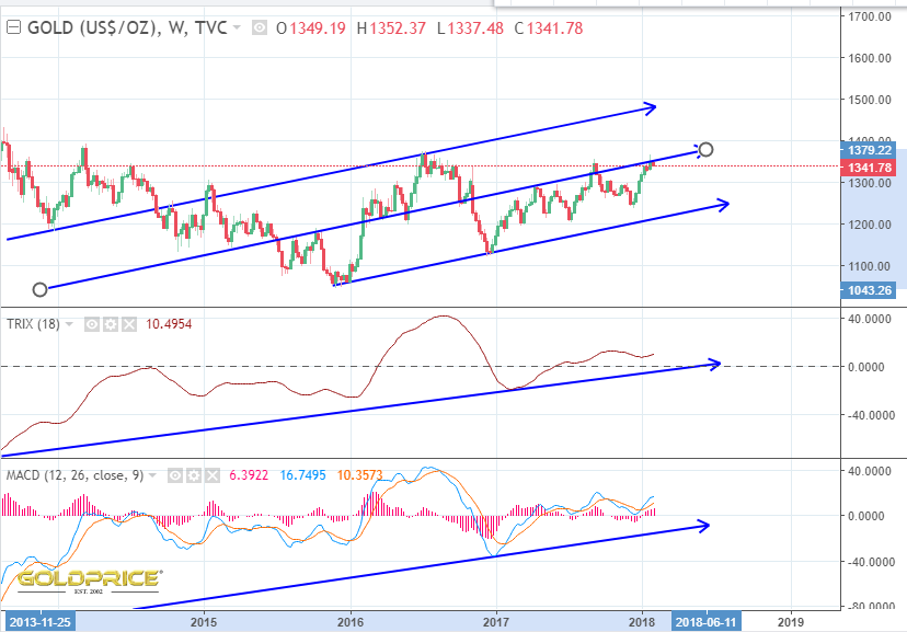
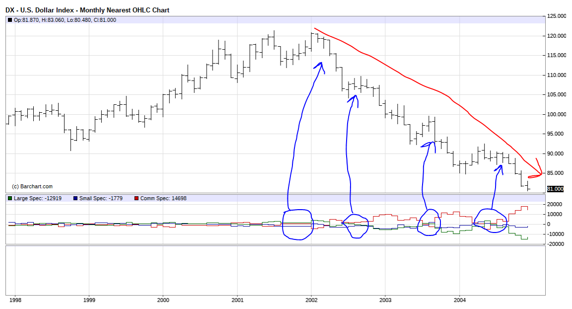
2002 and today