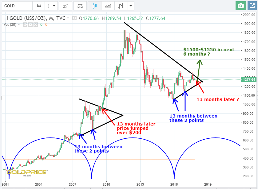
Gold Gearing Up For An Upward Break
Downside on this chart appears to be about $60 (assuming that rising support line holds). Upside is $200 + in the relatively short term. A correction should follow an initial move to the $1500-$1550 area, before we head higher again. I could be wrong of course, but that is what the chart looks like to me at this point. We could begin to move higher anytime I guess, but timings look to suggest further weakness into December. The similarities with 2007-2009 are too striking to ignore. Here’s the chart…
Here’s my fervent belief:where they are going they wouldn’t want to trade places with anyone on this earth. So, the sadness is ours and ours alone. They are home where it all began. Continuing to think of you. Thank you for checking in NS.
Nice sentiment G. Thank you. Taking a few minutes to check in here and take my mind off things is useful sometimes.
Thanks for the Chart Northstar.
Thanks Fully. Let’s just see if it plays out over the next few months.
Thanks Northstar.