On Track For $1200 Area ?
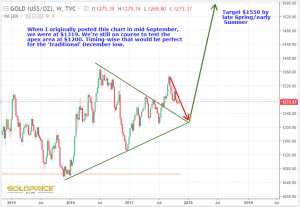
Apologies for going ‘AWOL’. Tough times at the moment, and it certainly puts everything in perspective. Anyway, one of my last posts in September included this chart…
Having been just an observer on this site for a few weeks, it’s good to have a few minutes to be able to update it…
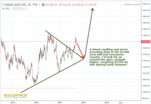
If I had more time, I’d add more supporting evidence (cycles, indicators etc), but suffice to say that it still looks like a bumpy ride into year end for gold and silver. Of course, it’s possible we don’t go quite that low, but the chart does suggest it’s likely. As many have noted the commodity sector is hotting up. Base metals breaking out, rare earths are stirring and uranium is following Graddhys script very nicely. Bottom line is that inflation is set to move into these sectors more convincingly over the coming months and years. The SM blow off phase looks to be underway with a smaller and smaller number of ‘big names’ blasting higher, whilst most are already showing weakness. It’s so well anticipated that when it happens, the rush for the exits will see a big move into undervalued sectors and traditional safe havens. 2018 looks set to be a big year for us. I may be mostly absent for a few more weeks, but I’ll be keeping tabs on everyones amazing posts with interest.


Thank you for checking in Northstar.
We miss your energy and well reasoned work.
Thought and prayers with you and yours.
Thanks Fully. Much appreciated.
Hi Northstar – Thanks for the post. Whatever you are currently going through, thoughts are with you. Hopefully things improve quickly.
Cheers Dave. It’s a close family member passing away slowly. Most of us have to go through something similar at some point, but it’s not easy.
I haven’t even read your post yet. I just saw your name and wanted to say we all have been thinking of you and certainly hope God’s grace fills your heart with courage and much love. Kindest regards.
Thank you Gallo.
Sorry to hear about your tough times, my thoughts are with you.
I’m seeing the same thing as you.
Thanks JL
As said, been there too, it is rough. Take care.
Thanks again Graddhy.
Your thoughts are always valued, all the best during your difficult time.
Thank you.