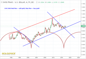
CHF/USD
Heading in the right direction for goldbugs…
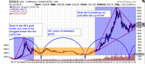
Another view of the gold chart. There really are a million ways of looking at it (the vast majority look bullish to me)…
I can quite easily see the eye is drawn to that 20+ years of sideways action and the two red triangles/blue boxes, and you could ask why not another 20 years of gold prices going nowhere. Cycles suggest continued upward momentum, and national debt/stock markets/silver-gold ratio and a long list of other things suggest it would be very hard to avoid an inflationary event and rapidly rising PM prices in the next few years. Others disagree of course 😉


Thanks, love the CHF indicator
Great stuff, as always. Thanks, Northstar.