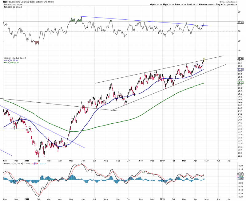
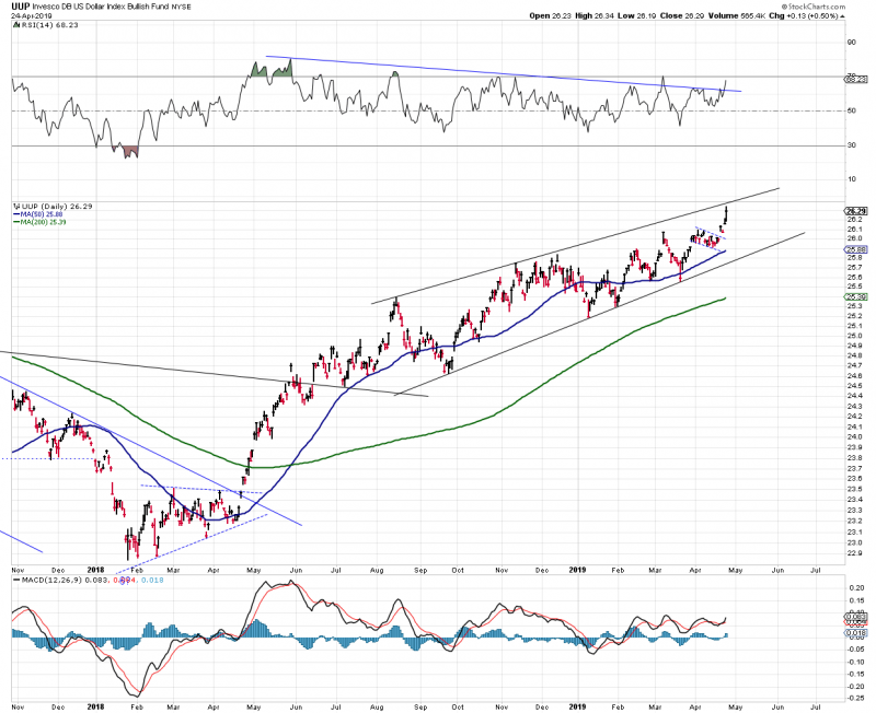
UUP – Daily
Oops. Its a breakout if it holds.
The UUP chart is more buoyant than DXY – at least when plotted on Stockcharts. I am assuming that is because UUP is actual dollars that accumulate interest. Anyone?
EDIT:
For Northstar – Or is it all in how you draw the line? This redrawn trend line suggests a topside UUP break out hasn’t happened – at least not yet. In any case, UUP closed at a new high.


Big decision time.
Good Question Fox
I always thought UUP tracked the Dx precisely …but clearly the UUP wants to go UUP
While the $USD chart is NOT breaking out ( yet)