Dollar & Gold Speculation
Goldtent friends – Three charts for you today, which help to reinforce where I think we are. I recently posted my downside levels to watch, so now here’s another look at Dollar Index behaviour over the last 50 years or so…
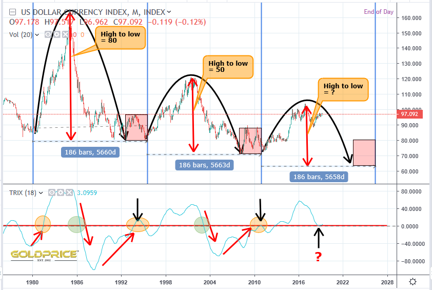
Looking at this there are a whole host of things that jump out at me from a scientific/pattern point of view. Firstly the cycles themselves. The two complete cycles since this paradigm (post gold standard) began have displayed perfect wavelength repetition. The period of time from low to low was duplicated beautifully. Secondly, the amplitude (peak to trough, shown by the vertical red arrows) is steadily declining – we are in a 50 year bear market. Next, the target area for a final low and new cycle beginning (red rectangles) are equal in size, shape and positioning. Turning to the TRIX (which I find very useful, as it combines trend and momentum), we can make some very useful factual statements. Number 1 – During each of the 3 cycles, the early ‘bull’ phase was characterised by TRIX moving from -40 or less through zero (shown by red up arrows and orange circles). Number 2 – ‘bear’ market confirmation in each cycle comes when TRIX falls from above 40 and passes through zero. So what is going on right now ? We appear to have fallen from above 40 and bounced at the zero line. The black arrows show where TRIX has ‘wobbled’ close to the zero line. The important point for me here, is that it doesn’t mean a change of trend. In the past when this happened, the TRIX resumed its previous path, which in this case will be down, thus giving final confirmation of the bear trend, targeting the third red box which covers the period 2023 to 2026.
So if the Dollar is displaying a decay of it’s price range and therefore a decay of energy, where is that energy going ? Lets take a look at the largest gold miner in the world and plot its share price on a chart with the Dollar Index…
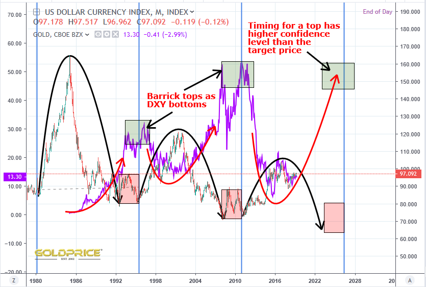
Great Scott ! – the Dollar is displaying a decreasing amplitude (energy) and Barrick is doing the exact opposite – the distance between each low and following high is increasing. For anyone with a science background, that’s entirely unsurprising. It’s exactly what you would expect if there is an exponential component to Dollar ‘devaluation’. I used Barrick because it goes back further than HUI etc, but a mining index would be the same. The million (or multi-trillion) Dollar question here is why ? What is it that’s causing the Dollar to follow an ever downward path ? The index is showing the Dollars relative worth compared to a basket of currencies from its main trading partners. It peaked just above 160 in its first cycle, just above 120 in its second cycle, and just above 100 this time. I know some here believe the cycle will fail here and we won’t head into that low between 2023 and 2026 – instead breaking upwards and making new highs. I beg to differ. It goes back to that fundamental question – why is the Dollar losing its grip, and is there something that will reverse a 50+ year trend of Dollar decay ? I believe the wheels that were set in motion in the early 1970’s will continue and ultimately lead to the Dollars demise as world reserve currency. Probably not for many, many years yet, but once a trend like this is in motion, the momentum is huge and usually irreversible. It keeps going until a ‘tipping point’ is reached – that when a new paradigm begins. It’s not a particularly ‘scientific’ concept – it’s just another way of saying ‘birth, growth, vitality, maturity, decay, demise, death, rebirth…’
Beautifully Eloquent Speculation Northstar !
Thanks Fully.
Yeah, and love the weather metaphors. Hurricane Buck is being downgraded to a tropical storm. Cool.
Hurricane Buck, lol. I’m waiting for Typhoon Gold – she’s just a tropical depression at the moment, but gathering strength…
Thanks Northstar! Really love the DXY vs Barrick chart, that’s a thing of beauty!!
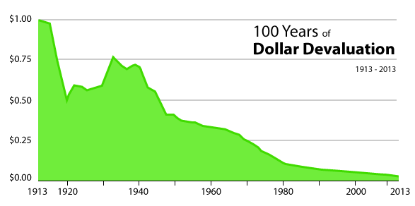
I understand your well constructed arguments here, but I guess my question is “Why?” Why should the dollar lose its world reserve currency status? I think Gold price was around $35 in the Great Depression Era? Versus $1,300 now. Why can’t the party keep going another 50 years? DXY down to 15 or 20, Gold up over $10K. I love the 100 Year, Dollar Deval chart, but why not another 100 years of that? Stocks too have exploded over that timeframe. Speaking from a place of “greed” with the aim of “wealth” preservation and growth, I kinda want the way things are to continue (funny because the “wealth” is measured in Dollars). If the US dollar does lose its world reserve status and is replaced with a “stronger” reserve currency, I don’t think that would be necessarily bullish for Gold and stocks. Seems like the party would end at that point?
From a human point of view, US dollar system promotes gross inequality, suffering, wars around the world. Just don’t know what the alternatives are.
The second paragraph should be read under the guise of a “Devil’s Advocate” haha